7 Unbeatable Soap Label Design Techniques That Increase Brand Recognition
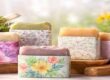
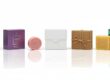
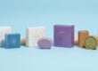
Packaging for soap brands is not just about preserving the product. It tells a story, instills confidence, and makes customers remember your brand name. A well-designed soap label can transform an everyday bar into a brand that comes to mind. It’s often the first thing people notice on the shelf. In seconds, your brand name will have them pick up your soap—or drive off. A well-designed label bonds. It informs them about you as a brand and what you believe in. Whether you produce handmade organic soaps or high-end bars, the label design has to convey your message. Let’s discuss seven unbeatable soap label design tricks that work for you and lead to brand recall.
1. Use Clear and Readable Typography
Why Typography Matters
Typography is not just font selection. It has others listening to your message and feeling your brand personality. If your customers are unable to read your words, they will lose interest quickly. Ensure the soap label type is easy to read and clear. Select fonts that match your product personality—organic, modern, or elegant.
Soap Label Typography Tips
Use bold font to make the brand name more prominent. Keep product details, such as ingredients or scent, small but readable. Avoid using more than one font style—two or three will suffice. And ensure that the text color provides sufficient contrast to the background. Black against white or white against black is best for readability.
Example
Natural soap can be shown with a soft and organic-feeling handwritten font. Luxury soap can be illustrated with a serif or metal-type font that will provide a luxury look.
2. Let Your Brand Name and Logo Be Seen Very Clearly
Why the Logo Is the Heart of the Label
Your logo is your signature in images. It speaks about your company’s history and gains belief every day. If a person is introduced to your logo, he or she has to recollect your soap and how awesome it is right away.
Placement and Size
Position your logo at the top or center of the label. This way, it will be the first thing to catch people’s eyes. Make it large enough to read but not large enough to dominate other info.
Consistency Across Products
If you have more than one soap product—lavender, charcoal, honey—be consistent regarding where you put the logo and look. That way, it is simple for customers to identify your brand anywhere easily.
Example
Take Dove or Lush. Their logo position and color scheme are always the same. That is how easily customers recognize them from a distance
3. Select Colors to Define Your Brand
The Psychology of Color for Soap Labels
Colors are emotive. They tell customers everything about your soap before they even pick up the label.
Examples:
- Green = fresh and natural ingredients.
- Blue = peaceful and clean.
- Gold or black = luxury factor.
- Pink = feminine, delicate, soft.
Color Coordination by Product Type
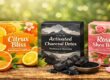
Select shades that complement your soap use or scent. Lavender soap pairs nicely with light purples. Citrus soap looks cheerful and vibrant in yellow or orange hues.
Balance Is Everything
Use no more than one color. A crisp, balanced color scheme makes your design look sophisticated and professional.
Pro Tip
Ensure color tests on papers, not just on screen. Occasionally, the colors print out slightly differently.
4. Place Needed Details Clearly
Why Placement of Information is Important
A pretty soap label gets noticed, but good information earns trust. Clients should be able to have a clue about what they are purchasing, what it contains, and who produced it. When your label shows such information in a systematic manner, your business looks genuine and reliable. Well-placed use of information also allows customers to receive information without confusion effortlessly.
What to Put on a Soap Label
All soap labels must have some general information that customers will be interested in:
- Brand name and logo: Clear to read and legibly indicated.
- Product name: Sample — “Lavender Handmade Soap” or “Charcoal Detox Bar.”
- Net weight: Informing customers how much product they will receive.
- List of ingredients: Fosters trust by revealing what is in the soap, particularly for sensitive skin.
- Manufacturing and expiry dates: Extremely crucial for freshness and safety.
- Usage or instructions for safety: Direct information such as “For external use only” or “Store in a cool place.
- Contact information or website: So that your customers can contact you or know more about your products.
Designing for Clarity
Your design must be clean and balanced. Don’t cram too much or too much text into one area. Put the same information together — i.e., have brand name and logo leading, product details in the center, and manufacturing information at the back. Utilize readable fonts and sufficient line spacing. Make critical details such as ingredients and best-before date legible. White space makes your design breathe, making the label professional and clean. With easily accessible information, customers feel comfortable trusting and remembering your brand.
5. Add Distinct Finishing Tips for a Luxury Appearance
Why Finishes Matter
Finishing can make your soap label stand out in a crowded market. Finishing techniques create texture, shine, or depth, making your label more appealing.
Most Popular Label Finishes
- Matte finish: Provides a soft, sophisticated appearance.
- Gloss finish: Provides shine and darkens colors.
- Embossing finish: Provides texture and sophistication.
- Matte + Texture finish: Provides softness with extra texture.
- Embossing or debossing: Pops up or presses designs for 3D relief.
- Foil stamping: Provides metallic glitz like gold or silver for a premium finish.
- UV coating: Applies to specific areas like the brand name for additional glitz.
When to Use Them
Choose finishes that reflect your personality as a brand. For example, premium brands can employ metallic foil, and eco-friendly brands can employ matte or recycled finishes.
6. Spin a Tale with Design Elements
The Power of Visual Storytelling
Each label needs to say a little bit about your soap or brand. Customers adore emotional connections. When they notice a design that speaks to them, they recall.
How to Spin a Story
Use packaging graphics, icons, or illustrations that communicate what your soap is all about. Hand-drawn leaves on a package of organic soap, for instance, reflect natural ingredients. Waves or bubbles can symbolize cleanliness and freshness.
Include a Short Brand Message
Add a tagline such as “Pure care from nature” or “Handcrafted for soft, radiant skin.” Single statements make your guarantee crisp and to the point.
Example
If your soap is eco-friendly, add a small icon or word such as “Eco-friendly” or “Plastic-free.” It conveys your message in a flash of time without taking many words.
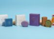
7. Design Your Label Material-Wise and Long-Lasting
Why Material Quality is Important
Your material of preference for designing your soap label is just as crucial as how it appears. Labels on soaps are also subject to water, oil, and humidity. If your label smudges, fades, or flakes off, your reputation is diminished. A robust label instills confidence and quality. It keeps your product appearing new even after weeks sitting on a retail shelf.
Ideal Materials for Soap Labels
Waterproof labels are ideal for soaps that will be exposed to water. They stick well and keep their adhesion even in contact with water. Kraft paper labels are the best for organic or handmade soap labels. Their natural texture provides them with a rustic, earthy appearance that customers adore. Vinyl or polyester labels are flexible and durable. They are tear-resistant and do not fade their bright color, so they’re ideal for luxury soap custom packaging.
Eco-Friendly Options
If your brand wants to be eco-friendly, use recyclable or biodegradable label stock. They show respect for the earth and appeal to the environmentally conscious consumers. You can also print with soy-based inks to produce more sustainable packaging.
Testing Is Important
Test your labels on the actual soap before printing in bulk. Test whether they adhere, are waterproof, and remain legible when used. Testing helps you find the right balance of appearance and longevity. A durable label lends authenticity and credibility to your soap—and your business.
Conclusion: Small Details Make Big Brand Impact
A great label does more than just recite ingredients. It tells your company’s story, inspires customer trust, and makes your product stick in their minds. With these seven winnable label design strategies, you can stand out with ease. Put readability, color consistency, storytelling, and high-quality finishing first. Each small detail results in a solid and memorable brand identity. When your soap label comes across other people and they instantly identify it with your brand, then hurray.
FAQ: Soap Label Design and Soap Branding
Q 1. What size should a soap label be?
Depending on the package and soap shape. Typical 2×3 inches or 3×4 inches, but test print first.
Q 2. Can soap labels be printed domestically?
Yes, for small batches, printable sticker sheets are available. But not for mass production, where there is better quality by professional printing.
Q 3. Which paper shall I use for eco-friendly soap labels?
Green label fine on kraft paper and recycled matte paper.
Q 4. How do I waterproof my soap label?
Use vinyl labels or laminate the print with clear, waterproof laminate.
Q 5. How important is consistency between soap varieties?
Very important. It informs your customer who you are straight away, no matter any aroma or color shift.