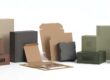
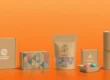
9 Smart Kraft Box Printing Ideas That Make Products Pop
Kraft boxes are simple, strong, and eco-friendly. But with the right printing ideas, they can become eye-catching too. Smart printing turns plain kraft boxes into stylish packaging that attracts customers and promotes your brand. In this article, you’ll learn nine creative kraft box printing ideas that make your packaging look unique and professional.
1. Add Bold Brand Logos
Why Logos Matter
Your logo is the window into your brand. It informs individuals about who you are before they even have to open the box. Your brand becomes memorable when you print your logo onto kraft boxes. Your product also becomes credible.
How to Print It Correctly
Print using good-quality ink for a clear print. Use bold colors such as black, white, or metallic shades for a great look against brown kraft paper. You can also utilize embossed or debossed printing to provide your logo with a raised or pressed texture.
Pro Tip
Make the logo simple. A clean and clear logo is more professional and contemporary.
2. Implement Minimalist Designs
Why Minimal Looks Work
Less is more. Minimalist kraft box printing provides a clean and sophisticated appearance. It also brings focus to your product rather than dominating it.
How to Do It
Use simple lines, light colors, or a single small design element. Such as, print the brand name in the middle and a small icon in the corner. Brown Kraft boxes with white ink make for a soft, fashionable look that appears elegant.
When to Use Minimal Designs
Ideal for skincare, candles, homemade soaps, or organic goods. All these items complement the natural look of kraft paper.
3. Try Eco-Friendly Ink Printing
Why It’s Important
Most consumers these days adore green brands. With soy-based or water-based inks, your kraft packaging remains green and kind to the earth.
How It Works
Eco inks are produced using natural substances rather than chemicals. They cut down on pollution and provide excellent color quality without hurting the environment.
Marketing Advantage
You may print a small green logo or message such as “Printed with Soy Ink” to indicate that you care about the planet. This plain message earns brand credibility and appeals to environmentally friendly consumers.
4. Opt for Custom Patterns and Textures
Why Patterns Catch the Eye
Patterns create custom packaging to appear innovative and attractive. Even basic shapes such as leaves, waves, or geometric shapes can create a one-of-a-kind kraft box design.
How to Print Patterns
Employ screen printing or digital printing for intricate patterns. Experiment with understated textures, like matte or spot UV finishes, for that premium feel.
Pro Tip
Leave the base Kraft color exposed. The brown is warm and adds character to your design.
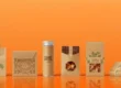
5. Include Product Illustrations
Why Illustrations Are Effective
Illustrations make your kraft boxes inviting and playful. They allow customers to see what’s inside without having to read lengthy text.
How to Apply Them
If you’re selling coffee, include a tiny cup or coffee bean drawing. If you’re packaging candles, include a small flame illustration or flower design. Use watercolor effects or line drawings for that hand-made look.
Extra Touch
Include your brand story below the illustration. This makes your packaging friendly and interesting.
6. Employ Foil Stamping for an Upgraded Appearance
Why Foil Stamping Lives Up to the Hype
Foil stamping adds elegance and shine. It can turn any Kraft box into a high-end, attention-grabbing box.
How It Works
Thin metallic foil (gold, silver, or rose gold) is pressed onto the box with heat. Ideal for logos, borders, or text you want to embolden.
When to Use It
Best suited for high-end products such as jewelry, candles, cosmetics, and gift wrapping. It creates a “wow” factor that customers recall.
7. Add Window Cutouts with Printed Borders
Why Window Cutouts Work
A small, clear window allows customers to view what’s inside. It adds flair without compromising the safety of the product within the box.
Printing Idea
Print a border or frame in a decorative manner along the window. Employ flowers, shapes, or dainty lines to represent your brand theme.
Extra Tip
If you are in the food or beauty business, window boxes are clean and professional-looking. They establish trust because the customer can see what they’re purchasing.
8. Use Typography as Art
Why Typography Matters
Words can be part of design as well. Polished fonts and legible text give your kraft boxes a trendy and modern appearance.
How to Use It
Print short, snappy phrases such as “Handmade with Love” or “Pure and Natural.” Use bold and light fonts for a quirky appearance. Provide enough space between the letters so that the design is not clogged.
Design Tip
Use white or black ink for contrast. Don’t use too many font styles. Two is sufficient for a clean appearance.
9. Use Matte and Gloss Printing Together
Why It’s Smart
Combining matte and gloss finishes provides depth and texture. It reflects light nicely and makes some elements of the design pop out.
How to Do It
Print the logo in gloss and leave everything else matte. Or apply spot UV to highlight important elements such as text or borders.
Where It Works Best
Suitable for contemporary brands that need clean yet striking packaging. This printing idea works well for gift boxes, subscription boxes, and high-end retail items.
Bonus Tips to Make Kraft Box Printing Even Better
- Choose the Right Box Style
Pick a box style that fits your product — mailer, tuck-end, or sleeve box. The design and print will look best when the box shape supports it.
- Test Print Before Final Order
Always test print a few boxes first. It assists you in verifying color grade, texture, and alignment prior to mass production.
- Include a Little QR Code
You can have a QR code that directs to your website, product video, or instructions for care. It renders your packaging more interactive and contemporary.
- Print Both Inside and Out
Don’t overlook the inside! You may print messages of thank you, patterns, or your brand messages inside the box to create a surprise.
- Maintain Your Design Consistency
Each Kraft box must reflect your brand tone and color scheme. Consistency is key to building trust and making it easy for people to identify your products.
Why Kraft Box Printing Is Important
Kraft boxes printed with images or information become more than packaging. They narrate your story, establish your brand, and differentiate your products on shelves or during unboxing. Here’s how clever printing makes all the difference:
- It makes first impressions that stick.
- It demonstrates professionalism and creativity.
- It increases your product’s value.
- It reminds customers about your brand.
- In short, printing makes basic kraft packaging into a fantastic marketing tool.
Final Thoughts
Clever Kraft box printing techniques can transform how customers perceive your brand.
From logos to foil stamping, every printing decision adds flair and significance to your packaging. Whether you make artisanal candles, natural foods, or cosmetics, creative kraft box printing can make your products look high-end and memorable. The good news? It’s budget-friendly, sustainable, and 100% customizable to your brand narrative.
Frequently Asked Questions (FAQ)
Q 1. What is the ideal printing technique for kraft boxes?
Digital and offset printing are more popular for kraft boxes. They provide crisp, intricate outcomes and are suitable for sustainable inks.
Q 2. Is it possible to print white graphics on brown kraft paper?
Yes! White ink is gorgeous on brown kraft paper. It creates a clean, new, and minimalist appearance that will suit most brands.
Q 3. Are eco-friendly inks long-lasting?
Yes. Both soy-based and water-based inks are eco-friendly and last long. They are not prone to fading quickly and have great color coverage.
Q 4. Can Kraft boxes be printed on both sides?
Yes. You can print messages, logos, or designs inside and outside the box. It provides a surprise factor to customers when they open it.
Q 5. Which printing concept is ideal for luxury products?
Foil stamping or spot UV printing is ideal for luxury products. They provide shine and depth, making the packaging look premium.
Q 6. Can I use embossing or debossing on kraft boxes?
Yes, both embossing and debossing work beautifully on kraft paper. These techniques add texture and depth, making your logo or design stand out. Embossing gives a raised effect, while debossing presses the design into the paper. They’re perfect for premium branding print without using too much ink.
Q 7. Are kraft boxes suitable for food or cosmetic packaging?
Absolutely. Kraft paper is naturally biodegradable and can be food-grade certified when coated with a safe barrier. It’s also a great choice for organic or handmade cosmetics because it aligns with the “eco-friendly” brand image. Always ensure the kraft material meets FDA or EU food-contact standards if used for edibles.
Q 8. How can I make kraft box packaging more attractive without harming sustainability?
You can use minimal printing with eco-friendly design inks, add natural jute strings, or use recycled tissue paper inside. Another great option is to use die-cut windows or add a simple thank-you note printed on recycled paper. These additions keep the packaging appealing while maintaining an eco-conscious look.
Q 9. What are the color limitations when printing on kraft paper?
Because kraft paper is brown, it can slightly mute or darken bright colors. For best results, use darker shades like black, navy, or forest green for strong contrast. White or metallic ink can also look stunning. Always do a test print before final production to check how colors appear on the kraft surface.
Q 10. Can I laminate kraft boxes for extra protection?
Yes, but choose eco-friendly lamination options. Matte or gloss water-based coatings are available that don’t affect recyclability. They make the boxes resistant to moisture, oil, and scratches while maintaining a smooth kraft finish. Avoid plastic lamination if your brand focuses on sustainability.