The Role of Color Psychology in Packaging Design: How the Right Palette Drives Buying Decisions
You step into a shop or browse an online site — dozens of items competing for your interest. But something grabs your attention immediately. A box. A package. A striking color.
Even before you can read the label, you sense something.
That’s no accident. That’s the power of color psychology.
In packaging, color isn’t just a cosmetic choice — it’s a marketing tool that influences the way people feel about your company, perceive its value, and decide to buy.
To small business owners, marketers, and designers, being able to leverage the power of color psychology can be the difference between a product that is purchased and one that is placed back on the shelf.
The Science Behind Color Psychology in Packaging
As per studies by the Institute for Color Research, consumers make 60–90% of their first impression of a product within only 90 seconds, and color is responsible for as much as 85% of this judgment.
That’s due to color:
- Provoking emotional responses
- Conveying brand personality
- Telegraphing quality and category
- Creating recognition and trust
Colors contain unconscious connotations, and when applied with purpose, they can silently influence buyers before they’ve even become familiar with your messaging or product benefits.
How Colors Affect Perception & Buying Habits
Let’s dissect how varied colors impact the buyer’s mind:
Color | Emotion Triggered | Associated Meanings |
Red | Energy, urgency | Excitement, appetite, power |
Blue | Calm, security | Trust, intelligence, professionalism |
Green | Nature, wellness | Sustainability, freshness, health |
Black | Sophistication | Luxury, exclusivity, boldness |
White | Simplicity, clarity | Purity, cleanliness, minimalism |
Yellow | Optimism, cheer | Youth, friendliness, attention |
Purple | Creativity, luxury | Imagination, royalty, spirituality |
Orange | Confidence, action | Playfulness, value, enthusiasm |
Pink | Romance, softness | Femininity, care, charm |
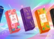
Industry-Wise Strategies For Packaging Colors
Food & Beverage Packaging
Here, colors not only convey — they provoke. Appetite, freshness, indulgence — all are evoked through visuals.
- Red & Yellow – McDonald’s, Lays, Coca-Cola: stimulate appetite and excitement.
- Green – Conveys health and freshness (employed by organic juice brands such as Suja).
- Brown/Kraft – Earthy and natural, great for baked food or organic snacks.
- Blue – Usually employed in water bottles or frozen food to suggest purity and refreshment.
Don’t use blue in food unless it’s associated with freshness or hydration. It’s not commonly found in nature and can act as an appetite suppressant.
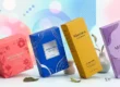
Beauty, Skincare & Personal Care
Packaging in this section needs to convey elegance, softness, or clinical success depending on the niche.
- White – Clean, clinical, low-key — used in brands such as The Ordinary.
- Pink & Pastels – Gentle, soft, and calming (Glossier, Laneige).
- Black & Gold – Luxury, edgy, bold (MAC, Fenty Beauty).
- Lavender – Care and relaxation — ideal for bath brands and aromatherapy.
Color is affected by age group: Gen Z enjoys brighter, playful colors. Older groups prefer simple, sophisticated colors.
Tech, Electronics & Gadgets
Trusted and innovative are the two emotions to evoke here.
- Blues and Greys – Industry leaders such as Dell, HP, and Samsung trust them.
- White & Silver – Futuristic, clean, new (Apple’s whole design).
- Black – Sleek, sophisticated, premium — perfect for high-end products.
In technology, neutral colors + clean minimalism = trust from the consumer. Let product features speak for themselves while the packaging looks premium and professional.
Health, Wellness, and Organic Products
Shoppers want to feel safe, in balance, and connected to nature.
- Green – Obvious pick for health, wellness, and eco-friendliness.
- Beige/Kraft Paper – Natural, unprocessed touch.
- Blue – Clean, peaceful, medicinal (best for supplements).
- Earth tones – Calming and credible for herbal or Ayurvedic products.
Soft, nature-driven palettes. Steer away from gaudy tones that may diminish perceived authenticity.
Emotional Anchoring: Color to Brand Personality
Colors should align with your brand’s values and voice.
Brand Voice | Matching Colors |
Fun, Bold, Playful | Orange, Yellow, Bright Pink |
Sophisticated, Luxury | Black, Gold, Deep Purple |
Natural, Organic | Greens, Browns, Creams |
Clinical, Trustworthy | Blue, White, Gray |
Artistic, Creative | Purple, Teal, Multicolor |
Create a brand color palette with:
- master brand color
- 1-2 complementary accents
- A neutral base (white, gray, beige)
Using this palette consistently creates familiarity and trust over time.
Cultural Sensitivity: One Color ≠ Same Emotion Everywhere
Did you know white is purity in the West but mourning in Asia? That red means luck and celebration in China, but danger in some Western cultures?
Color perception is highly cultural.
Before launching globally, localize your color strategy to align with regional sentiments. Brands like Pepsi and Coca-Cola often tweak packaging colors for Chinese New Year or Diwali promotions to align with local emotional cues.
How Top Brands Use Color Intelligently
- Apple uses white and silver to emphasize clean tech and modernity.
- Tiffany & Co. made their robin egg Tiffany Blue® iconic — symbolizing timeless luxury.
- Innisfree employs greens and browns to echo its nature-loving skincare heritage.
- Oatly employs clean white and beige with dramatic black fonts — fun yet earthy.
Such brands don’t apply color for aesthetic purposes only — they apply it for differentiation as well as emotional resonance.
Actionable Tips for Designers & Marketers
A/B Test of Packaging Colors: Cheap test runs with various color combinations can yield fascinating consumer insights.
- Readability First: Use light text against dark backgrounds (or vice versa) to be more readable and improve UX.
- Keep Up, But Keep YOU: It is wonderful to keep up with trends (e.g., color of the year), but never at the cost of brand consistency.
- Create Seasonal Color Variations: Tweak the palette a bit for holidays (holiday red/gold, spring pastel) to update without deviating from the brand.
Conclusion
In a market where brands fight for milliseconds of attention, color is your quick path to the buyer’s feelings.
It can:
- Put your product in the correct category
- Tap into emotions that lead to purchases
- Create brand memory and loyalty
So if you’re designing a package for organic tea, vibrant lipsticks, or a fresh smartwatch, select your colors on purpose.