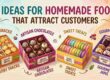
How to Design Food Boxes That Increase Shelf Appeal
When you go into a store, there are many food products vying for your attention. From chips to frozen vegetables, every business wants to leave an impression. But more often than not, it’s not the product itself that grabs your attention first. It’s the box or package. This is called shelf appeal, and it’s very important for sales.
Well-designed food boxes can halt customers in their tracks, make them take a look, and prompt them to purchase. Today, we’ll discover how to create food boxes that catch attention, are visually appealing, and instill trust. The aim is to make packaging protective yet potentially powerful as a marketing vehicle.
Why Shelf Appeal Matters in Food Packaging
First Impressions Count
Buyers scan shelves for only seconds. If your food box fails to capture their attention, they will go away. Your product will be remembered within those seconds through an effective design.
More Than Protection
Food boxes aren’t only used as protection for products. They are also a silent salesman. They tell your company story, your values, and the quality of your product.
Building Trust
A tidy and professional food box has people believing in you. People believe that if the packaging is decent, so will be the food within it, fresh and safe.
Important Points of Food Box Design
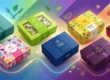
- Color Choice
Colors have a massive role when it comes to packaging food. They affect emotions and decisions.
- Bright colors like red food packaging and yellow food packaging tend to get noticed easily.
- Green color is typically used to describe healthy and organic food.
- The blue color gives a feeling of security and trust.
- Brown or Kraft colors demonstrate natural as well as green ethics.
- Choose colors that are appropriate for your brand and the contents of the box.
- Fonts and Typography
The way you spell out the product name matters. Big, clear, and readable fonts are best. Script or fancy fonts can be tidy but not hard to read. Remember that customers only glance for a few seconds.
- Images and Graphics
A picture of fresh fruits on the package makes people hungry. Graphics should be of excellent quality and look real, not misleading. A clear image of the actual product notifies customers what they are buying.
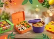
- Shape and Structure
Food boxes come in many forms. It can stand out on the shelf due to its interesting shape. A window cut-out, for example, shows the product inside. A handle makes it easier to transport. A rigid frame also safeguards the food.
- Brand Logo Placement
Your company logo should be displayed on the front panel. It assists in immediate recognition. Even though consumers may not buy this time, they will remember your logo the next time.
- Material Quality
Using quality material gives the box a premium look. Tough cardboard or eco-friendly kraft paper not only protects food but looks professional, too.
Design Strategies That Attract Customers
Application of Storytelling
There is a story behind each brand. You can put your brand’s history, values, or reason on the food box packaging. Short and simple storytelling makes the product personal.
Minimalist Design
Less is more in some instances. Simple design and fewer elements can look clean and premium. Minimalist packaging is trendy and attractive to new customers.
Transparency and Honesty
If you promise “organic” or “sugar-free,” place it front and center on the box. Consumers are smart these days. Honest packaging builds long-term consumer trust.
Eco-Friendly Appeal
Green boxes are very hip these days. Many consumers prefer recyclable or biodegradable packaging. A green stamp or a “100% recyclable” label will increase sales.
Designing for Different Types of Food
Snacks and Fast Food
Snack boxes need to have colourful and dynamic looks. Fun graphics and ‘can’t resist’ copy are what children and young consumers like.
Bakery and Confectionery
Sophisticated looks are ideal for cakes, cookies, or chocolate. Window boxes enable customers to see what is inside, thus making it irresistible.
Frozen and Ready-to-Eat Meals
The packaging needs to convey freshness and taste for frozen foods. Make the meal look irresistible with graphics. Thick material is used to retain cold storage.
Organic and Healthy Foods
For organic food, apply natural colors like green, brown, and beige. Eco-friendly material gives an additional benefit.
Beverages
Juice or milk cartons need to communicate freshness. Fresh fruits, clean typography, and accurate health values can contribute to shelf presence.
The Role of Printing Techniques
Digital Printing
Perfect for colorful and intricate designs. Good for small to medium orders.
Offset Printing
Used for mass production with better results. Perfect for brands with high output.
Flexography
Good for simple designs and large quantities. Can print on numerous materials, including paper or plastic.
Spot UV and Foil Stamping
These add glitter and luxury. Ideal for luxury products like chocolates or gourmet foods.
Future Trends in Food Boxes Design
The world of food packaging continues to change. Brands want to make a statement, reduce waste, and interact more with customers. New trends in food box design are revolutionizing the appearance of products on supermarket shelves in the future. Let’s discuss the biggest trends that will be in charge.
Smart Packaging
Smart packaging is arguably the most exciting trend. It uses technology to make boxes smarter and more interactive.
QR codes are the newest feature of many food packages. Scanning them using their mobile phones, consumers can see recipes, cooking tips, or product videos. Even NFC chips are added by some companies that direct customers directly to special offers or loyalty clubs.
Smart packaging also helps with food safety. For example, smart labels can track freshness and show if the food was stored at the right temperature. This builds trust and reassures customers about what they eat.
Eco-Friendly Materials
Customers today are green-conscious. They want brands that use green and safe packaging. Because of this, eco-friendly materials are becoming a gigantic trend when it comes to box design for food.
The majority of firms are moving to biodegradable plastics, compostable paper, and plant-based coatings. They reduce pollution and waste. These may be strong enough to hold food but still be eco-friendly.
Some firms are even converting to kraft boxes, which are plain, natural-looking, and recyclable. Having eco-friendly logos or inscriptions like “100% recyclable” on the box persuades your consumers to use your product instead of the competition.
Interactive Designs
Food boxes are no longer simply about food containment. They are now also about giving customers fun experiences. Interactive packaging makes consumers engaged and excited.
For example, some boxes open differently, like drawers, pop-ups, or fold-outs. This makes unboxing fun. Customers are likely to share these creative boxes on social media, giving brands free promotion.
Interactive elements like cut-out windows also enable consumers to see what’s inside. This is reassuring and makes food look more inviting.
Personalization
Customers like to feel special. Personalization of food box design is growing very fast because it produces a strong emotional bond.
Brands are able to print customers’ names, greetings, or customized messages directly on kraft food packaging. For example, a coffee brand can print “Good Morning, Sara!” on the cup. Or a cereal brand can create limited-edition boxes with children’s names.
Personalization works well during holidays, weddings, or birthdays. It helps make the product memorable, and brands are likely to attract repeat business. Customers are more likely to make repeat purchases when they believe that the product was manufactured just for them.
How to Test Shelf Appeal
Half the task is to design a food box, but you also need to test whether it actually works in the market. Testing makes you notice how customers respond and whether your box is viable enough to outsmart the competition.
Shelf Mockups
One simple method to test shelf appeal is by testing a shelf mockup. Place your food box alongside the competition on a shelf at a shop or mock-up arrangement. Take a step back and ask yourself the question: Does my box get your attention? This test shows you how your design looks in a real purchasing situation.
Customer Feedback
Customers are the final judges. Show different box designs to a group of people who represent your target buyers. Then ask them which box is more attractive, easier to read, and more believable. Feedback from actual buyers will allow you to make adjustments to your design before launch.
A/B Testing
A/B testing means testing two designs at the same time. One design might have bold colors, and another might have a theme of natural design. Test which one gets sold more in real stores. This gives us immediate proof of what people actually prefer.
Common Mistakes to Avoid
Even good food products can get fewer sales if the packaging has mistakes. These are frequent errors that reduce shelf appeal.
Too Much Text
If your box of food has too many words, customers won’t even notice. Shoppers glance at shelves for seconds. Get your message across quickly, simply, and clearly. Use simple words to describe the product in a hurry.
Poor Quality Printing
A box with low-quality images or faded colors looks cheap and unprofessional. Always print your box in the best printing quality so that your box is sharp and professional-looking. Keep in mind that your custom packaging represents the quality of your food.
Not Considering Practicality
Good appearances are not enough. Unless the box is simple to open, transport, and store, consumers will be frustrated. Make sure that the box is not just good-looking but also functional. A well-designed package must balance aesthetics with functionality.
Conclusion
Designing food boxes is not just about making them look good. It is about balancing beauty, credibility, and functionality. A well-designed box can gain attention, ensure loyalty, and sell more. Whether it is color or fonts, or eco-friendly materials, every single detail matters.
When shelf appeal becomes the focal point of your attention, you don’t just sell food—you sell an experience.
FAQs
Q1: Why is shelf appeal important for food packaging?
Shelf appeal makes your product visible in full aisles and grabs buyers immediately.
Q2: Which colors are most suitable for food boxes?
Bright colors attract attention, while natural colors indicate health and greenness.
Q3: Does eco-friendly packaging make it possible to boost sales?
Yes. Most buyers today prefer brands that employ recyclable or biodegradable boxes.
Q4: Which printing method is most suitable for food boxes?
Digital printing is best for small orders, and offset printing is best for bulk orders.
Q5: I want to know how to test if my food box design is good or bad.
Use shelf mockups, customer surveys, or A/B testing and see what design performs better.