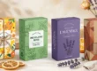
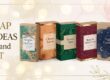
8 Smart Soap Label Design Ideas That Improve Brand Recognition
Soap is not only used to wash. It can also turn your brand into a household name. An intelligent soap label design makes people notice your brand and remember it. When customers love your soap, they buy again.
A perfect soap label talks about you, expresses your personality, and gives essential information. In this article, we will share 8 intelligent soap label ideas that can boost your brand.
1. Keep It Simple and Clear
Why Simplicity Works
Simpler labels are simpler to read. If the label is too busy, customers become confused. A simple design makes your soap look professional. Customers spot it faster in stores or online.
How to Do It
- Use one or two strong colors.
- Use a clear font that is easy to read.
- Use minimal text.
Leave room for the logo to be visible.
Example
A white soap bar with a subtle green tag and legible black text looks clean and natural.
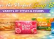
2. Choose Colors That Represent Your Brand
Why Color Matters
Colors are your brand personality. Young consumers like bright colors. Soft colors convey luxury or peace. Green is likely to convey natural or organic soaps.
How to Choose Colors
- Match your brand logo colors.
- Employ colors that symbolize your soap ingredients.
- Do not use too many colors.
Example
Lavender soap can be provided with soft purple labels. Coconut soap can be provided in cream or light brown shades.
3. Highlight Ingredients Clearly
Why Ingredients Are Important
Customers want to know what is in the soap. Ingredient labeling promotes trust. People are cautious regarding chemicals, allergies, or natural ingredients.
How to List Ingredients
- Employ bullet points for clarity.
- Mention the benefits of significant ingredients.
- Highlight organic or natural ingredients.
Example
“Contains shea butter for soft skin” or “Made with organic aloe vera.”
4. Apply Uncommon Fonts and Typography
Why Typography Matters
Fonts provide personality. A playful font appeals to young customers. A sophisticated font reflects luxury. Typography makes your brand memorable.
How to Use Fonts
- Use a primary font for the brand name.
- Use a minimalist font for ingredients or directions.
- Don’t use too many fonts on one label.
Example
A handcrafted soap company can apply a hand-drawn font for the name and plain text for details.
5. Make Your Logo Front and Center
Why a Logo is Important
A logo is the face of your company. Individuals remember logos more than text. A great logo has your soap prominently.
How to Display Your Logo
- Place it at the top or middle of the label.
- Make it large enough to be visible from afar.
- Keep similar colors on the logo across products.
Example
A circular soap label with an embossed centered logo appears professional and sophisticated.
6. Include Storytelling Elements
Why Storytelling Works
Everyone adores stories. A story on the soap label makes your brand stand out. It can be about ingredients, craft, or your brand purpose.
How to Add a Story
- Write 1-2 sentences about your brand.
- Add the soap-making process if handmade.
- Show your values, e.g., “eco-friendly” or “cruelty-free.”
Example
“Handmade in small batches with love and care,” or “Our lavender soap is from organic farms.”
7. Use Shapes and Layout Creatively
Why Shapes Matter
Not all labels are rectangles. Shapes can be exciting. An oval or circular label may look high-end. A square label can look modern.
How to Choose Shapes
- Match the soap shape.
- Place text in a proper position.
- Apply a layered appearance for a luxurious feel.
Example
A tiny round soap can employ a round label with the company logo in the middle and ingredients at the end.
8. Add QR Codes or Digital Links
Why QR Codes Are Handy
QR codes connect offline and online engagement. Customers can scan to get product information, promotions, or company history. It builds loyalty.
How to Use QR Codes
- Place it in a corner of the label.
- Make sure that it is legible.
- Connect it to your website or social media page.
Example
A small QR code soap label linking to a “soap care guide” webpage.
More Tips to Promote Brand Recognition
- Consistency: Apply the same colors, font, and logo across all products.
- Eco-friendly labels: Biodegradable or recyclable labels are sought by eco-friendly consumers.
- Readable size: Labels must be legible at the point of sale.
- Special finishes: Matte, glossy, or embossed finishes create the soap to feel premium.
Common Mistakes to Avoid in Soap Label Design
A soap label has the power to make and break your brand. The majority of brands make small mistakes that decrease trust or appeal. Below are the best mistakes and how to avoid them:
- Too Much Information
There are certain labels that try to say everything at once. This confuses customers.
How to Cure It:
Keep text short and readable. Show only essential information like brand name, ingredients, and soap benefits. Use bullet points whenever needed.
Example:
Don’t write a long paragraph about company history. Instead, write:
“Handmade in small batches with natural ingredients.”
- Small Fonts
It is hard to read tiny print. Your customers will shy away from your label if they cannot read it.
How to Fix It:
Select a font size that can be easily read on small soap bars. Make the brand name bigger than the rest.
- Colliding Colors
Too many colors or bright colors together make the label appear cluttered. It will repel customers.
How to Correct It:
Use 2-3 colors that complement your brand and ingredients. Gentle or natural colors are kinder to the eyes.
Example:
Lavender soap: white and light purple. Coconut soap: brown and cream.
- Disregarding Brand Consistency
All soaps under your brand must resemble each other. Color changes, font changes, or logo changes confuse the customers.
How to Fix It:
Use one logo, color scheme, and font on every product. Consistency makes your brand stick in people’s minds.
- Leaving Out Ingredient Information
Leaving out ingredients creates distrust among customers about your soap. Customers are interested in knowing what they are putting on their skin.
How to Fix It:
Post all main ingredients prominently. Highlight natural or organic ingredients. Promote benefits like “Moistures skin” or “Soothes irritation.”
Example
“Contains shea butter and coconut oil for soft, healthy skin.”
- Forgetting Label Legibility
Difficult-to-read or small contrast labeling annoys customers.
How to Fix It:
Contrast colors for the background and the text. Steer clear of hard-to-read fonts.
- Too Detailed Designs
Too many decorations, patterns, or icons make the label busy.
How to Fix It:
Keep the design simple. Focus on your main color, logo, and necessary text.
- Poor Low-Quality Printing
Poor-quality printing makes your soap appear inexpensive. Blurred print or dye fading hurts brand image.
How to Fix It:
Emphasize high-quality printing methods and durable labels. For a luxurious finish, utilize matte or gloss.
- Lack of Label Testing
Some companies skip testing. That label on the screen may not appear quite so pretty when placed on the actual soap.
How to Fix It:
Print a test label and inspect size, color, legibility, and positioning prior to mass production.
- Inadequate Legal or Safety Information
Labels that do not have sufficient legal or safety information are problematic. Customers will avoid soaps that do not have clear warnings.
How to Correct It
Include allergen information, weight, expiration date, and any other legal or safety information. Keep it short but small enough not to detract from the primary design.
Final Thoughts
An intelligent soap label design is not merely for appearances. It tells your story, builds trust, and optimizes brand identity. Use simple designs, clear ingredients, consistent colors, creative shapes, and storytelling. Add your logo and QR codes to stand out with your soap.
If you apply these 8 smart tips, your soap brand will glow, be more desirable, and yield loyal customers.
FAQ – Soap Label Design and Soap Branding
Q 1. Why do I need a soap label for my brand?
A soap label is the first thing customers see. It represents your brand, ingredients, and background. A great label gives people confidence and makes them remember your brand.
Q 2. How do I make my soap label stand out?
Use clear text, white or contrasting brand colors, a large logo, and unique shapes. A short story or QR code can also differentiate your soap.
Q 3. What are the best colors for soap custom packaging?
Choose 2-3 colors that go well with your brand or symbolize ingredients. Pastel colors illustrate relaxation or luxury. Vibrant colors appeal to younger consumers. Green is likely to illustrate natural or organic soap.
Q 4. Can I place QR codes on my soap label?
Yes! QR codes link consumers to your site, product information, or promotions. Place it in the corner and make it scannable.
Q 5. How do I list ingredients on my soap label?
List ingredients clearly in bullet form or short sentences. Highlight key ingredients like “Shea Butter” or “Organic Aloe Vera” to build credibility.
Q 6. Do I use specialty fonts on my soap label?
Yes, fonts give personality. Use a single main font for the brand name and a simple font for details. Don’t overdo the fonts. Keep text readable.
Q 7. What are good shapes for soap labels?
Round, oval, or square labels work. Use the soap shape. Weird shapes can make your soap stand out and look Instagram-pretty.
Q 8. Can green labels improve my brand reputation?
Yes! Green or recyclable labels attract eco-conscious customers. They tell customers your brand cares about the environment.
Q 9. What is the value of storytelling in my soap brand?
A short story about your brand or ingredients creates an emotional connection with customers. Customers love brands that are personal or caring.
Q 10. What are some label design errors to avoid in soap label design?
Don’t use too much text, clashing colors, small font, and uneven logos. Always declare ingredients and keep it simple in design.