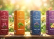
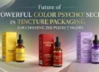
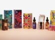
The Role of Typography in Tincture Box Packaging
Typography is the art of letters and the way they look when printed. Even for typography, the way words appear—even on a box, on a label, on packaging—matters. In consideration of tincture products, typography is more than letters; it sets a mood, tells a story, and enables one to relate with a brand.
Everything is in the design for tincture box packaging: a well-chosen font can make the product seem premium, natural, or trustworthy, and poor typography confuses buyers or makes the box look unprofessional.
One big way to make tincture boxes pop on store shelves is typography: it displays a brand’s personality and instills confidence in the purchase for customers.
Why Typography Matters on Tincture Box Packaging
With this brand of tincture, typography is going to play a huge role. It’s going to carry information, for example, the name of the product, usage, and ingredients. Also, it will be responsible for provoking emotions since fonts can make the box look calm, elegant, or modern.
Good typography makes reading easy. If the name and the purpose of the tincture are in plain view to customers, they know it and also trust it more. The right font makes custom packaging memorable.
Building Brand Identity with Fonts
Typography is shaping the way a brand feels, and every font tells a different story. So, in line with your brand message, the font style should be used when it comes to tincture boxes.
Examples could be:
- Clean, straight fonts for a health tincture to connote purity.
- Elegant script fonts to showcase high class in a luxury tincture.
- Earthy, handwritten fonts in the case of a natural tincture to give it that organic feel.
Typography used on one product and then carried through on other products establishes brand style identity. Sometimes, people recognize the brand by the style of writing on the box.
Creating a First Impression
It’s the first touchpoint for most customers; typography sets the tone immediately.
It should be catchy, bold, and clear, with letters to be viewed from a distance. Definitely, the creative font style will make the tincture outstanding. The size of the font, spacing, and placement matter—if it is too small or not clear, then customers may skip the product.
Clean typography conveys professionalism—a brand that actually cares about its details. In this competitive tincture market, first impressions mean everything, and it is just about whether the box will be picked up or not.
Communicating Brand Values
Moreover, typography helps in reflecting and communicating exactly what the brand is about. A wellness brand would use soft and calm fonts, while for selling energizing tinctures, it may use sharp, bold fonts that exude power.
Font choices can reflect brand values, including:
Trust: Fonts that are simple and easily readable.
Luxury: Elegant script or serif font.
Sustainability: Natural or rustic font styles.
The design of the font on the packaging of this tincture will speak to the customer even before it is read.
Typography and Readability
Readability is one of the most important aspects when it comes to packaging design; it is here that the name of the product, dose, and ingredients should be readable by the consumers.
Fancy fonts or fonts that are too thin may turn out unreadable on those small tincture boxes. Clear sans-serif or serif fonts work best. Proper spacing between letters and lines improves readability.
Readable typography ensures compliance. Most of the tincture boxes have to carry information that is vital, such as warnings, usage, or details of the batch. Easy-to-read text means all instructions will be understood by the customers.
Pairing Fonts for Better Design
Most tincture boxes use more than one font. Pairing fonts is one such practice that adds depth and creates a balance in luxury design. It would be common to have one major font for the name of the product and then another for details.
While the main font attracts attention, readability is maintained with the secondary font. One example could be a bold sans-serif that would look nice with clean serif fonts. Decorative fonts are used only in small portions of text, which could be a brand name or tagline, since too many different fonts on packaging make it look messy.
Psychology of Typography
Fonts evoke emotions in us. That is called the psychology of typography. Rounded fonts are friendly and soft, sharp fonts are powerful and sure, thin fonts are elegant, while thick fonts are bold.
That would, of course, bring in the psychology of typography too:
- Black fonts show power and clearness.
- Green feels natural and calm.
- Gold adds luxury.
When color and font style match the message of the tincture, the packaging feels so complete. Typography shapes how people will feel about the tincture, even before they try it.
Typography and Legibility in Small Spaces
These tincture boxes are small in size, and that is the reason designers have to be choosy in the selection of fonts. Sometimes, tiny text areas are hard to read using thin or very ornamental fonts.
A simple, clean font will be helpful in maintaining the professional feel of the design without sacrificing readability. Writing in all capital letters for short names like “CBD” or “Herbal Drops” could provide better readability.
Legibility ensures clarity in important information such as dosage, ingredients, and expiration dates.
Using Typography to Highlight Key Details
Typography guides the customer’s eye. Important words can be in bold or different colors. Directions can be very small compared to the name of the product, or large and bold.
Key benefits, like “100% Natural” or “Fast Relief,” might be in all caps. Smart typography layout makes sure that information is arranged in such a way that it does not make the box look crowded.
Balancing Typography with Graphics
Typography should work with the rest of the design elements. The fonts, colors, and images should feel like they balance each other.
The font should be simple if some detailed pattern or strong image is on the box, or if it’s minimal, then typography can be creative and bold.
A good balance is such that it should make the text stand out, not overpower it. That is what is called harmony between visuals and words.
Custom Fonts for Branded Feel
Some brands of tincture use professionally designed fonts. For custom typography, this helps build an appearance that no other brand owns.
A custom font can be the signature of the brand, building its recognition and hence differentiating it from any competition.
But the custom font must still be readable. Even a fashion typeface must never hurt readability.
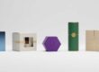
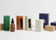
Typography and Packaging Materials
The typography can look very different with respect to the material used for the box. The fonts are soft and natural on matte paper, shiny and modern on glossy surfaces.
Embossed or debossed text has a texture that goes along with the high-end feel. The typography is luxurious with gold or silver foil stamping.
Such printing effects help fonts not only look good but also make them feel special whenever touched.
Typography and Brand Storytelling
Every brand of tincture has a story. Typography helps to tell that story visually.
A nature-inspired brand would perhaps feature earthy tones and organic fonts, while the science-based ones go for modern, sleek fonts with a professional feel.
Typography works as a silent storyteller, bridging product design with brand messaging.
Tincture Packaging Typography Trends
Packaging for modern tincture products has typography that’s clean, minimalist, and natural. Current trends include:
Minimal fonts: Simple sans-serif styles for a modern look.
Handwritten fonts: For an organic and personal touch.
Bold lettering: To create a strong brand presence.
Mixed typography: A combination of two font styles for contrast.
While the trends change with time, clarity and readability are still key in most instances.
Avoiding Common Typography Mistakes
Some packaging designs lose their impact because of incorrect typography. Common mistakes include:
Too many fonts.
Choosing unreadable styles.
Poor color contrast between text and background.
Uneven spacing or alignment.
Simple, well-aligned typography looks more professional; consistency in font use helps create trust and visual comfort.
How Typography Builds Customer Trust
Trust is of utmost importance when it comes to tincture products, especially those related to well-being. Typography plays into that trust.
Clean, readable fonts suggest transparency and reliability for the brand. Using one font across all packaging builds recognition, creating brand loyalty.
When typography is professional, customers believe the product is made with care.
Typography and Online Presentation
Typography also matters in tincture products sold online because clear, high-quality text ensures that customers can read the labels even on small screens.
Continuous font usage between the website and packaging improves brand cohesion. When the online visuals appear to match the actual box, it creates buyer confidence.
Typography for Luxury Tincture Boxes
The packaging of a luxury tincture often focuses on every single minute detail. Fonts play a big role in creating a premium experience.
The box looks exclusive with elegant serif or script fonts paired with gold foil or embossing. Minimal design makes it sophisticated, adding refined typography.
The luxury customer tends to notice the little design cues, and fonts are one of them.
Sustainable Typography Design
Sustainable brands often use simple typography to match eco-friendly values.
Minimal fonts, printed with soy or water-based inks, go well with the natural look. Earth tones and clean lines help communicate the brand’s green promise.
Typography can make the packaging both eco-conscious and stylish.
Conclusion
Typography is much more than decoration. It defines how a tincture box feels, looks, and communicates.
The appropriate font builds trust, highlights key details, and communicates brand personality. Good typography makes the product easily understandable and visually appealing.
Every detail, from font style to spacing, has an influence on how customers view the brand. In tincture packaging, words are not just read—they are felt.
Typography turns plain boxes into branded experiences that speak volumes without sound.
Frequently Asked Questions
Q 1: Why is typography important when it comes to packaging tincture?
Typography creates brand identity, improves readability, and draws customer attention.
Q 2: What kind of font is suitable for packaging a tincture?
Sans-serif or serif-style fonts, simple and readable, would go well with the tincture packaging.
Q 3: How would the color of the font influence the packaging design?
A font color is a mood: natural colors feel calm; bold tones add energy or luxury.
Q 4: Can a custom font make a tincture brand more noticeable?
Yes, a custom font will help in bringing uniqueness that would lead to building strong brand recognition.
Q 5: What typography errors are common enough that one should avoid them?
Overuse of fonts, poor contrast, and unreadable text make packaging look unprofessional.