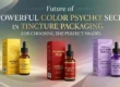
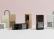
The Art of the Drop: A Masterclass in Creative Tincture Box Packaging Design
In the crowded wellness and natural health market, your custom packaging is the first thing customers notice about your brand. Even before they use the product, the box already tells them what your brand stands for. Creative tincture box packaging does more than just protect the bottle — it also helps customers feel connected to the brand and believe the product is helpful and healing.
As brands focus more on premium quality, creative tincture box packaging becomes a powerful way to share the brand’s story. The texture of the paper, the style of the text, and the overall design of the box shape how safe, trustworthy, and effective the product appears.
According to Packaging Strategies, well-designed packaging in the medicine and health industry builds customer trust and encourages people to buy. A well-designed box makes people feel confident, safe, and comfortable with their choice. To make a successful package, designers must balance legal rules with creative design. The packaging must stand out both online and in stores while clearly showing that the brand is a reliable leader in the wellness and herbal market.
The Psychology of Visual Trust: Color and Form in Tincture Design
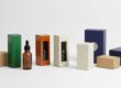
The look of a creative tincture box packaging is the first thing a customer sees. This makes the colors very important. When someone picks up a creative tincture box packaging, their brain notices the colors in just a few milliseconds. Dark green can make people think of nature and purity. White can make people think of medicine and cleanliness. Research from the Pantone Color Institute shows that up to 90% of a customer’s first opinion comes from color alone. Using soft earth-tone colors can give a natural and calm feeling. Shiny metallic or smooth matte finishes can make a plain box feel like a luxury item. By mixing these colors and finishes carefully, brands can show ideas like calm, energy, or recovery, even without words on the label.
Strategic Spatial Planning: Designing for 10ml and 30ml Scales
When you scale your artwork for creative tincture box packaging, it is very important to pay close attention to what is called “information density,” especially when moving from the small 10ml bottle to the larger 30ml standard. On a 10ml creative tincture box packaging, every single millimeter of space is important. In this case, a simple, minimalist design is not just a style choice—it is necessary to avoid giving the customer too much information at once. On the other hand, the 30ml creative tincture box packaging has more vertical space. This extra space can be used for things like a detailed brand story or a beautiful botanical illustration that would not fit well on a smaller box. Good creative packaging design makes sure that the brand name and the main ingredient are always the center of attention, no matter the box size. This helps keep a consistent brand look and feel across the whole product line.
Typography and Legal Compliance: The Balance of Style and Law
Choosing the right font for creative tincture box packaging takes careful thought. You need to balance a beautiful, artistic look with tough legal requirements. Tinctures are most often treated as dietary supplements or cosmetics. Because of this, the box has to show all the needed details. These include net weight, the full list of ingredients, and the “Supplement Facts” panel. You must add them without making the whole design feel crowded, messy, or dull.
The U.S. Food and Drug Administration (FDA) sets specific rules for font sizes and how easy the text must be to read. This helps make sure every customer can quickly read and clearly understand the important information. Many professional designers use a smart “double-layered” method for fonts in creative tincture box packaging designs. They pick bold, striking, and attention-grabbing fonts just for the product name. This helps the name pop out and catch the eye right away. Then, for all the technical and legal details, they choose clean, simple sans-serif fonts. These fonts keep everything clear and professional.
This approach works well. It lets the creative tincture box packaging look like a real piece of art on the outside. At the same time, it follows every legal rule perfectly. Customers get all the facts they need in an easy-to-read way.
Luxury Finishes: Textural Elements that Demand Attention
To make your brand stand out, your creative tincture box packaging should not only look good but also feel good in the hands. When a customer picks up the creative tincture box packaging in a store and touches it. That moment immediately influences how high-quality and valuable they believe the product is.
You can add luxury finishes like soft-touch lamination or aqueous coating. These give the box a smooth, velvety, almost silky surface that feels expensive and matches its high-end price perfectly. On top of that, blind embossing is a great technique. It presses designs right into the paper without using any ink at all. This creates a subtle, raised effect that adds real elegance and makes the packaging feel truly handcrafted and artisanal.
The Paper and Packaging Board points out that when people physically touch and interact with packaging. It builds a much stronger emotional connection to the brand compared to anything they experience digitally.
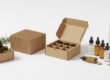
Sustainable Design Choices: Integrating Ethics and Aesthetics
With more and more people caring about the environment these days. Smart creative tincture box packaging now includes real sustainability without losing any of its beautiful style. The creative tincture box packaging is no longer just something to throw away after use. It actually shows how much the brand truly cares about protecting the planet.
One of the smartest ways to prove this commitment is by choosing FSC-certified recycled paperboard. The Forest Stewardship Council certification guarantees the materials come from responsibly managed forests. When you pick materials that are easy to recycle or even compost, your brand cuts down on the product’s carbon footprint. This directly attracts the growing group of eco-conscious “green” shoppers. Just as the Sustainable Packaging Coalition has pointed out in their reports.
In the exciting world of creative tincture box packaging. This focus on sustainability often brings in “raw” and natural textures. Unbleached Kraft paper is a favorite choice because it has that honest, earthy feel. It gives off a genuine artisanal vibe that pairs beautifully with botanical oils and plant-based tinctures.
Another key step is switching to soy-based or vegetable-based inks for all the printing on the box. These inks are much cleaner and safer for the environment compared to traditional petroleum-based ones. Using them keeps the whole package as pure and natural as the tincture inside. This choice strengthens the brand’s holistic message and connects deeply with the wellness community. That values clean, thoughtful products.
The “Hidden” Canvas: Interior Branding and Structural Surprise
One of the most overlooked parts of creative tincture box packaging is the inside of the box. The outside grabs attention and pulls people in, but the interior creates a special surprise the moment the customer opens it. That unboxing moment can really make someone smile and feel delighted.
Imagine opening the box and seeing a sudden burst of bright color. A hidden uplifting message, or a beautiful detailed drawing of botanicals and plants. These little touches create a genuine “wow” feeling. Customers often love sharing that exciting reveal on social media, which gives your brand free promotion.
This smart use of the inside space basically doubles your branding area without making the box any bigger or heavier. You get twice the chance to connect with the customer. The inside flaps of the box are perfect for useful information too. You can print clear dosage instructions right there so it’s easy to find every time. Or add QR codes that link straight to lab test results (COAs) for full transparency. These practical details show you care about the customer’s safety and trust.
When every single part of the packaging—from the outside all the way to the tiniest inside detail—feels thoughtfully designed, the customer notices. It makes the whole experience feel premium and personal. That extra care builds stronger loyalty to your brand. In the end, creative tincture box packaging like this becomes a powerful tool for keeping customers coming back again and again.

Technical Accuracy: Dielines and Print-Ready Files
When you switch from a digital design to an actual physical tincture box, you really need a solid grasp of the technical side of production. In creative packaging design, the most important guide is called the “dieline.” This is basically a flat, unfolded map of the box. It shows exactly where the paper will be cut, scored for folding, and glued together.
Since 10ml to 30ml tincture bottles are surprisingly heavy for their small size, your packaging needs to feel sturdy and reliable. That’s why most designers choose paperboard with the right thickness. Usually between 16pt and 24pt SBS (Solid Bleached Sulfate) board. This weight gives the box enough strength without making it too bulky or expensive.
To make sure the finished box looks completely professional, every designer must pay close attention to “bleed” areas. Bleed is an extra margin—normally 0.125 inches (about 3mm)—added around the edges of your artwork. This bleed area guarantees that colors, patterns, and images stretch all the way to the very edge of the box after it’s cut and trimmed. Without proper bleed, you can end up with annoying white borders or cut-off graphics, and misaligned text. Those small flaws instantly make the brand look cheaper or careless.
If the design doesn’t match the printer’s exact technical rules, problems like white edges, crooked printing, or uneven folds can happen. These mistakes hurt the customer’s first impression and damage how trustworthy your brand seems.
The smartest way to avoid all these issues is to follow professional resources like Adobe’s Packaging Design Guide. Tools and guides like that help you set up your files correctly from the start. When your creative tincture box packaging files are built with the right dieline, bleed, resolution, and specs. They become fully print-ready. This works perfectly for high-quality offset printing or modern digital printing. And it saves you from expensive reprints or production delays later on.
Interactive Elements: The Rise of Smart Packaging
The contemporary creative tincture box packaging is no longer a passive item; it is a doorway to a digital world. Adding “Smart” features to your packaging is a new trend that connects the product with the digital world. By putting QR codes or NFC (Near Field Communication) tags on your tincture box. You can give customers quick access to test results, “how-to-use” videos, or loyalty programs. This is very important in the tincture market. Because customers want to know exactly what is in the product and its strength. According to Smart Packaging Hub, interactive packaging can increase customer engagement by up to 20% compared to regular packaging. When adding these features, make sure the QR code is part of the design, not just an extra. You can put a border around it. That matches your brand or place it on the side so it does not take attention away from the main design of the box.
The Final Checklist: Pre-Flighting Your Tincture Design
Before you send your creative tincture box packaging design to the printer. It is very important to do a final check to make sure your brand stays consistent and the print comes out correctly. A careful “Masterclass” check involves looking closely at the following parts of your tincture box design:
Legibility Check: Is the font size of the “Supplement Facts” section at least the legal minimum (usually 6pt)?
- Color Matching: Have you changed your brand colors from RGB to CMYK or used Pantone (PMS) numbers. To make sure the colors print correctly on your tincture box?
- Safety Seals: Does your design leave space for a tamper-evident seal or a shrink wrap section?
- Barcode Functionality: Is there enough contrast between the barcode and the background so it scans easily at checkout?
- Scale Verification: Have you made a “dummy” mockup of your design at actual size to check that the 10ml or 30ml bottle fits snugly without rattling?
Visual Hierarchy: Leading the Consumer’s Eye
In the small but valuable space of a tincture box, the way a customer sees information, called visual hierarchy, can decide between a sale or a skip. The best creative tincture box packaging design uses a “top-down” approach, where the brand logo or a unique geometric design is at the top of the box. Followed by the product name in bold, high-contrast fonts. Next comes secondary information, like the milligram strength or flavor, which should go in the lower third of the box. This design is more than just looks; it follows how the human eye scans a vertical surface. According to Nielsen Norman Group, users follow certain paths when looking at a page, and by using these “F-patterns” on your tincture box. You make sure the key points of your product are seen in the first three seconds. By planning and guiding this flow, your creative tincture box packaging design becomes a roadmap. Taking the customer from curiosity to the checkout counter.
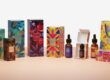
Seasonal and Limited Edition Strategies
One of the best ways to use creative tincture box packaging design is to add seasonal versions or limited editions. This lets a brand try brighter colors, shiny foils, or artist designs that may be too bold for a regular tincture box. For example, a “Winter Wellness” tincture can have a box with icy blue colors and silver foil. While a “Summer Vitality” tincture can have a box with bright orange and shiny UV patterns. This type of design makes customers feel like it is a “collector’s item.” So they may want to buy even if they still have some product. Studies show that limited edition designs can create “FOMO” (Fear Of Missing Out). Which can increase sales a lot in a short time. When making these designs, make sure the brand look, like the logo placement, stays the same as your normal tincture box design.
The Use of Photography vs. Illustrations
Using high-quality photos or illustrations is an important part of creative tincture box packaging design. Photos on a box show the quality of the ingredients. Like a clear picture of a hemp leaf or a sprig of lavender, which quickly tells the customer what is inside. Illustrations, on the other hand, can give the box a “boutique” or playful look. That makes it different from more clinical products. Right now, abstract illustrations that show the “feel” of the product. Like flowing lines for relaxation, are very popular. According to Creative Bloq, illustrations give a human touch that stock photos cannot. Making the tincture box look handmade and special, unlike mass-produced products.
The Architecture of Protection: Balancing Safety with Beauty
While focusing on the outside, the structure of creative tincture box packaging design must also include safety features. For glass bottles from 10ml to 30ml, the box design should have “buffer zones” or inserts. That stop the glass from moving and rattling during shipping. The best tincture box designs use a double-walled bottom or a “crash lock” bottom to prevent the bottle from falling through. From a design point of view, these safety features can also fit the theme of the box, like printing a “Thank You” message on the dust flaps. This way, the tincture box design is not just beautiful but also smartly engineered to deliver the product safely to the customer.
Designing for Retail Lighting: Managing Visual Contrast
One problem with creative tincture box packaging design is not thinking about the strong LED or fluorescent lights often used in stores. A box that looks bright and colorful on a computer screen can look dull or faded under store lights. To fix this, designers should use high-contrast colors and shiny or reflective materials in their tincture box design. So the brand is easy to see from far away. Using metallic inks or holographic stamping can catch the light and naturally draw the customer’s eye to the product. The “specular reflectance” of the materials, measured in lighting studies by the IES (Illuminating Engineering Society), is very important. For how people see the color and quality of the packaging. By testing your tincture box designs under different lighting. You can make sure the deep ambers and bright greens of your brand look consistent and attractive in any store environment.
The Science of Shelf Presence: Facade and Depth
When you have many brands next to each other, the front of your creative tincture box packaging design needs to grab attention. For 10ml to 30ml bottles, the front panel is narrow, so the box design should use vertical space. Designers often use “borderless” designs to make the box look wider or “wraparound” designs that make the customer pick up the box and turn it. This is important for consumer behavior; once a customer touches a product, the “endowment effect” makes it more likely they will buy it. Good creative tincture box packaging design also thinks about the “shadow gap,” the small space between boxes on a shelf. By using bright colors on the side panels. Your box design can create a “billboard effect,” so that many products together look like one big advertisement for your brand.

Color Calibration and Global Printing Standards
One of the biggest challenges in creative tincture box packaging design is keeping the brand consistent across different printing runs. A tincture box printed in New York should look exactly like one printed in London. But “color drift” can happen because of differences in ink and paper moisture. To prevent this, professional tincture box design uses G7 Master Qualification or ISO 12647 standards. These international rules make sure the look of your box is the same on different printing presses. When designing your box, it is important to use Pantone Matching System (PMS) colors instead of CMYK process colors. This keeps your signature “brand blue” consistent. So your loyal customers can recognize your product immediately on the store shelves.
The Power of Texture in Brand Storytelling
In the luxury wellness industry, the “hand feel” of a creative tincture box packaging design can sometimes communicate more effectively than the visuals. In creative tincture box packaging designs. “Debossed” patterns are often used, where the design is embossed into the paper, giving it a three-dimensional feel. For instance, a creative tincture box packaging design for a luxury CBD oil brand could include a debossed linen texture. To give the consumer a sense of organic luxury and comfort. On the other hand, a high-gloss UV coating on certain parts of the creative tincture box packaging design can give the consumer a sense of the technical, high-quality purity of a lab-developed supplement. The combination of both matte and glossy finishes on a single creative tincture box packaging design. Gives the brand a sophisticated look, implying that the brand has paid attention to every detail of the consumer experience.
Accessibility in Creative Tincture Box Packaging Design: Inclusive Solutions for All Users
True excellence in creative tincture box packaging means designing a box. That everyone can use easily, including people with physical or visual difficulties. Many users, especially older people or those with health problems, may find regular tincture boxes hard to hold or open. Accessible design is not just about using big text. It also means using strong color contrast. So the writing is easy to read, following WCAG accessibility standards even for printed packaging. The box can also be made more user-friendly by adding raised Braille dots on the sides. So visually impaired users can identify the product safely by touch. At the same time, the structure of the box matters. It should be easy to open without needing too much hand strength, but still secure enough to protect the glass bottle inside.
The Digital Frontier: Augmented Reality (AR) in Tincture Boxes
As technology moves forward, creative tincture box packaging is becoming a bridge to digital experiences. By adding Augmented Reality (AR) features to the design of a tincture box, brands can give customers a new and exciting unboxing experience. With just a smartphone, a customer can point their camera at the box and see it come to life on the screen. They might see a 3D animation showing how hemp is extracted or watch an interactive guide on how to measure the right dose. This turns the box from something people throw away into something useful and educational. According to Artivive, AR packaging can increase the time customers spend interacting with a brand by more than 40%. This extra engagement helps build transparency and makes your brand look modern and innovative in the market.
The Effects of Shelf Life and Material Aging
No 3,500-word guide would be complete without mentioning the shelf life of your creative tincture box packaging. Tinctures are commonly kept in bathrooms or kitchens, which are areas that are commonly exposed to humidity and temperature changes. A substandard tincture box can easily become warped or have its ink fade after several months of use. To avoid this, high-quality creative packaging commonly employs the use of “UV-stabilized” inks and moisture-resistant coatings. This ensures that the tincture box remains as fresh-looking on the day the tincture is completed as it did on the day it was purchased. When choosing materials for your creative tincture box packaging, you should take into consideration the “yellowing” effect that commonly occurs on certain uncoated white papers after a period of time. Using high-quality paperboard ensures that your tincture box remains as professional-looking from the time it is purchased until the end of its shelf life, further emphasizing the high quality of the liquid inside.
Typography and the Psychology of Serif vs. Sans Serif
Within the micro-environment of a tincture box, the “voice” of your brand is expressed through your choice of font style. In creative tincture box packaging design, Serif fonts — which have small “feet” at the ends of letters — are often used to show tradition, history, and professional medical knowledge. This works well for tincture boxes that focus on ancient herbs or long-established remedies.
In contrast, Sans Serif fonts — which have smooth letters without feet — look clean, modern, and friendly. These are great for brands that want to attract younger customers who care about lifestyle and wellness. Many designers use both styles together on the same box. For example, they might use a Serif font for the brand name and a Sans Serif font for the ingredients list. This mix creates a balance that feels both natural and modern at the same time.
Using this combination of fonts is a sign of thoughtful and advanced packaging design. It shows that the brand values both tradition and innovation.
“Navigating the 2026 Child-Resistant Mandates”
A work of art in creative tincture box packaging design has to be as secure as it is stunning. In 2026, the rules for tincture packaging became stricter. Now, child-resistant packaging must stay hard for children to open from the first use to the last drop.
This means designers must add simple safety locks directly into the cardboard box. These may include push-and-turn or squeeze-and-pull tabs. These features are now required by law. Brands can read more about these rules in a guide called “Compliance Requirements for Tincture Box Packaging: Navigating the 2026 Child-Resistant Mandates.” This guide explains how packaging changed from basic tamper seals to stronger safety designs.
When designing these boxes, companies must make sure adults — especially older people — can open them easily. At the same time, the box should still look premium and high quality.
The Finish and Its Impact on Longevity and Safety
While the shelf presence is important, the finish of your creative tincture box packaging also has an unseen impact on safety. A shiny high-gloss finish can make a tincture box slippery, which can make it harder to open a child-resistant lock. A soft-touch matte finish, on the other hand, gives a better grip and makes it easier to handle while opening the box safely.
The right protective coating. Such as aqueous or UV coating, also keeps the warning labels and dosage instructions clear and clean over time. This prevents the text from smudging, fading, or wearing off.
According to the Consumer Product Safety Commission (CPSC), all safety labels must remain easy to see and easy to read for the entire life of the product. By using strong and durable finishes. Your tincture box can stay safe, compliant with the law, and still feel premium and high-quality in the customer’s hands.
Final Masterclass Checklist for Brand Managers
To finish off this guide, every professional undertaking a creative tincture box packaging design should test their final design prototype against this strict checklist:
- Dieline Integrity: Does your creative tincture box packaging design offer a “snug fit” for the 10ml or 30ml bottle to avoid breakage of the internal glass?
- Visual Hierarchy: Does the most prominent message of your brand appear within 3 seconds of viewing the creative packaging design?
- 2026 Compliance: Have you checked that your locking system complies with the latest regulations for child-resistance, as outlined in the latest industry whitepapers?
- Tactile Engagement: Does your creative tincture box packaging design incorporate texture (embossing, matte finish) to provide a luxurious experience?
- Digital Connectivity: Is the QR code on your creative tincture box packaging design positioned in a high-contrast location for simple scanning?
Conclusion: The Future of Tincture Branding
The tincture box has grown from just a simple protective case to a powerful tool for branding. This shows how the wellness industry has become more complex. By focusing on creative tincture box packaging design. You can make your product feel special and create a strong emotional connection with your customers.
This can be done in many ways — using eco-friendly materials, adding AR features, or following the 2026 safety rules carefully. Your tincture box is one of the most important marketing tools for your brand. As your products grow from 10ml to 30ml and bigger sizes, remember that good design is not only about how the box looks. It’s also about how it works, protects the bottle, and shares your brand’s story with the world.
Frequently Asked Questions: Mastering Tincture Packaging
Q1: What is the most common mistake made in creative tincture box packaging for small bottles?
The most common mistake is “over-designing” the 10ml scale. A 10ml tincture box is very small, so many brands try to put too much information on it. The key to a great design for a small box is “Information Hierarchy.” This means you focus on one main thing, like the logo or the flavor, and keep the rest of the box clean and simple.
Q2: How can I make my tincture box feel premium without a huge budget?
You don’t have to break the bank with gold foils to make your tincture box feel high-end. Creative packaging design can be given a high-end makeover with the strategic use of “Blind Embossing” or “Spot UV” on select areas, such as your logo. Both of these techniques leverage the natural texture of the paper or a simple, clear gloss to give the design depth. Another way to give your tincture box a high-end feel is to incorporate a unique structural opening, such as a thumb-notched lid.
Q3: Does the type of material for the creative tincture box packaging liner impact the shelf life of the oil in the bottle?
Even though the glass bottle keeps the oil safe, the tincture box also plays an important role in protecting it from sunlight. The box should be made from thick, dark paperboard (at least 18pt thick) so light cannot reach the bottle on a store shelf. This helps keep the tincture strong, which is very important for premium wellness brands.
Q4: How do I incorporate QR codes in my creative tincture box packaging design without compromising the design?
Do not simply place a black and white QR code on the back of your creative tincture box packaging design. With modern design, you can “brand” your QR code by using your own colors or by placing the code inside a circular frame or an icon. You can place the code on the bottom flap or the interior side panel of your creative packaging design.
Q5: Are there certain color schemes that are more effective for 30ml tincture box designs versus 10ml designs?
In the 30ml packaging design. You have the ability to utilize the vertical space to create “Gradient Bleeds” and large-scale botanical designs. For the 10ml tincture box, “Block Colors” are more effective. Darker backgrounds with clean, white fonting will give your creative packaging a sharp, professional appearance. That will ensure your design is readable in a retail setting, even in low light.
Q6: How do I make sure that my tincture box design meets the 2026 requirements?
Safety is the backbone of your design. You must begin with a child-resistant dieline and then overlay your design. As stated in our conversation about the 2026 Child-Resistant Mandates. The structural lock is the most important element. After the safety feature is added. You can then overlay your creative packaging design around it, making sure that no “Warning” labels or “Ingredients” are obscured by the locking tabs.