7 Powerful Color Psychology Secrets in Tincture Packaging for Choosing the Perfect Shades
Introduction to Color Psychology in Tincture Packaging
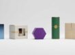
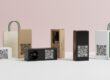
The landscape of the wellness and CBD market is highly competitive, and packaging does a lot more than protect a product these days. It conveys a brand personality, evokes emotions in customers, and allows products to stand out on the shelf compared with competitors. Color is a cornerstone in packaging design; it could be one of the most influential components. Color psychology in tincture packaging revolves around a primary idea of how color affects perception, trust, and buying behavior.
Whether it is a chilled blue, earthy green, or opulent black, every color delivers a pre-purchase signal to consumers without reading the label. Using the right colors in their packaging can help tincture brands capture a target audience, enhance their brand identity, and increase customer return.
Regardless of selling herbal tinctures, CBD oils, wellness drops, or organic supplements, leveraging colour psychology will greatly enhance your packaging approach and therefore boost the success of your marketing.
Why Packaging Colors Matter for Tincture Brands
When consumers browse products online or in stores, packaging colors are often the first thing customers see. Since different colors evoke different emotions, choosing which color to use is one of the key branding decisions for tincture brands.
At the same time, for instance, green is often associated with nature, health, and sustainability, and therefore with organic tincture products. Blue often invokes trust, calmness, and reliability; black conveys luxury and premium. These emotional triggers are imprinted on the customer’s mind even before using the product.
Deep shades are also useful for tincture brands looking to establish continuity in their marketing materials, including their website, labels, and social media. In an industry where tinctures and CBD are growing in popularity, having a recognizable color palette improves brand recognition and better distinguishes a business from its competitors.
How Colors Influence Customer Buying Decisions
Consumer behavior studies indicate that consumers jump to conclusions about a product based on visual representation, and moreover, color is central to those determinations. Great packaging will grab attention and compel buyers to take a closer look.
Warm colors like red, orange, and yellow are often used to elicit excitement and energy, while cooler tones such as blue and green evoke a feeling of calmness and trust. These colors can affect how a customer sees tincture packaging and whether or not they view the product as calming, natural, classy, or therapeutic.
Colors also affect product memorability. Out of the unique packaging designed by expert designers, brands are more memorably remembered by customers. That is why all successful tincture companies choose shades that align with their market and product.
The Connection Between Branding and Packaging Shades
The colors used in branding, as well as packaging, both play an important role in creating a strong brand identity. Yet, not all tincture brands have the same identity — that is where the packaging shades will help differentiate your brand from others.
For example:
- As more tincture brands focus on organic ingredients, they usually choose earth-tone greens or kraft-type packaging.
- Luxury wellness products are typically in black, gold, or dark navy.
- A plain package with a white background & light touches for minimalist brands.
- Brands that target young people or are energetic-oriented may choose bright colors and even saturated colors.
- Using colors consistently across all packaging and branding elements allows customers to identify your products in no time, as it gives an impression of professionalism and may build trust. Having this consistency can help drive long-term brand value and build customer retention.
What Is Color Psychology in Tincture Packaging?
In tincture packaging, color psychology is the practice of employing colors so they can invoke certain feelings in customers and sway purchasing choices. It combines marketing psychology with packaging design to design products visually, and it connects with consumers densely on an emotional level. Different colors communicate different meanings. For example, green invokes health and nature, blue conveys safety and trust, purple signifies wellness and creativity, while white evokes purity and simplicity. Tincture brands utilize these associations to market their tinctures.
If you understand color psychology well, you can select the shades of your packaging that suit both the purpose of your product as well as your potential audience and goals.
Understanding Consumer Emotional Responses to Colors
Our brains associate colors with our emotional and experiential state. This psychological response impacts consumers’ engagement with products and brands.
Some common emotional associations include:
- Green: Natural, healthy, eco-friendly
- Blue: Calm, trustworthy, professional
- Black: Luxury, sophistication, exclusivity
- Red: Energy, urgency, passion
- White: Cleanliness, purity, simplicity
- Purple: Wellness, creativity, relaxation
Emotional little things about tincture packaging — when customers see the packaging, these cues influence them in terms of their expectations about the quality and effectiveness of a product. And that is why color psychology serves as a big parameter to achieve success in packaging design.
How Different Industries Use Packaging Psychology
Color psychology is widely used by businesses from various industries to affect customer behavior and build a strong brand identity. Red and yellow make you hungry, which is why you see so many food brands use those colours, while healthcare companies often go with blue and white, which make consumers feel like they can trust a brand or feel clean.
Likewise, strategic packaging colors are used in the tincture and wellness industry to signal benefits. For green hues to reflect more natural products, and premium CBD oils with black or dark matte packaging for a luxurious feel are common in herbal tinctures.
Nostalgic gig vibes, minimalist and emotion-evoking colors in watches, beauty, skin treatment, and beauty supplements are also leaning on such packaging to gain traction with contemporary consumers. As competition continues to grow in wellness markets, this trend becomes only more popular.
Why Color Selection Impacts Product Perception
The color of a tincture product is directly associated with the taste, feel, quality, efficacy, and value of that tincture in the marketplace. Bad color choices will make the package look unprofessional or confusing, and the right colors can build trust and bring more customers.
As an example, neon bright colors might not suit calming wellness tinctures since the product is supposed to unwind you. Soft natural tones, on the other hand, can convey a more soothing and trustworthy impression.
The best packaging colors can also increase exposure on the shelf, promote brand stories, and create an impression among clients. This particularity is what makes the color psychology in tincture packaging a crucial technique for business growth and enhancing brand image.
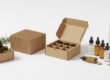
Use Green Shades for Natural and Organic Tinctures
Among the colors in color psychology in tincture packaging, green is one of the most powerful because it instantly conveys nature, health, freshness, and sustainability. Most tinctures are bottled in green glass, lending the products a calming and earthy class that speaks to wellness-minded consumers.
People are taught to want that which is safe, plant-based, and eco-friendly in the herbal/CBD market. Before buyers even read the product label, green packaging helps establish that image. It provides the consumer with the notion that the tincture is made from natural products and promotes a healthy lifestyle.
Green is generous, very easy to collaborate with when you have different packaging styles such as minimalist paper box, kraft paper packaging style, matte finishes, and even premium custom tincture boxes. Green is one of the most trusted, recognizable colors in the wellness field due to its versatility.
Why Green Represents Health and Wellness
Green is associated with nature, plants, growth, and balance. As tinctures are often thought of as herbal remedies, CBD oils and more natural wellness productizing behavior green is quite in line with expectations from the market itself.
In terms of psychology, green evokes relaxation, calmness, and renewal. Customers are often better people than the packaging greenwashing triggers.
- Organic ingredients
- Eco-friendly products
- Herbal wellness solutions
- Sustainable business practices
- Safe and natural formulations
That emotional tie is what helps tincture brands connect with health-conscious consumers. The bright green colors usually produce a more refreshing and calming look, while the darker greens convey stability, high quality, and are considered premium.
Green is a common color that many of the successful brands utilize, as it reinforces their mantra of natural healing and healthy living. This is the reason green continues to be a primary choice for herbal and CBD tincture packaging!
Best Green Tones for Herbal and CBD Tincture Packaging
Different tones of green evoke different feelings, and therefore selecting the right one is key to the success of its packaging.
Here are a few of the best green tones to select for tincture packaging:
- Forest Green
In tincture packaging, Dark Green gives a more luxurious and trustworthy look. It’s good for luxury herbal goods and premium CBD oils.
- Sage Green
Sage green adds softness, calmness, and a modern look to the ambience. Large. It is popular among minimalist wellness brands and packing for organic tinctures.
- Olive Green
Olive green :Transmits clues of earthen elements and ingredients. It goes in line with Kraft packaging and eco-friendly branding.
- Mint Green
Mint green generates a clean and refreshing feel. This is particularly effective for wellness products with a focus on relaxation and stress relief.
- Emerald Green
Emerald green gives products a refined, edgy, yet natural quality in how they look.
Picking the right green depends on who you are selling to, how you want your products positioned, and branding around them.
Combining Green With Eco-Friendly Packaging Design
By pairing green packaging with sustainable packaging materials & eco-friendly design elements, you can maximize the impact of your efforts. Modern consumers are far more interested in brands that care about the environment.
Tincture boxes, you can play around with the green:
- Kraft paper packaging
- Recyclable cardboard boxes
- Soy-based inks
- Minimalist label designs
- Matte finishes
- Earthy textures and natural patterns
This experience results in a very real, natural look that can help enhance brand confidence and attract eco-conscious shoppers.
Tincture brands that pair eco-friendly packaging with other green color schemes demonstrate their awareness of the prevailing sustainability trends in the wellness market. With the growth of consumer awareness of sustainability issues, sustainable packaging design can become a key factor for your competitive advantage.
Choose Blue Colors to Build Trust and Calmness
Blue is also a very powerful tone in the use of color psychology in tincture packaging since it widely symbolizes trust, stability, serenity, and professionalism. Blue packaging gives products a safe, reliable feel, and thus, many wellness and healthcare brands are able to do that.
The use of color blue is particularly beneficial for tincture products that are oriented towards relaxation, sleep, stress relief, and therapeutic wellness. Blue is often linked by customers to cleanliness and emotional balance, which works perfectly with modern wellness marketing branding.
Blue packaging gives products a smart and sharp look that aids tincture items in standing out against the other competing products you might find in a brick-and-mortar store or online.
How Blue Creates a Sense of Reliability
Blue is linked to trust, confidence, and dependability from a psychological perspective. This is primarily the reason you see banks, healthcare companies, and drug brands using blue in their branding and packaging often.
For tincture brands, blue can help to communicate:
- Product safety
- Professional quality
- Scientific credibility
- Calmness and relaxation
- Customer trust
Light blue hues can be calm and gentle, while darker navy shares authority and a premium.
Products that look fresh, neat, and clean are more likely to earn a consumer’s trust. This idea is backed by blue packaging, so tincture brands use it to develop closer relationships with customers.
Best Blue Shades for Wellness and Medical Tinctures
Picking the appropriate shade of blue is invaluable, as each one triggers a distinct feeling.
Sky Blue
The colour sky blue gives a sense of tranquillity and calmness. This is ideal for sleep tinctures and stress-relief products.
Navy Blue
Premium and professional appearance when used in packaging. It’s commonly used for medical-grade wellness products and high-end tincture branding.
Teal Blue
Teal: It combines the warmth of blue and the grounding effect of green. Best for contemporary wellness and CBD packaging.
Ice Blue
Ice Blue: Pure and Clean Ice blue is a cooling, refreshing color that gives your wellness product a clean appearance.
Royal Blue
Royal blue is eye-catching but still trustworthy and reliable. This is useful to help tincture products stand out in the crowd on shelves.
The right blue tones help to enhance packaging design and appeal to the minds of consumers.
Mistakes to Avoid When Using Blue Packaging
Blue is very effective for tincture, but not-so-great color choices will lessen its effectiveness.
The one thing that most UX/UI designers make a mistake in is applying dark blue shades without contrasting them with the element. Using very dark packaging would follow suit and could come across as cold or uninviting without something lighter incorporated into the design.
A third error is overuse or careful use of the Muse behind “blue” tones in a great number on a design together, this tends to result in muddled and fully scripted packaging. For good professional branding, it is essential to keep things as clean and balanced as possible.
Brands should also refrain from using muted or antique blue hues that create a tinge of an old product. Today, consumers want packaging that looks new and clean.
Lastly, when your packaging design relies solely on blue and lacks any supporting art elements, it can come across as a generic box. If you pair blue with white, silver, green, or minimal typography, your tincture packaging will be even more memorable and premium.

Use Black for Luxury and Premium Tincture Packaging
Since black is one of the most powerful colours in colour psychology in tincture packages, it creates instant impressions of luxuriousness, high-end niche, and exclusivity. Black is frequently seen in premium wellness, CBD, and cosmetic brands to offer an air of luxury and professionalism.
A successful example for a broad visual identity of tincture products in competitive retail markets is the use of black packaging that creates a powerful and elegant appearance. Black is often imbued with value, authority, and quality, so making tincture label designs black can work perfectly.
Black also lends itself nicely to modern minimalist packaging trends. A simple tincture box with a matte black finish, clean typography, and metallic accents may be enough to quickly turn heads and build your brand.
Visual branding and consumer behaviour studies indicate that packaging design impacts customer purchase decisions and product faith. Regulatory agencies such as the U.S. Food and Drug Administration (FDA) Packaging and Labeling Resources stress that presentation must be clear, professional, simple, modern, and accurate; all of these rules apply to any consumer product where a proper impression is necessary. Likewise, the guidance on Consumer Health Communication from NIH illustrates that visual communication of scientific messages impacts public perceptions and consumer confidence.
Why Black Packaging Feels High-End
One common association of the color black with luxury goods is that this arouses elitism, refinement, and sophistication. Brands of haute couture, manufacturers of premium electronics, and expensive skin care products often wrap their goods in black packages to underline the luxury character.
Black can convey the following for tincture packaging:
- Premium product quality
- Advanced formulations
- Professional branding
- Modern aesthetics
- Luxury wellness experiences
Matte black coatings are particularly popular because they produce a smooth and elegant look that feels much more deluxe than the glossy finishes. Black tincture boxes are usually associated with higher-end products, and people typically consider what’s inside more valuable for black tincture packaging, creating the feeling of professionalism.
It aids strong visual contrast, which is why logos and labels or metallic details stand out even better against black backgrounds. That enhances shelf presence and builds a memorable unboxing experience for customers.
Combining Black With Gold or Silver Foil
A black and gold or silver foil combination is also one of the most reliable strategies to improve black tincture packaging. Metallic finishes lend richness, sophistication, and visual interest while also enhancing the premium experience.
Black and Gold Packaging
Bringing black together with a splash of gold foil gives an elegant and exclusive look. This is a typical pairing for high-end CBD tinctures, herbal wellness merchandise, and premium skincare packaging.
Gold foiling can be done with the following:
- Foil stamping
- Embossed logos
- Metallic typography
- Decorative borders
- Premium label finishes
- Black and Silver Packaging
A combination of silver foil and black packages gives a classy, contemporary, elegant look. It does work best for wellness tinctures, med-grade ones, or a strong supplement.
While this is still a high-end package, silver embellishments allow for cleaner and newer aesthetics.
Metallic finishes are a great way for tincture brands to improve customer perception without overloading the packaging design. Sometimes the simplest layout with a little bit of foil looks the best.
Best Industries for Premium Black Tincture Boxes
Black tincture boxes are the most versatile type of packaging you can come across, and it conveniently suits multiple luxury, wellness, and high-end brands.
Here are some of the leading industries that black tincture boxes offer, but are not limited to:
CBD and Cannabis Wellness
In preparation for retail-store conversion, premium CBD oils usually adopt a matte black look, which can give off a luxurious and reliable impression.
Herbal Wellness Products
Luxury herbal tinctures alter their appearance with black packaging in order to signal a departure from natural products and an updated image.
Beauty and Skincare
The use of black packaging is common among tinctures for skincare and cosmetics; it feels classy and on trend.
Nutritional Supplements
Thus, wellness supplements that are high-performing tend to lean towards black packaging paired with metallic touches to create a sense of performance and quality.
Aromatherapy and Essential Oils
Black Packaging for Luxury Aromatherapy Products Black is calming and associated with luxury, making it a winner in branding for aromatherapy products aimed at wellness seekers.
Black creeps onto the packaging of many premium-product companies thanks to its timeless ability to shout sophistication.
Red Shades Increase Attention and Product Visibility
Red is one of the most emotive colors in color psychology in tincture packaging, as it instantly draws attention and stimulates excitement. Red has a low reach. Many brands leverage red packaging to get people’s heads up on the goods, stimulate emotions, and also make sure customers engage when they enter the aisle.
In retail settings, red stands out aptly amongst neutral packaging shades. That makes it a good choice for tincture brands looking to develop more dynamic packaging designs and improve their shelf impact.
It creates feelings of passion, energy, urgency, and even confidence. When used wisely, this method helps products stand out as more vibrant and memorable in the minds of consumers.
Visual Branding Elements Use of Packaging, Design, and Colors: Consumer communication guidance from the U.S. Small Business Administration (SBA) Branding and Marketing Resources indicates that packaging design and color can very much affect customer appeal and the decision to make a purchase. Also, the National Institute of Mental Health (NIMH) Educational Resources talks about the influence of colors and visual environments on emotion, mood, and human behavior.
How Red Stimulates Urgency and Excitement
Red psychologically represents energy, action, and emotional intensity. It inherently draws the eye more quickly than many other hues, which makes it a perfect choice for packaging design.
Red packaging can evoke the following feelings:
- Excitement
- Passion
- Confidence
- Energy
- Urgency
- Strength
These psychological impacts are why red is so often used in promotional packaging, limited runs of products, and with any item you really want to create an emotional connection with.
Red works well in packaging tinctures:
- Energy support
- Performance enhancement
- Immune wellness
- Mood enhancement
- Focus and vitality
Bright reds herald vibrancy while deeper shades like burgundy evoke feelings of luxury and elegance.
When to Use Red in Tincture Packaging Design
Justify that red should only be used based on the tincture product’s intent and the consumer audience.
Red is most effective in packaging for brands that want to:
- Increase shelf visibility
- Launch bold product lines
- Create energetic branding
- Promote limited-edition tinctures
- Attracts younger or active consumers
- Highlight powerful formulations
Let’s say you have a tincture for wellness, something that’s aiming to boost vitality or mental focus; red might actually work well as the physical medium supports its intended purpose.
But red can be a bit too stimulating for calming or sleep-focused tinctures. In such cases, a blue or green tone would suit better.
Balancing Bold Red Colors Without Overwhelming Customers
Red is extremely eye-catching, but if it appears on a label too much, it can feel aggressive or even overly busy. The trick lies in pairing red with neutral or more calming design elements.
Ways for red tincture packaging design that you can use to your advantage:
- White background with red details.
- Red + black = luxury
- Burgundy with gold details — luxurious branding
- Employing clean typography to minimize visual noise
- Restrict bright red to logos or highlight spots
Brands also do not get honest with using a lot of competing colors together, especially alongside red, giving a messy appearance. The clean layouts and the limited use of red keep it professional whilst still drawing in customers.
Utilizing red properly has the potential to vastly increase tincture packaging visibility, evoke emotion, and make a better brand memorability!
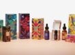
Purple Packaging Creates a Sense of Wellness and Creativity
In color psychology, purple is very common in tincture packaging because it expresses a sense of wellness, relaxation, creativity, and luxury. Purple in the wellness and CBD space often makes products feel cool, fancy, and sexy.
Purple colour is linked with spirituality, healing, imagination, and sophistication for centuries. The idea of planning your tincture is employed by modern tincture brands, casting this psychological connection as innovative and wellness-oriented. Similarly, it also stands out among common green and blue packaging designs while remaining a relaxing visual identity for tincture products.
Since purple is half warm, half cool, it evokes a totally different emotional response that works nicely for herbal tinctures, stress-relieving products, aromatherapy oils, and luxury wellness blends.
Why Purple Is Popular in CBD and Herbal Products
Purple colour is one of the fastest growing choices in CBD and herbal tincture packaging as it gives a very calming and healing showcase. Purple colours are usually associated with calmness, mindfulness, and emotional balance.
Purple packaging, in particular, is effective when it comes to:
- Sleep-support tinctures
- Stress-relief CBD oils
- Herbal wellness products
- Aromatherapy tinctures
- Holistic healing brands
Purple is also favored among a lot of modern wellness brands because it conveys creativity and innovation. This allows products to look more custom and high-end than other classic packaging styles.
Furthermore, purple goes well with the package’s minimalist and metallic finishes that replace many boxes for tinctures, which allows brands to create visually attractive tincture packaging, great for wellness-conscious buyers.
Light Purple vs. Dark Purple Packaging Effects
The use of variations in purple creates various visual and emotional effects on tincture packaging.
- Light Purple Packaging
Welcoming light purple and lavender tones bring a feeling of calmness, softness, and relaxation. Such shades are suitable for wellness tinctures targeting sleep, anxiety, and mindfulness.
Light purple packaging often feels:
- Gentle and calming
- Feminine and elegant
- Modern and minimalist
- Soft and therapeutic
- Dark Purple Packaging
Plum, dark purple, and royal purple lend an air of luxury, glamour, and sophistication. They are often used for high-end tincture products and trending wellness brands.
Dark purple packaging often communicates:
- Luxury and exclusivity
- Creativity and uniqueness
- Premium product quality
- Strong brand identity
The right purple tone depends on the overall emotional experience that a brand wants its customers to have.
Pairing Purple With Minimalist Packaging Styles
Purple is particularly effective on a variety of very minimalist packaging designs because it inherently adds physical interest without tonnes of graphics and embellishments.
Some effective minimalist combinations include:
- Lavender with white typography
- Silver foil on superfine purple boxes
- Black labels on dark purple with no deviation
- Purple colour in soft pastel and kraft packaging
- White packaging background with purple accents
The packaging is minimalistic purple, which makes it clean and professional-looking while also echoing emotional warmth and stylistic elegance. This trend is particularly appealing to millennial consumers and high-end wellness sectors.
Meaning of white Packaging Color: It is a symbol and nature imbued with purity and simplicity.
Color psychology is diverse when it comes to tincture packaging, and white symbolizes purity, cleanliness, simplicity, and transparency, so it becomes one of the most universal colors. White packaging is often used by bad companies as it creates an image of a professional and trustworthy brand – this is why many modern wellness and healthcare brands have white-night branding.
White Packaging Reflects Purity and Simplicity
White gives packaging a clean visual presentation and helps tinctures feel fresh, safe, and organized as well. It also works well for branding strategies that are minimalistic in nature, and the emphasis is on simplicity and elegance.
White packaging works well for tincture brands looking to highlight natural ingredients, purity, and modern design.

Why Minimal White Packaging Attracts Modern Buyers
More and more modern consumers are attracted to minimalist package designs that appear neat, tidy, and polished. This trend is also backed up with white packaging, which looks classically clean and minimalist.
Minimal white packaging often communicates:
- Product purity
- Transparency and honesty
- Simplicity and professionalism
- High-quality ingredients
- Modern branding aesthetics
In busy retail settings, brightly colored labels can be more distracting than inviting. White packaging can also provide a sense of visual balance and allow customers to focus on key product information.
This design strategy is popular with luxury wellness brands, skincare lines, and organic tincture producers.
Creating Clean and Professional Tincture Branding
The white packaging gives tincture brands a professional persona that feels orderly and reliable. White packaging can boost consumer loyalty views when combined with clean typography and a simple design board.
The brands generally match each other in white packaging with:
- Black minimalist fonts
- Soft natural colors
- Metallic accents
- Embossed logos
- Transparent labels
It’s what lends it a classy, high-end feel while remaining readable and visually uncluttered.
Apart from that, white acts as an adaptable tone that fits with almost every branding pattern, which again makes it super custom tincture packaging friendly.
Using White Space Effectively in Packaging Design
Negative space, or white space, is where the empty areas around packaging elements exist, like text, logos, and graphics. White space used correctly increases legibility and produces a more graceful look.
Advantages of good white space are:
- Cleaner packaging layouts
- Improved visibility of brand components ·
- Improved customer readability
- Modern and luxurious presentation
- Reduced visual clutter
Successful tincture brands often go with minimal graphics and larger blank areas for a quality feel with upscale packaging.
Yellow and Orange Boost Energy and Positivity
Yellow and orange are warm colors that stimulate energy, optimism, excitement, and happiness. Greet, for example, the colors that open Muji container packaging are very colorful and constitute a dominant color in tincture coccobarct.
Well, the warm packaging colours draw in our attention naturally and make these products pop on shelves. They can give tincture brands a more vibrant look and feel while making the product still appear friendly and upbeat.
Use of yellow and orange is a great fit for wellness tinctures focused on energy, focus, mood enhancement, or active lifestyles.
How Warm Colors Influence Consumer Mood
Warm colors inspire emotional energy and excitement. Yellow has a high connection with happiness, joy, and optimism, while orange is a bright colour that is often equated with creativity, kindness, and friendship.
This is a human edit MESSAGE SENDER: These colors can make consumers fly;
- Happy and energized
- Motivated and optimistic
- Emotional connection to the brand
- More visually engaged with the product
Due to their natural eye-catchiness, warm hues shine for products aimed at younger demographics.
Best Uses for Bright Packaging Colors
Use bright colors selectively so products do not blend into colorful backgrounds, and customers know exactly where to look without being bombarded by the bright colors all around.
Yellow and orange work well for:
- Energy-support tinctures
- Focus and productivity products
- Mood-enhancing wellness products
- Vitamin and supplement tinctures
- Youth-focused wellness brands
However, bright colors can also just be used as accents instead of primary packaging colors. With an overall tidy look, small bursts of yellow or orange can grab attention and enhance the shelf impact.
Combining Warm Tones With Neutral Packaging Elements
However, warm colors are more powerful when balanced or in combination with neutral colors like white, beige, black, or gray.
Popular combinations include:
- Orange color on matte black packaging.
- White boxes with yellow accents
- Earthy tones contrasted by kraft packaging
Minimal Logo Design. Varied typefaces used in logo design
- Simple Orange with minimal typography
- Natural earth tones with golden yellow
Bright colors are balanced with simple elements of neutral color to refract color until it never looks too aggressive on packaging, so as not to create visual chaos.
How to Choose the Right Color Combination for Tincture Packaging
The right colour combination for packaging sufficiently establishes your brand identity and helps you reach the perfect customers. It has been active in offering successful color combinations for fun after the update: Visual appeal, emotional connection, and shelf visibility.
Matching Colors With Your Target Audience
Different audiences interact differently with different packaging colours. Knowledge about customers is so in-depth that it assists the brand in choosing more suitable colors.
For example:
Wellness targeting buyers often favour soft greens and blues.
- Black and gold is more appealing to the luxury consumer
- Bold and energetic tones attract younger audiences
- Eco-friendly Color Palettes Eco Friendly Colours-Eco-Consumers Pay Attention to Nature
Packaging colours should resonate with the mood and lifestyle of consumers.
Understanding Brand Personality Before Selecting Shades
Every tincture brand has its own character. You should be consistent about that in your packaging colors.
A relaxation-centered brand might feature soft blue and lavender tones, whereas a luxury wellness provider could use matte black with metallic touches.
Knowing what kind of persona your brand embodies before picking packaging colors allows for more cohesive and meaningful branding.
Using Contrasting Colors for Better Shelf Impact
Different colors make packaging more visible and easier to notice.
Examples include:
- Black and gold
- White and green
- Purple and silver
- Blue and white
- Orange and gray
Using strong contrast increases readability and is a great way to allow tincture merchandise to stand out on busy, competitive retail shelves.
Common Mistakes to Avoid in Color Psychology for Packaging
Color choice issue, and depending on the colors used in package design, it can make packaging less attractive and affect consumer attitude.
Choosing Colors Without Brand Research
Choosing a color without knowledge about what will resonate with the customers or what is common in the market could lead to packaging that feels like it misses the target audience.
Brands need to conduct research on competitors, customer behaviour, and industry standards before finalising the colours of the packaging.
Ignoring Cultural Meanings of Colors
For example, colors have a different meaning for various cultures. One market leans towards one thing when it comes to color — where something that means positivity in one place could mean something different in another region.
Tincture brands planning to sell their products worldwide should think about local colors.
Don′t Use Too Many Colors in One Design?
Overuse of conflicting colors causes visual confusion and less professionalism in style.
Simple and less cluttered color palettes often help make the branding stronger as well as ease placing text on top of a package, thereby supporting how produce retailers Markup and Ceres Infinite inventory due to abjectly weighed Unprofitably.
Latest Trends in Color Psychology in Tincture Packaging
Packaging trends remain in a state of evolution, as consumer moods shift ever-narrower into sustainability, simplicity, and premium looks.
Minimalist and Neutral Packaging Trends
The wellness market overview is that one of the strongest trends in this industry is minimalist packaging. Neutral colors like white, beige, sage green, and pale gray lead to harmonious and elegant packaging designs.
Sustainable Packaging Color Themes
Sustainable packaging typically uses natural and earthy tones, including kraft brown, olive green, and muted natural colors that amplify the sustainability message.
2026: Matte vs. glossy color finishes
The demand for matte packaging finishes remains on the rise due to their softer and more premium look. For energy wellness beverages, bold and vibrant packaging styles are still typically printed with a glossy finish.
Benefits of Using Smart Color Psychology in Tincture Packaging
One of the significant branding and marketing benefits of strategic color selection
Increased Brand Recognition
Use of consistent packaging colors allows customers to identify products quickly and remember brands easily.
Better Customer Trust and Loyalty
Well-designed, emotionally appealing packaging develops greater confidence that consumers will remain loyal in the long run.
Increased Visibility and Sales Potential for Products
Good packaging design grabs attention, enhances shelf appeal, and increases the chances of a sale.
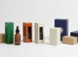
Why Custom Printed Tincture Boxes Matter for Branding
Custom packaging enables tincture brands to develop a specific identity that distinguishes products from competitors.
Custom tincture packaging adds an attractive look to your product and attracts customers to choose your product over others, enhancing your branding.
Affordable and Premium Packaging Options for Businesses
Packaging companies in this modern world now provide transformative ways to pack products and allow you to create both affordable and luxury tincture packaging designs, regardless of the size of your business.
FAQs About Color Psychology in Tincture Packaging
Q: How do you identify colors based on their emotions in tincture packaging?
The best tincture package colors are based on the product type, target audience, and brand personality. Green is a suitable colour for all-natural and organic tinctures as it denotes health and sustainability. Blue works very well as the color for wellness and calming products because it generates trust and relaxation. Dark blue is best for tincture packaging, green for edible tinctures, and it also works well with tea products (usually a supplement); black is perfect to showcase the premium nature of the product, and purple has become very trendy in recent years when it comes to tincture packaging, CBD & herbal wellness products. Warm colors such as yellow and orange lead to more vibrant and attractive designs, while white packaging is commonly used for simplistic and clear branding.
Most successful tincture brands choose colors in line with the emotional experience that they want to provide their customer upon purchasing the product.
What is the significance of Color Psychology in Packaging Design?
Why Should Colors Be Important in The Packaging Design? — Color psychology: As colors have a direct impact on customers’ emotions, behaviour related to purchasing, and product perception, etc. For example, the colors of packaging can help consumers immediately establish whether they feel a natural, high-end-formula-calming drink or an energetic tonic on-premise tincture product.
Good packaging design sometimes makes the difference between whether customers perceive your product or ignore it in highly competitive retail markets. Adopting the right colors increase product visibility on shelves build branded identity.
Tincture brands can use color psychology to define their brand identity more distinctly as well. Using the same colors for packaging helps customers recognize your brand and builds loyalty in the long run.
What color builds trust in tincture branding?
Blue is the most trusted color for tincture branding. It evokes sensations of security, dependability, professionalism, and tranquility. This is also the reason that most healthcare, wellness, and pharmaceutical brands prefer to use the blue color in their packaging products and marketing materials.
Dark navy blue conveys authority and premium quality, while lighter blue is softer and significantly soothing. Similar is the case for White and Green, which also symbolize trust, cleanliness, purity, and natural wellness.
Blue can represent corporate-like professionalism at the same time, when minimalist elements are added with tincture packaging.
Can the color of the packaging increase sales of products?
Without a doubt, packaging colors have an important effect on the sales of goods. Well-designed packaging grabs your product’s attention, makes your products stand out from others on the shelf, and drives consumer purchase.
When it comes to conveying quality, effectiveness, or value, color psychology influences customer perception of these impressions as well. For example:
- Tinctures in black packaging with touches of luxury can convey a premium touch
- Trust for organic products can be increased by using green packaging
- It is said that red packaging increases recognition or visibility
- A packaging using white can produce a clean appearance and give a modern feel
Packaging colors that meet customer expectations and play a role in the brand can enhance purchasing decisions and sales potential.
What Are The Newest Trends In Tincture Product Color(s) Packaging?
Current tincture packaging trends include minimalistic design, natural color palettes, and premium finishes. Here are some of the trending color trends in packaging:
- Sage green and natural tones to appeal as a sustainable brand
- Designation: Matte black packaging of luxury wellness products
- Soothing wellness brands use soft lavender and pastel colors
- White minimalistic box design with clear typography
- Oct objectives: · Genuine Kraft Fashioned Terminals with muted tones
- Gold and silver metallic finish for high-end designs
- Matte finishes create a softer, more sophisticated look and at the same time are becoming more popular than glossy packaging.
How to Order Custom Tincture Packaging?
Companies should opt for suppliers of a custom tincture packaging option with unique features like high-quality printing, custom color matching, eco-friendly materials, and premium finishing in colors. Brands can make more attractive, customized tincture boxes that match the product identity with the help of professional packaging companies.
Contents: What businesses should look for when selecting a packaging supplier:
- Custom printing services
- Low minimum order quantities
- Sustainable packaging options
- Available in matte and glossy finishes
- Fast turnaround times
- Design assistance and color consultation
PackifyMe is the incredible online solution for businesses looking to customize tincture packaging at lower prices yet looking glamorous; they provide custom printed boxes, purchasing at a premium package design, modern finishing options, and branding-focused packaging solutions, packaged with a variety of different product types like wellness products or CBD products that use tinctures in their formulation.