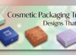
7 Powerful Psychological Triggers in Cosmetic Box Design That Make Buyers Choose Your Brand
The Three-Second Decision That Determines Your Sales
In the beauty industry, every shelf and every e commerce scroll hides a powerful three second moment where packaging silently shapes buying decisions. The instant a cosmetic box catches someone’s attention, their mind begins judging quality, trust, value, and desirability long before they check ingredients or pricing.
This is not luck, it is psychology in action. The most successful beauty brands understand that cosmetic packaging is far more than decoration, it is a strategic tool designed to trigger emotions, create instant attraction, and influence purchasing behavior in a way that feels natural yet incredibly powerful. A beautifully designed cosmetic box does not simply hold a product, it creates desire, builds confidence, and turns attention into sales within seconds.
Neuroscientists have shown that 70%+ of buying decisions are made at the point of sale due to visual and tactile stimuli. Packaging triggers are even stronger for cosmetics — a category that is so closely linked to identity and self-expression. A buyer does not just purchase a lipstick. When they hold that beautifully crafted box in their hands, they don’t buy the product inside as much as the version of themselves they are imagining.
With this, we explain seven top psychological triggers involved in selling boxes that influence wholesale buyers or retail and e-commerce customers. These triggers are what will change every design decision you make, from the colors you use to apply finishing touches to the shapes you commission.
Color Psychology — What Every Shade Signals Before a Word Is Read
When the brain sees a cosmetic box design, color takes the lead — ahead of text, shape, and any conscious examination. Studies of consumer color psychology have shown that up to 85% of the reason a buyer chooses between two products during a split-second visual scan is based solely on color.
Each color is associated with certain mental associations that can be directly linked to purchase intent.
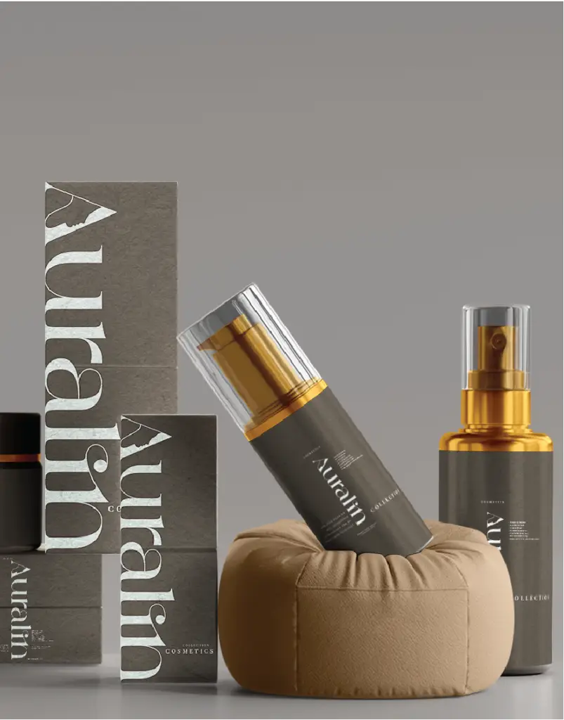
Black, as a color, however, conveys authority and sophistication with incredible efficiency — premium positioning, if you will. A buyer sees a matte black cosmetic box design and, based on the packaging, instantly thinks that it is in the luxury segment. The trigger is exclusivity — this product is not for everyone, and the aspirational signal has commercial power.
Associations of purity, minimalism, and clinical credibility that White triggers. When it is especially in skincare, white packaging digs into the buyer’s need for clean, transparency, and scientifically-backed products. Trust is the psychological effect — a clean surface communicates that this brand has nothing to hide.
Lighter hues of pink and rose gold are evocations of femininity, warmth, and the aspiration to beauty. A combination of foil monochrome used in a rose gold color creates an aspirational, luxe approach — glamour without being unreachable. It is a psychological cocktail of desire and accessibility that always converts for affordable luxury brands.
Today’s market is also double-casting green and especially earth tones. They evoke the traditional connection to natural and organic food while also marking ethical trustworthiness. Green packaging is a snappy visual shortcut buyers rely on to identify which brands share their environmental values — a trust mechanism triggered the second their eyes land on that shelf of products.
Consistency is one of the most ignored dimensions in color psychology. The associations that colors evoke become incredibly powerful when uniformly applied across an entire range of products. For the buyer who associates that deep emerald green with dependable, natural skincare, this will become conditioned after enough exposure; immediate repurchase follows as a reflex.
The articles exploring cosmetic packaging colors that drive impulse purchases discuss the strategic framework for color selection, which exact color combinations thrive well in conversion data across beauty categories.
Typography — How Letterforms Build Trust and Signal Your Price Point
The majority of cosmetic label brand owners are cautious about everything written on their boxes. Many spin them off into the ether, but far fewer people give serious thought to how they form those words. However, typography — the choice, size, weight, and placement of typefaces — is one of the more sophisticated mental triggers in packaging design.
Buyers make judgments about a brand’s personality, pricing, and trustworthiness in mere milliseconds of coming across text on a cosmetic box design — not based purely on what the words say but rather how they look.
And serif typefaces have centuries of psychological baggage as the typographic lexicon for institutional power: banks, law firms, heritage fashion houses, and luxury cosmetics brands. An excellent serif causes the instant reaction of authority and credibility in a cosmetic box design. For consumers getting their first exposure to a brand, a serif can lend an aura of heritage that time has not aided the younger element of a brand.
Sans-serif fonts activate the contemporary, lucidity, and bold minimalism. Bolder fonts still, particularly big, sans-serif typography for brands that appeal to younger consumers or the clean beauty set, communicate that this brand is contemporary, honest, and no-fuss. And in a market diluted with embellished packaging, smooth sans-serif typography provides instant visual contrast, evoking modern associations.
Things like script and handwritten fonts awaken intimacy, personal workmanship, and genuineness. What the letterforms suggest is an intangible human hand that no amount of mass-produced typography could touch with a wildly produced brush stroke. Script typography is a way to signal to small-scale and artisanal cosmetic brands that this product was crafted by hand with care.
While font selection is not the whole story, typographic hierarchy — how heavy and large brand names, product names, and supporting descriptors are, relative to each other — lays the architecture of visual trust. A box with minimal and intentional hierarchy communicates an organized, professional brand. Disorder is created through inconsistent font weights and typefaces, like a signal in the noise that hires before a conscious examination ever happens.
Incorporating the entire strategic framework for choosing, sizing, and mixing fonts — including font category patterns that yield stronger buyer behavior signals between the types of beauty categories- is explained here in this article listing cosmetic packaging fonts that influence buying decisions.
Tactile Psychology — How Finish and Texture Create Desire Before the Box Opens
One of the most overlooked senses in all cosmetic packaging psychology has to be touch. Research in haptics shows that touch has a direct effect on quality, value, and desirability judgments. The neural pathways create a connection when the buyer’s fingertips feel a velvety matte texture. If the box feels premium, then your brain perceives that physical sensation as evidence that the product inside is premium.
The finish and texture are not decorative adders. These are psychological triggers, and they work at a level where visuals can never reach.
There may be no greater date psychological weapon in the cosmetic packaging arsenal today than soft-touch matte lamination. The velvety feel, close to the texture of skin itself, causes what researchers describe as “haptic halo effect” — whereby positive tactile impressions improve holistic product assessment. A buyer runs their fingers across that unique softness, and the physical pleasure invokes an emotional state of being that transfers instantly to how they connect with a brand. This finish makes your box stand out from the competition on an otherwise shared shelf through pure touch experience when in retail.
High-gloss lamb finishes conjure up energy and vitality, as well as exuberance. Its reflective surface generates a lively energy that reads young and daring — a psychographic correlate for color cosmetics such as lipstick and eyeshadow, where the charger’s vibe should echo the transformative effect of the product.
Spot UV — a gloss coating over matte background — develops one of the most complex multi-sensory triggers in existence. The levelling of glossy elements on a coated place together with the use of a flat matte field set during the spots, is a tactile discovery moment wherein your hands transfer over the raised floor. This little nugget is an example of how tactile experience can forge brand connection and make memorability possible in a way that uniform finishes cannot. Spot UV also guides the viewer’s gaze: your brain is hardwired to look for contrast, so it does a great job of bringing eyes to logos, important claims, or decorative details.
From all packaging psychologies, embossed and debossed touches have the most primal associations. The physical depth of a premium board onto which a debossed logo was pressed communicates permanence and craft — that this brand did not cut corners. This depth is as tangible to buyers as the knowledge and perceptions on how manufacturing processes work (even without specific information about those processes), and real investment in these elements of quality is interpreted more.
One of consumer culture’s most universally rooted psychological associations is triggered by the hot foil stamping, a connection that goes back hundreds of years between gold and silver and extraordinary value. As soon as a buyer sees gold foil on a cosmetic box design, that connection fires instantly and forcibly, lifting their mental tier of the contents within.
The full visual science in these finish options — including the impact of different foils and how they affect various substrate materials is explored in: A luxury finishing design guide for your cosmetic box luxury finishing design: the visual science of spot UV, foil and premium surface effects (the practical application across product categories is explored here through 8 creative cosmetic box finishes that add instant glamour.)
Shape and Structure — The Geometry That Sends Subconscious Quality Signals
Long before a buyer even reads your brand name, their visual cortex has already registered the form of your cosmetics box and made assumptions about it from there. This is referred to as “shape semantics,” and it is the self-generating meaning that human brains perform when they are faced with geometric algorithms—one of the things environmental psychologists have been studying recently.
Order, solidity, and expertise lie in the rectangular and square systems. Geometric regularity is interpreted by the brain as a sign of control and precision, which are both characteristics that correspond very nicely to the expectation that one wants from a product with consistent results. It could be so much sharper rectangular boxes for clinical, scientific, or results-driven cosmetic brands, direct people to the idea of precision and trustworthiness. This really matters, and you have to execute the structure well: sharp, clean edges tell of competence, while all soft or poorly aligned construction is a quietly powerful indicator of poor manufacturing quality.
Select cardstock thickness is a technical specification of cosmetic box design production for structural precision; when and whether to perforate a score line, along with how to construct corners, is addressed in the article technical specifications for cosmetic box production: selecting cardstock thickness for structural excellence.
Arcs and cylindrical shapes elicit feelings of accessibility, warmth, and Mother Nature authenticity. Research done on consumer psychology clearly shows that rounded shapes are perceived as friendlier and safer than angular alternatives — a definitive cue for brands to position themselves around natural ingredients, gentle formulations, or inclusive brand personalities. In retail environments primarily characterized by straight lines and rectangular forms, curves generate a biological pattern interrupt, in which the eye is momentarily diverted to areas of curvature even prior to visual processing.
Sleek, towering forms exploit what consumer psychology research shows to be a height-status heuristic — the automatic link we make between vertical elevation and high status. This is why most luxury cosmetic box design is, by definition, tall and skinny. The vertical treatment gives a sense of sophistication and class that cannot be obtained with shorter formats. For brands that exist in the luxury or accessible luxury tier, an elongated structure is one of the most effective geometric forms for communicating premium positioning.
And finally, if you get past the rigid box construction diagram, it shows what is possibly the strongest signal of structural quality there is to come; Sturdy weight, unapologetic resistance, and precision-fit of a rigid cosmetic box design give an instant impression of superlative quality — one that the foldable cartons can never live up to. The physical immutability of the building gives buyers an asset-backed rationale for the high price tag — a haptic confirmation that, yes, their purchase has merit. The full commercial and design framework on how to build a rigid box has been highlighted within the on premium cosmetic rigid box packaging: the complete guide to luxury cosmetic box solutions article.
In an article about 8 stunning cosmetic box shapes that attract attention in stores (the shapes of boxes that are available for sale in the market), the whole type of form and their individual commercial uses are categorized according to beauty categories.

Perceived Value Cues — The Design Architecture That Makes Buyers Believe Your Product Is Worth More
How designers perceive value is almost completely determined by the design of packaging. Two cosmetic box design might actually contain identical products, but if one has been designed with distinctive perceived-value cues, the contents consistently get rated as higher quality and worth two to three times more.
This is not a trivial effect. Behavioral economics research (including pioneering studies on how humans evaluate risk) shows that consumers in domains where it is hard to assess a product’s inherent quality at the point of sale rely heavily on external signals — including packaging. The primary evidential base that the purchasers analyze to ascertain whether they should proceed with purchasing your product is the makeup boxes.
The “weight-quality heuristic” — the automatic and physical mental shortcut of how we associate weight with product quality — gives you a communication of quality based on material weight immediately. Before a single design element is assessed, the quality perception battle has been won by a box printed on heavy, rich board material. Investing in the proper substrate weight, therefore, is a psychological investment in buyer quality perception that yields commercial payback at the cash register.
Completeness of Your Design: Completeness is one of the most potent but also least-discussed perceived-value cues you can find. With your data set spanning to October 2023, experienced buyers unconsciously watch for inconsistencies in the packaging – a clean, well-designed primary panel with neglected side panels or a base left poorly finished signals significant corner-cutting. The best cosmetic box design treat each surface as a brand communication opportunity, leaving consumers the impression of a brand that cares for every detail.
The first, and most important one, is: brands looking to expand into international markets should pay special attention to regulatory compliance as a signal of credibility. Under the Federal Food, Drug, and Cosmetic Act (FFDCA), the U.S. Food and Drug Administration has established certain labeling guidelines for cosmetic products with regard to declaration of ingredients; net quantity; identification of manufacturers or distributors; and warning statements when appropriate. Packaging that conveys these requirements in an intelligible way can boost buyer confidence by communicating compliance, and detailed, self-evident packaging comes with a trust-value signal to which the buyer assigns measurable credibility. If you make packaged products shipped to Europe, Packaging that gives a professional presentation of the regulated information required sends signals to buyers that this brand acts with transparency and accountability —a trust trigger of substantial commercial value.
The role of perceived-value architecture in how premium cosmetic boxes increase perceived product value — Articles are the strategic dimensions of architecture.
Sustainability as a Trust Signal — How Eco-Design Became the Most Powerful Credibility Trigger in Modern Cosmetic Packaging
Sustainability as a trust signal — When the Eco-design Passed to Become the Most Suspect Trigger of Trust in Modern Cosmetic Packaging. See more at www.gosiawielk.com
For ten years, sustainable cosmetics packaging was a niche differentiator. By 2025, it will be a normal trust signal that is affecting purchase decisions for every buyer demographic, at every price point, and through every retail channel.
Values alignment is the psychological mechanism behind this change. The modern-day consumer makes buying choices in a way that validates and strengthens their own narrative of their identity as an ethical consumer (i.e., a cosmetic box design signalling real sustainability credentials begets a feeling of powerful alignment: this brand thinks how I think. In a crowded market, where product formulas become quickly commoditized, that trust is one of the most durable competitive advantages there is.
The visual language of sustainability speaks before one reads a written claim. Kraft paper patterns, unbleached board textures, earthy color palettes, and intentionally austere design aesthetics jolt you into thoughts of sustainability. The visual language appropriate for matching the claim is crucially important. Where a glossy, heavily laminated box could say ‘make me green’ in text but not actually be sustainable, a warm kraft board printed cosmetic box design reads as environmentally responsible. For the trust trigger to fire, sustainability messaging and the aesthetics of packaging must have visual coherence.
Material transparency, in turn, can help amplify credibility more strongly than any other generic eco-claim. Buyers have become seriously wary of looseness with sustainability language — terms like “eco-friendly” and “we care about the planet” are now psychologically dead for informed buyers, because they have been used so much. Material claims — FSC-certified board, soy-based inks, recyclable construction — that are specific and verifiable engender actual trust in the viability of a brand’s sustainability stance.
The Forest Stewardship Council (FSC) is a globally recognised certification standard for responsibly sourced paper and board and offers comprehensive information about FSC certification and best practice in the use of FSC trademarks on consumer packaging. FSC certification, in turn, is as far as cosmetic brands will go towards outstanding sustainable sourcing credentials guaranteed. In fact, the Forest Stewardship Council has the most credible and buyer-recognized third-party validation available for packaging materials.
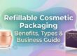
And refillable packaging systems are the most complex sustainability trust trigger we have — talking environmental credibility and long-term relationship orientation at the same time! From a brand standpoint, investing in reusable design speaks both to confidence in product quality as well as an intention around the enduring buyer relationship beyond the transactional. However, for aspirational brands, the enabling of refillable packaging creates a compelling convergence of credibility and positioning in sustainability that overcomes any argument for disposables as an offering.
The articles on refillable cosmetic packaging: advantages, forms, and business guide, as well as eco-friendly cosmetic packaging alluring to green consumers, outline the course of commercialisation for Refillable Cosmetic Packaging: Sustainable Options for Modern Brands.
The Unboxing Experience — Engineering the Emotional Reward That Turns Buyers Into Brand Advocates
The unboxing moment represents the most emotionally charged point of the entire buyer journey. It is when expectation turns into experience, when the promise of the package meets its reality, and when buyer loyalty matures into genuine preference or subtly wanes into apathy.
For e-commerce-oriented cosmetics brands, this moment of unboxing is the most significant brand experience event because when they shifted their sales from physical retail to an online delivery experience, the in-person touchpoint ceased to exist. It is when your brand has captured your buyer in their own unique moment of listening, hungry for what you offer, and no other brands on that same shelf.
The underlying framework of unboxing design is sequential revelation, a carefully crafted discovery sequence that sets expectations and tension at each step in the process of unwrapping. Such a cosmetic box design is not transparent right away. You have the beautifully printed interior lid, a piece of tissue paper lying on top; underneath it, a custom insert that fits your product exactly. Each layer builds emotional engagement. So by the time the buyer gets to your product, their mind has gone through an emotional journey that gave them a greater appreciation for its worth and made them feel like they have a connection with your brand.
The inner insert operates several simultaneous psychological processes. That is the function level protect for the product itself. On the psychological level, it makes you think that the product needs to be protected and exhibited. An insert custom-fitted to hold a cosmetic just right — nothing sliding around, shaking in its case, or ever feeling like it doesn’t fit quite right — is an instant hit of perceived premium quality. The product is designed for that cross-section. Nothing can convey care and seriousness like a meticulous investment, and that turns words into a point of view that no external mass market printed claim could ever replicate.
On the other hand, a product that rattles within its packaging does one of the worst things psychologically in all the buyers’ journey — it creates a disconnect between promises made on the exterior and reality inside. This disconnect, with intentional insert design, is easily avoidable and one of the highest ROI enhancements available to brands looking to boost buyer perception (the unboxing moment).
A thank you card, a brand story insert, a care instruction card — all minuscule in size and cost but exerting an outsized emotional impact. In a transactional, mechanical world of business relationships predicated on anonymity and impersonality, the discovery of a card that directly addresses the buyer brings warmth to those relationships, which generates loyalty with almost blinding speed. This is the psychology of the human touch at scale: that you are not a transaction to us, precisely at the most emotionally heated moment in the buyer journey.
The last dimension of unboxing psychology that is also by far the most commercially important is social amplification. According to research by Dotcom Distribution, whose consumer e-commerce packaging study is frequently cited in beauty and retail spaces, about 40% of people said they are more likely to share a product on social media if it comes in premium or gift-like packaging. The complete data regarding the study is available via this link: https://www.dotcomdist.com/ecommerce-packaging-study. As for cosmetic brands, truly beautiful and rewarding unboxing packaging translates into organic social content — unpacking videos, product photography, Instagram stories — which allows them to reach much larger audiences than just the customers purchasing the products with zero paid media allocation.
The articles on cosmetic packaging inserts: functional yet stylish ideas and strategic dimensions of the unboxing experience, while 5 proven cosmetic packaging secrets that maximize brand value synthesize the bigger picture relating packaging investment and brand value outcomes.

Conclusion: From Triggers to Strategy
The seven of them discussed in this article, which are color, typography, tactile finish, shape of the structure you perceive, perceived value signifiers, sustainability signaling way, and unboxing experience, do not work separately. The most commercially effective cosmetic box design deliberately combine each of the seven, using a multi-layered experience that operates on buyers visually, tactually, rationally, and emotionally at one time.
It is the difference between pretty packaging and profitable packaging. Attractive packaging pleases the eye. Packaging is massaged in ways that create desire, establish confidence, convey worth, double down on what buyers care about, and deliver experiences they want to repeat or share.
First and foremost, every design choice you make for your cosmetic box design speaks to psychology. The question is not if your packaging sends psychological signals; the question is whether those signals are intentional, strategic, and commercially optimized or just an accident.
At packifyme. At Boxyy, we take these psychological measures and put them into action with custom cosmetic box design that resonate at every trigger point — from the first glance to the last emotional interaction when unboxing. We blend expertise in materials, finishes, structures, and print techniques with an intimate knowledge of buyer psychology to produce boxes that look premium — boxes that catalyze the specific actions and instill the experience that compel shoppers to purchase your product time after time.
Frequently Asked Questions
Q1. Where can I buy custom cosmetic box design with psychological design triggers already built in?
Packifyme also allows you to order personalized cosmetic box design which come with the proven psychological design elements — premium finishes, various structural options, and custom inserts. com. Specialist custom packaging suppliers can provide complete solutions for brands that need to source at scale, handling all aspects of the process from material selection and finish options through structural design and print. When you look for suppliers, find ones that provide custom products in terms of materials and printing styles, along with luxury finishes including foil stamping, embossing, debossing, spot UV treatment, and matte or glossy lamination — these fit exactly the types of finish categories that activate both tactile and visual psychological triggers mentioned in this article. Always ask for a 3D proof or physical hype sample before placing an entire order, because you want to experience those tactile and visual triggers in person rather than on screen.
Q2. How does cosmetic box design psychology actually influence buying decisions?
The impact is so immediate and quantifiable. According to data, 72% of American consumers say that packaging design impacts their purchase decisions, and the effect works mainly beneath the level of conscious perception. And when the text is organized in a clear hierarchy, and the product name, benefits, and most relevant claims are available for easy consumption, it decreases the mental cost of deciding whether to proceed towards a purchase after being interested. But specifically for cosmetic products, where formula quality is not possible to assess at the time of purchase, packaging becomes even more critical: utilizing color, finish, shape/ weight, and typography as primary indicators of perceived quality. This is not an aesthetic choice; this is commercial advice and designing those cues intentionally.
Q3. Which cosmetic box design finish has the strongest psychological impact on buyers?
The strongest tactile psychological trigger across all buyer segments is soft-touch matte lamination. Smooth matte finishes evoke tangible sophistication through a soft, luxurious feel that kicks into the so-called haptic halo effect — where positive tactile experiences lead to overall elevation in impression of product and brand. For most brands with a combination of triggers, the best method is layering: soft-touch matte as the foundation, spot UV on the logo for contrast and initial discovery, and hot foil stamping on the brand name to get that universal connection between metallic surfaces and premium value. Moments when you touch them and experience the finish, put your finger on them to feel their design features — all of this is directly related to how valuable the product inside will be for you.
Q4. What colors work best for cosmetic box design to attract buyers psychologically?
The choice of color should come from the kind of psychological seed you want to plant in your buyers’ eyes when they see it at a glance. Soft pastel colours like lavender, blush pink, and mint green give a calm and are used for skin care products, bold and vibrant colours such as red or gold create a sense of luxury that appeals to premium cosmetics companies; while neutral colours like black, white, and grey represent sophistication, minimalism is often preferred by luxury beauty brands. Consistency adds fuel to the trigger. The Color Drives Brands – Implementing a non-congruent color which is un-synced with the holistic “Message of Expression” by a Brand and does not communicate the Product with consistency can dilute the Power Of Recall for Consumers!!! In today’s increasingly visual world, beauty brands that know how to execute color well will come to the fore.
Q5. Does sustainable cosmetic packaging actually influence buyer trust, or is it just a trend?
It’s a business reality that is as solidly established as it can be and not just a passing fad. In an IPSOS survey published last month, two-thirds of US consumers — 67% — stated that packaging in paper or cardboard made a product more appealing, and that nearly two out of three (62%) say it made products look superior quality as well. About half (49%) say they would be extremely or very willing to spend more on products when packaged in paper or cardboard, including 71% of buyers saying they are more likely to buy brands that package their goods in paper or cardboard, mainly because firmer materials are better for the environment. Specificity — verifiable material statements and globally recognized third-party certifications such as FSC create much stronger trust responses than the vague eco-language that are planted as fake breadcrumbs in sustainability claims – is what it takes to turn sustainability from a superficial claim into a real trust trigger.
Q6. How important is the unboxing experience for cosmetic box design in 2025?
The unboxing experience is the most critical brand experience event for e-commerce cosmetic brands and has become increasingly commercially important. Innovative packaging that uses QR codes, NFC technology, and augmented reality functionalities is also increasingly ubiquitous to provide instant information about the product, verification of its authenticity during the unboxing) moment. Psychologically, the sequential reveal design approach — crafting a piecemeal discovery event through components like tissue paper, custom inserts, and personal touches — drives emotional engagement, giving way to social sharing and repeat purchase, leading to brand loyalty. Brands that create an unboxing experience as intentionally as the exterior packaging outperform those that take a backseat in designing the interior packaging by miles.
Q7. What is the minimum order quantity for custom cosmetic box design with premium finishes?
Based on the course of finish and supplier, minimum order quantities differ. Most of the best custom cosmetic packaging manufacturers have a minimum order limit as low as 100 boxes with a standard turnaround time of 12 to 14 business days after the artwork gets approved, and provide a 3D proof before production starts. For fledgling brands or even brands testing a new design, this rule-of-thumb lets you determine how well the psychological triggers — most importantly, tactile finish and structural quality — translate in the hands of real buyers before you go over to heavier production runs. At packifyme. com, we partner with brands both large and small to provide the finish quality and structural precision these emotional triggers need in order to play their part.
Q8. How do typography choices on cosmetic box design affect buyer perception of price point?
The most effective yet least expensive price-point positioning tool in cosmetic packaging design is legibility through typography. Font size choices will be influenced by the age range of your customer base and ongoing typographic style must connect to whether your target audience is sustainability forced, luxury experiential, convenience oriented or focused on a value-based market. More specifically, serif fonts indicate heritage and authority — a place in the tried-and-true premium tier for your brand — while clean bold sans-serif typefaces signal modernity and powerful minimalism that aligns with contemporary clean beauty shoppers. In general though, a script typeface or handwritten font is an indicator of artisanal authenticity and nostalgic boutique credibility. Whether you are branding or selling just one product, that answer should dictate your typographic hierarchy and visual focus — what you call out on the front of the packaging is what consumers initially latch on to.
Q9. Can small cosmetic brands with limited budgets apply these psychological triggers effectively?
Absolutely. Not all psychological triggers in cosmetic box design are expensive to implement. It can be as simple as identifying colors, creating typographic hierarchy, and structural shape selections — all of which come at no expense other than the design decision itself. A modest up-charge on soft-touch matte lamination — one of the strongest tactile triggers in existence — yields a wildly disproportionate payoff in perceived buyer quality and associated qualitative market value compared to standard lamination. There’s no generalising what aesthetically works in psychology-based packaging design — only for your audience. What do they care about? What do they aspire to? Your answers provide the foundation for how your packaging should feel (not just what it says). Any small brand that can answer those questions clearly and implement even three or four of the seven triggers outlined in this article will consistently beat broader brands that, at almost any budget, create much flashier but less strategically sound packaging.
Q10. How do I know which psychological triggers are most important for my specific cosmetic product category?
These major triggers are highly dependent on the product category, the price positioning and eventually target buyer. If you are a skincare brand targeting clinical or results-driven buyers, structural accuracy, clean typography and only the whites/neutrals in color palettes will be top 3 triggers. Bright color psychology, shiny finishes and experience design of unboxing are the most commercial in color cosmetics aimed at younger buyers. Whether you are looking at luxury brands in the $10 space or higher, tactile finish, rigid box construction, perceived value cues and foil details work together to create a premium signal that helps justify asking higher prices. A beautiful, luxury packaging must fit your brand — after all you can’t have a message contradicted, so each visual element should support this confidently and loudly while the box, label and product all boast the same brand voice. Packifyme – The detailed guidance on application of these triggers through the span of respective product categories is discussed throughout this document saraswati|Read the complete story at cosmetic packaging design mistakes you should avoid and 5 proven cosmetic packaging secrets that maximize brand value.