8 Proven Ways Cosmetic Box Storytelling Turns First-Time Buyers into Lifelong Brand Fans
Introduction: The Question Is Whether It Says Anything Worth Hearing
Many beauty brands spend months perfecting formulas, creating stunning logos, and investing heavily in advertising, only to deliver their products in boxes that feel empty, forgettable, and emotionally disconnected. A cosmetic box may protect the product and look attractive on the shelf, but truly powerful packaging does something far greater, it creates an instant emotional connection between the brand and the customer. It communicates personality, values, and identity before the product is even opened. In today’s beauty industry, packaging is not just a container that gets thrown away, it is the first conversation your brand has with the customer and often the moment that decides whether they remember you or forget you completely.
That is a costly mistake in a market this crowded. The global cosmetic box packaging market was valued at USD 57.55 billion in 2025 and is projected to reach USD 89.72 billion by 2034. Every dollar of that growth represents a brand competing for the same limited shelf space, the same digital scroll, the same buyer attention. In that environment, a box that merely identifies product is not doing enough. A box that tells story — that makes a buyer feel something, believe something, and remember something — is a fundamentally different commercial tool.
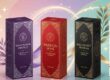
This is what cosmetic box storytelling actually means. Not a paragraph of marketing copy squeezed onto a side panel. Not a tagline printed under logo. Real storytelling through packaging is the deliberate use of every design element — color, material, structure, finish, typography, interior design, and printed content — to communicate brand’s identity, values, and personality in a way that connects with specific buyer at an emotional level. Custom cosmetic box packaging in 2025 is deeply rooted in storytelling. Brands use their packaging to convey origin stories, highlight ethical practices, and express cultural influences that differentiate them in a saturated market.
The eight strategies in this article show exactly how to do that — practically, affordably, and in ways that translate directly into stronger buyer loyalty, higher perceived value, and the kind of word-of-mouth that paid advertising simply cannot buy.
Strategy #1: Lead With Why, Not Just What
Every cosmetic box tells the buyer what is inside. Very few tell them why it exists. That distinction matters more than most brands realize. Buyers in 2025 are not just purchasing a moisturizer or a lipstick. They are choosing which brand’s story they want to be part of. They are making a statement about their own values, their identity, and the kind of companies they want to support with their money. A box that only communicates what the product does misses the entire emotional dimension of that decision.
“Why” is founding story, brand mission, specific point of view on beauty — and it belongs on packaging. Not in a 200-word essay on the side panel, but woven into every visual and textual element of the box design.
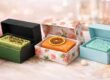
A natural skincare brand founded because the founder couldn’t find clean products for sensitive skin has a story that resonates immediately with a large and loyal buyer segment. That story should be visible in the packaging’s earthy color palette, its unbleached kraft texture, its restrained typography, and the short, honest founding statement printed inside the lid. Every element should say the same thing: we started this because we genuinely believed something was missing, and we built it ourselves. That coherence — the alignment between the brand’s origin story and every design choice — is what makes packaging feel authentic rather than manufactured. And authenticity, in a category awash with polished but soulless branding, is one of the most powerful commercial differentiators available.
Start by asking one honest question before next packaging brief: if a buyer read nothing but this box, what would they know about why this brand exists? If the answer is “not much,” the storytelling work starts there.
Strategy #2: Use Visual Consistency to Build a Story Buyers Remember
A single beautifully designed box tells a story once. A consistent visual language across an entire product range tells a story that buyers recognize, remember, and return to. This is not just an aesthetic principle. It is a commercial one. Brand memory is built through repetition and distinctiveness — and packaging is the most physically consistent touchpoint most cosmetic box brands have with their buyers. Packaging acts as a canvas for a brand’s narrative — its visual cues, such as logos, colors, and typefaces, offer insights into brand heritage and values. A carefully conceived box can communicate that story at first glance.
The practical implication is straightforward but often underexecuted. Every product in range should share a visual DNA — the same color system, the same typographic hierarchy, the same finishing approach — while still allowing enough variation to distinguish between product lines or categories. A buyer who picks up eye cream should immediately recognize it as belonging to the same brand family as serum, toner, and cleanser, even if each box has a different accent color or structural variant.
As consumer expectations evolve, cosmetic box packaging will be part of a larger, connected brand ecosystem — integrated with in-store displays, digital platforms, and immersive brand storytelling. The brands that do this well are easy to identify. Know their boxes before read the name. That level of visual recognition is not achieved by accident — it is the result of treating packaging as a coherent narrative system rather than a series of individual design projects. This is where investing in a proper packaging design system — not just individual box designs — pays serious commercial dividends. For guidance on applying this consistently across product range, the articles on cosmetic packaging design mistakes you should avoid and luxury cosmetic boxes that create an irresistible first impression cover the specific design pitfalls and success patterns that determine whether a brand’s visual story lands or gets lost.
Strategy #3: Let Materials Tell the Story Words Cannot
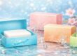
There is a type of brand communication that happens before a buyer reads a single word on box. It happens the moment their hand closes around it. The weight, the texture, the resistance of the board, the smoothness or grain of the surface — these are all storytelling elements, and they work at a level of immediacy that printed language simply cannot match.
A brand that claims to be luxurious but ships in lightweight, flimsy board is telling two conflicting stories simultaneously. Buyers notice the contradiction — not always consciously, but always commercially. The material story undermines the verbal story, and the verbal story loses. Get the material story right first. If brand is premium, the board weight, the finish quality, and the structural precision of the box should communicate that before the buyer has read a word. According to Ipsos, 70% of consumers say packaging design directly impacts brand perception — and for B2B cosmetic box suppliers, that means every surface, from lid to insert, matters.
If brand is natural and sustainable, kraft textures, unbleached board, water-based inks, and deliberately minimal lamination tell that story more persuasively than any printed claim. The material is the message. More than three-quarters of cosmetics shoppers now say ingredient transparency is increasingly important to them, with most expecting honest communication from packaging — showing how transparent design can strengthen credibility. The technical decisions behind material selection — including cardstock weight, structural integrity, and how material choices affect the overall tactile experience — are covered in depth in the article on technical specifications for cosmetic box production: selecting cardstock thickness for structural excellence. It is worth reading before any packaging brief, because material choices made at the specification stage determine whether the finished box tells the story intend.

Strategy #4: Make the Interior of Box a Second Chapter
Most cosmetic box brands treat the inside of their box as dead space. That is a storytelling opportunity they are leaving entirely unused. The interior of a cosmetic box is, in many ways, more valuable storytelling real estate than the exterior. Why? Because the buyer is already committed when they open it. They have bought the product. Their emotional guard is down and their receptiveness is at its highest. A beautifully designed interior — a printed message, a brand story panel, a striking color reveal, a well-crafted insert — hits at the exact moment of maximum emotional openness.
Clever packaging design puts brand owners in complete control over the way this experience is delivered — using structural and aesthetic elements to create a story that consumers have to discover for themselves. Magnetic drawers, peelable layers, hidden compartments — this turns packaging from a purely functional container into an integral part of consuming a product.
Think about what the inside lid of box could say. A short founding story. A personal note from the brand founder. A statement of the values behind the formula. A care instruction that doubles as a brand values message — “we made this without compromise, so don’t have to make any either.” Any of these transforms the interior from dead space into a brand connection moment that the buyer carries forward into every subsequent use of the product. The insert itself is part of this story. A precisely fitted, beautifully finished insert that cradles the product communicates care and craft in a way that loose or generic packaging cannot. The functional and design dimensions of insert storytelling are explored in detail in the articles on cosmetic packaging inserts: function and style and cosmetic packaging inserts: functional yet stylish ideas.
Strategy #5: Use Typography as a Character Voice, Not Just a Label
Typography is the voice of brand story. Not just what it says — how it sounds. Pick up two cosmetic box from different brands. Read nothing. Just look at the fonts. One feels like it is whispering in a hushed, expensive boutique. Another sounds like a bright, confident friend who knows exactly what she is talking about. A third has the authoritative calm of a trusted clinical expert. None of those impressions comes from the words. They all come from the typeface, the weight, the spacing, and the hierarchy. Typographic choices are a character voice. They should be chosen with the same intentionality would bring to writing a brand manifesto — because to most buyers, they communicate brand personality more immediately and more durably than any manifesto ever could.
Brands with a heritage story to tell lean into serif typefaces that carry centuries of institutional credibility. Brands building a modern, clinical positioning use clean sans-serif fonts that say “science-forward and no-nonsense.” Indie and artisan brands use script or handwritten styles that say “this was made by a human who cared, not a factory that didn’t.” The key is that the typographic voice must be consistent with every other element of the story box is telling. A brand using earthy kraft materials and natural color palettes but printing in a cold, corporate sans-serif is creating a narrative dissonance that buyers feel even if they cannot name it. Everything should speak the same character voice.
For a practical guide to font selection, weight hierarchy, and typographic combination strategies that drive stronger buyer responses, the article on cosmetic packaging fonts that influence buying decisions covers the full framework with specific category-by-category guidance.
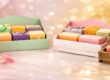
Strategy #6: Turn Sustainability Into a Story, Not a Footnote
Here is the honest reality of sustainable cosmetic box packaging in 2025. Most brands that use sustainable materials treat it as a footnote — a recycling symbol here, a small-print claim there. The brands that win commercially are the ones that turn it into a story. There is a meaningful difference between a box that is made from recycled board and a box that tells why that choice was made, what it means, and what it says about the brand’s relationship with the planet and with its buyers. The first is a compliance checkbox. The second is a story that buyers opt into and want to share.
NielsenIQ’s 2024 Green Buying Report found that 74% of consumers are more likely to choose brands using sustainable packaging, while 64% associate such packaging with higher quality. That second statistic is the one most brands miss. Sustainable packaging does not just attract eco-conscious buyers — it elevates quality perception across all buyer segments. The story of care that sustainable materials tell extends beyond environmental values into product quality values.
Tell the sustainability story specifically and verifiably. “This box is made from FSC-certified board, printed with soy-based inks, and is fully recyclable” is a story. “Eco-friendly packaging” is a claim that means nothing to an informed buyer. The Forest Stewardship Council provides full guidance on how to use verified FSC certification claims on consumer packaging at https://fsc.org/en/for-business/fsc-labels — and that certification mark on box is worth more credibility than three paragraphs of sustainability marketing copy. For brands looking to build a comprehensive sustainability narrative into their packaging design, the articles on eco-friendly cosmetic packaging that attracts green consumers and refillable cosmetic packaging: benefits, types and business guide provide the strategic and design framework to do it effectively.
Strategy #7: Design for the Story Buyer Will Share
Every cosmetic box that ships to an e-commerce buyer is a potential piece of organic content. Either the buyer shares it — on Instagram, in an unboxing video, in a recommendation to a friend — or they don’t. The difference is almost entirely determined by whether the packaging gives them something worth sharing.
Beauty brands are now using packaging as a digital storytelling tool by embedding shareable elements and integrating social media handles or AR filters — turning every product into a marketing asset that encourages user-generated content and peer-driven discovery. Packaging designs that support social content creation can boost brand reach without added ad spend. Design for shareability deliberately. What is the moment in unboxing experience that a buyer would want to photograph? The reveal of an unexpected interior color? A beautifully crafted insert that holds the product like jewelry in a case? A personal note that makes them feel genuinely seen? A structural detail — a magnetic closure, a ribbon pull, a sliding drawer — that creates a moment of physical delight?
None of these requires a luxury budget. A striking interior color costs almost nothing extra over a plain white interior. A well-worded personal note card is a tiny production cost. A magnetic closure adds modest expense but creates a physical experience that buyers consistently photograph and share. The commercial return on these investments is not abstract. By thoughtfully integrating storytelling elements into packaging, brands can build lasting relationships, foster loyalty, and create beautiful, memorable experiences that resonate long after the unboxing is complete. The box is no longer just a box — it is the beginning of a conversation.
For brands designing specifically for the e-commerce unboxing moment, the complete framework for structural choices and finish combinations that create shareable experiences is covered in the articles on cosmetic packaging innovations that drive online sales and 8 creative cosmetic box finishes that add instant glamour.
Strategy #8: Evolve Story Without Abandoning It
This one is the hardest strategy to execute — and the one most brands get wrong when they try. Every cosmetic box brand’s story needs to grow. Packaging from three years ago may no longer reflect who are, what stand for, or what buyers now expect. The market has moved. Brand has matured. Sustainability commitments have deepened. Positioning has sharpened. The packaging needs to reflect that evolution. But here is the trap. Brands that redesign their packaging without preserving any continuity with what came before lose the brand recognition they have spent years building. They effectively introduce themselves to their existing buyers as strangers. The shorthand that buyers had developed — the color they associated with, the finish they recognized on a shelf — disappears overnight.
Unique unboxing experiences — such as custom-fit molded forms, surface textures, and embossed logos — make the interaction memorable, enhancing customer connection and long-term brand loyalty. Those signature elements — the ones loyal buyers recognize — are the ones to preserve through any redesign.
The best cosmetic box packaging evolutions retain the core visual DNA — the primary color, the typographic character, the structural format — while updating the elements that need refreshing: finishing techniques, material sustainability, structural innovations, and secondary design details. The story grows, but the narrator stays recognizable. L’Oréal’s 2025 World Refill Day push lifted refillable options seventeen-fold in five years without diluting premium positioning — a powerful real-world example of a brand evolving its packaging story significantly while preserving the brand equity it had built. That balance — evolution without erasure — is the discipline that separates brands with lasting loyal followings from those perpetually restarting from zero.
For brands navigating a packaging redesign or evolution, the strategic framework in the articles on cosmetic packaging trends 2026: designs that boost sales and 12 powerful cosmetic packaging trends for 2025 every brand must try provides the current market context needed to make evolution decisions that keep story current without losing what makes it.

Conclusion: Box Is Brand’s First Conversation — Make It One Worth Having
Put it plainly: in a beauty market this crowded, this noisy, and this competitive, the brands that win are the ones with a story worth telling and the packaging intelligence to tell it well. A cosmetic box that merely identifies a product is doing the minimum. A cosmetic box that communicates a brand’s origin, values, quality commitment, sustainability story, and personality — through every material choice, every finish, every typographic decision, and every interior detail — is doing something categorically different. It is building a relationship. And relationships are what loyalty is made of.
Packaging for cosmetic box goes beyond just containers — it is a medium for storytelling and brand narrative itself. The eight strategies in this article are not theoretical. They are the specific, practical tools that brand owners, packaging designers, and beauty buyers can apply right now to transform packaging from a cost line into a commercial asset. Start with why. Align materials with message. Design interior as deliberately as exterior. Make every typographic choice a character decision. Build sustainability story into the design, not the footnote. Create something worth photographing and sharing. And when evolve, evolve with intention — growing the story without losing the thread.
At packifyme.com, this is exactly what we help brands do — from the first design brief to the finished box in the buyer’s hands. If packaging is not telling the story brand deserves, that is a problem we know how to solve.
Frequently Asked Questions
Q1. Where can I get custom cosmetic box designed with brand storytelling built in?
Packifyme.com specializes in custom cosmetic box solutions that integrate brand narrative into every design element — from material selection and structural format to finish choices and interior design. For brands at any stage, the process begins with understanding brand story first and translating it into packaging decisions second. That sequence — story before specification — is what separates packaging that connects from packaging that merely contains.
Q2. How do I start telling my brand story through cosmetic box packaging if I am a small or new brand?
Start with the one thing that is genuinely true about brand that competitor cannot say. Founding reason, specific ingredient commitment, target buyer, point of view on beauty. Then ask: which design elements — color, material, typography, finish — naturally express that truth? Do not need a large budget to tell a strong story. Need clarity about what the story is. A well-chosen kraft material with honest typography and a clear founding statement inside the lid is more commercially powerful than expensive finishes on a box that says nothing.
Q3. Does cosmetic box storytelling actually affect sales, or is it just a branding exercise?
It affects sales directly and measurably. With brick-and-mortar retail still expected to capture more than 80% of overall retail sales in 2025, and half of consumers buying beauty products in-store, packaging has become a primary driver of discovery, comparison, and purchase. In that context, a box that tells a compelling story at the shelf moment — one that makes a buyer feel something in three seconds — is doing sales work that no amount of post-purchase marketing can replicate. Brand storytelling through packaging is not separate from sales strategy. It is sales strategy.
Q4. How many words of copy should a cosmetic box actually carry?
Less than most brands think. The most effective cosmetic box storytelling is largely visual — told through design choices rather than written content. When copy is used, it should be concise, specific, and written in the brand’s genuine voice. A front panel needs almost no copy beyond the brand name and product name. The sides and back carry supporting information. The inside lid or a card insert is where the brand’s human voice can speak most directly. Keep exterior copy tight. Use the interior for the story.
Q5. How do I make my cosmetic box packaging story feel authentic rather than manufactured?
Authenticity in packaging design comes from coherence — when every element tells the same story. If brand claims to be natural but uses heavy plastic lamination, the packaging contradicts the claim. If brand claims to be artisan but uses corporate sans-serif typography, the visual voice contradicts the story. Audit every design element against the story are trying to tell. When everything is aligned — materials, color, typography, finish, interior design, copy voice — the result feels authentic because it is coherent. Incoherence is what makes packaging feel manufactured.