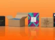
Best Fonts and Typography for Packaging Design
Typography means the style and appearance of words. It is the way letters look on boxes, labels, and packages. Good fonts make people pay attention to your product. Fonts for packaging designs also convey how your brand is perceived. Some fonts are playful. Some look elegant. Some look strong. Having the right font is extremely crucial in packaging design.
This article will guide you through selecting the best fonts for your packaging. We will write in simple English so that even a 6th-grade student can read it. The article will guide you to select fonts according to your product. You will know which fonts are suitable for food, skincare, toys, and others. You will also learn some tips to improve your packaging.
Let’s begin!
Why Typography Matters in Packaging Design
Typography is not writing. It is the first thing someone reads on a package. A good font can catch attention immediately. It can stop someone and make them view your product.
Here’s why typography is important:
- It reflects your brand’s personality.
- A playful font makes your product happy. An elegant font makes it classy.
- It makes people trust your product.
- Clean and neat fonts make your brand appear honest and professional.
- It aids in fast reading.
- Folks read quickly in shops. Nice fonts enable them to read your brand name fast.
- It makes your product distinguishable.
- In a crowded marketplace of boxes, the appropriate font makes your packaging distinguishable.
Why Is a Good Font for Packaging?
Not all fonts are suitable for packaging. Some fonts are difficult to read. Some appear too vintage or too dull.
Here are the best things to seek in a packaging font:
- Simple and easy to read
- Looks good with your brand
- Clear even when printed small
- Looks good in color or black
- Understands your brand’s voice
- Works well with images and colors
Let’s now see the best types of fonts.
Best Fonts for Modern Packaging Design
If your product is new, clean, or trendy, employ modern fonts. These are sharp and basic. They appear new and professional.
Good modern fonts:
- Montserrat
Montserrat is bold and smooth. It appears wonderful on tech products, cosmetics, and skincare packages.
- Lato
Lato is neat and friendly. It can be used for healthy products, baby products, and clean food.
- Futura
Futura is round and simple. It is modern and smart-looking. Most tech companies use this typeface.
- Avenir
Avenir is timeless and classy. It is wonderful for fashion, skincare, or candles.
Best for:
Tech, skincare, clean food, fashion products, and green brands.
Best Fonts for Bold Packaging
Certain products must stand out on the shelf. Bold fonts are strong and thick. They command attention within one second.
Strong, bold fonts:
- Bebas Neue
All capital letters and clean. Excellent for energy drinks and protein bars.
- Anton
Tall and very thick letters. The font appears loud and energetic.
- Impact
A timeless, bold font. Ideal for headlines and logos.
Best for:
Snacks, beverages, sports equipment, gym supplies, and toys.
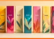
Fonts Best for Luxury Packaging
Luxury goods require sophisticated fonts. These are smooth, soft, and full of flair.
Sophisticated fonts for luxury:
- Playfair Display
This one appears classy and luxurious. It reminds one of a fashion magazine.
- Didot
Didot is slender and pointed. It is very high-end and artistic.
- Garamond
This is an antique serif font. It appears wise and costly.
Best for:
Perfumes, cosmetics, jewelry, and luxury items such as chocolate or wine.
Best Fonts for Fun Packaging
Fun products require happy fonts. These are adorable, rounded, and playful fonts.
Playful fonts:
- Baloo
Bouncy and round. This font is friendly and fun.
- Comic Neue
Similar to Comic Sans, but a better version. This one is neat and cheerful.
- Fredoka One
Chunky letters that smile. Ideal for children and sweets.
Best for:
Toys, sweets, games, and children’s products.
Best Fonts for Homemade or Natural Products
If your product is homemade or natural, employ soft fonts. Handwritten or script fonts are most suitable.
Handwritten-style fonts:
- Pacifico
It resembles handwriting. It is beachy and smooth.
- Great Vibes
It resembles cursive writing. It feels personal and elegant.
- Amatic SC
Thin and high. It feels like someone wrote it with a marker.
Best for:
Homemade soap, candles, organic foods, craft products, or gift boxes.
Best Fonts for Retro or Vintage Aesthetic
There are some brands that want to appear classic or old-fashioned. Vintage fonts are just what helps create that atmosphere.
Retro fonts:
- Lobster
A dramatic script font reminiscent of the 1970s.
- Rockwell
Blocky and old-fashioned. Best used with retro colors.
- Raleway Dots
This dotted font gives the vintage playfulness.
Best suited for:
Coffee, baked items, diner-type brands, or vintage presents.
Tips for Using Fonts in Packaging
- Always Make Text Easy to Read
Your product name must be legible. Don’t use lots of curly, messy fonts.
- Use One or Two Fonts Maximum
Too much font makes your pack look messy. Use one for headings, one for details.
- Coordinate Fonts with Colors and Images
Your font must not wrestle with your design. It must feel like it belongs.
- Select the Correct Font Size
Keywords must be large. Secondary words may be smaller.
- Consider Font Weight
Heavy fonts look powerful. Light fonts look gentle. Choose what fits your product.
- Experiment with Font Pairing
Pair a heavy font with a clean one.
Example: Bebas Neue (heading) + Lato (description).
Where to Get Free Fonts for Packaging Design
You do not need to pay for nice fonts. Plenty of great fonts are free on the web.
- Google Fonts
A large collection of safe, free fonts.
- Font Squirrel
Businesses use fonts. Simple and easy to search.
- DaFont
Playful fonts, script fonts, and other fun ones. Ideal for fun packaging.
- Behance
Designers post custom fonts here. Some are free or inexpensive.
Be sure to read font licenses. Some are free for personal use only.
Common Font Mistakes to Avoid in Packaging
Most brands select the wrong fonts. Such minute errors can damage sales. Individuals may overlook the product or be perplexed. A significant error is employing fonts that are too tiny. If individuals are unable to read your words on your box, they will not believe in your product. Always select fonts that are large enough to read even from afar.
Another mistake is picking a font that does not match your product style. For example, if you are selling a luxury perfume, you should not use a silly or cartoon font. The font must feel like your product. If it feels wrong, people will skip your item.
Some brands use too many fonts in one design. This makes the package look messy and unprofessional. Two fonts are enough—one for big titles and one for small text.
Color also matters. If your font color blends with the background, people will not see it. Don’t use yellow text on a white background. Make sure your font color is clear and easy to read.
Using fancy or curly fonts is also a problem. They might look great, but they are usually difficult to read. If readers need to slow down and try to guess what the word is, they will not purchase it.
Finally, don’t use fonts you see on big brands. Every brand has its own font. If you use theirs, your product might seem untrue. It’s best to produce your own look.
Test your font before printing your packaging. Print a small sample. Display it to your friends or team. Ask them, “Can you read this fast?” If they answer no, you must correct it.
Real Examples: How Big Brands Use Fonts
Lots of top brands utilize fonts in an intelligent manner. Let’s examine some real examples.
Coca-Cola employs a unique script font. It resembles handwriting. It is warm and friendly. It is also old, like something trusted for decades. This font makes Coca-Cola appear personal and vintage.
Apple employs clean, minimalist fonts such as San Francisco or Helvetica. These fonts appear modern and intelligent. They are appropriate for Apple’s brand, which is clean design and high tech. The fonts also read easily and are very soothing.
Lush employs bold, handwritten fonts. They are raw and playful-looking. They suit Lush’s brand, which is focused on natural beauty and new products. The fonts appear to have been written out by hand, which makes the packaging feel genuine.
Toblerone employs a bold serif font. The characters are large and pointed. The font makes the product seem special and vintage. It commands attention on the shelf and is readable from afar.
Dove employs gentle fonts. It blends script and serif fonts. The fonts are smooth and soft to the touch. This is fitting for Dove’s care and gentleness message.
These companies don’t select fonts just because they look nice. They select fonts based on the mood of the brand. You may not be able to emulate them. But you can take cues from them. Observe how every font suits the mood of the product.
Final Thoughts
Typography isn’t about letters. It is about emotion. It is how the world hears your product. A good font can get you to pause, smile, and shop.
Select fonts that suit your product and brand. Ensure that they are legible, attractive, and simple to read. Consider the size, weight, and type. Utilize only one or two fonts. Test packaging before large printing. Regardless of whether you are selling tea, soap, toys, or skincare, the appropriate font will make your product stand out. Fonts are tiny, but they have tremendous power. Utilize them effectively.