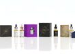
CBD Box Design Inspiration: Creative Layouts for Essential Symbols
To build a strong brand today, good CBD box design inspiration is only the first step. The retail market is growing fast and becoming crowded. In this space, packaging becomes your silent salesperson. It shows quality and builds trust before anyone reads a label.
Designers now look beyond simple function. They aim to create a complete visual story. This story blends beauty with strong structure. It helps define what a quality product feels like.
A logo alone is no longer enough. Designers study color, texture, and shape to make a box stand out. When customers pick up a product, touch and sight matter. Clear information and good design can influence the buying decision. By using creative ideas, even required labels and warnings can become part of the design. This adds to the personality of the package instead of hurting it.
Design begins with research. CBD box design inspiration can follow many styles. Some look clean and medical. Others feel natural and botanical. Each style supports the required industry symbols and icons. Using the right style keeps the packaging attractive and authentic.
In the end, great CBD packaging tells a story. It shows care in every crease, corner, and finish. Whether you choose gold foil or eco-friendly kraft paper, the box reflects your brand. Good design turns challenges into opportunities and helps your product leave a lasting impression.
The Art of Placement: Balancing Brand Identity with Regulatory Icons
To begin this creative process, it is important to understand visual hierarchy. A good CBD box design inspiration must match the brand’s personality. It should also include required symbols and icons in a natural way.
Designers should treat these symbols as part of the design, not as problems. When placed well, they can look premium and useful. Many successful brands use grid layouts. This helps align icons with the logo. It also guides the eye smoothly across the box without overload.
Balance is key in CBD box design inspiration. Designers often use side panels or empty space for required symbols. This keeps the front clean and attractive. The main area can then focus on telling the brand’s story.
According to 99designs experts, a clear visual path is essential. The eye should move easily across the design. When art and rules work together, the symbols become signs of quality. This builds trust in the brand.
Another creative option is custom icon styles. These match the brand’s colors and line style. The symbol stays clear, but its look fits the design theme. This can suit modern, simple, or vintage styles.
With this level of detail, a simple box becomes special. It shows that compliance and creativity can work together. Many luxury wellness brands prove that strict rules can still lead to beautiful packaging.
Color Psychology in CBD Packaging: Making Compliance Symbols Pop
Choosing the right colors is one of the most important steps in CBD box design inspiration. Color sets the mood for the entire product line. In the wellness industry, soft greens, earth tones, and pastel shades are common. These colors suggest calm, purity, and a connection to nature.
The challenge is adding required icons without breaking this peaceful look. Skilled designers use color psychology to solve this. They add a second color that matches the design and helps the icons stand out.
Many premium designs use metal foil or spot coating on symbols. This adds gentle texture and contrast. It helps the icons stand out without using loud colors. A simple color scheme with light and dark shades also works well. In this case, the icons feel like a natural part of the design.
A good design guides the eye with color. It leads the customer from the brand name to the benefits, and then to the icons. This builds trust and makes the message clear.
Contrast also helps with accessibility. According to the Pantone Color Institute, color is the first thing people notice. It can increase brand recognition by up to 80%. When icons have enough contrast, they are easier to see and understand.
By choosing colors carefully, your packaging looks clean and professional. It stays consistent and high quality at every point of contact with the customer.
Minimalist vs. Maximalist: Visual Trends for CBD Box Design Inspiration Layouts
Choosing between a minimal or bold style is very important in CBD box design inspiration. Each style sends a different message about your brand.
Minimalist packaging follows the “less is more” idea. It uses clean space and only a few colors. This style is often called “quiet luxury.” It works well for premium health products. It suggests clarity, trust, and scientific care. With fewer graphics, the required icons are placed neatly and precisely. They become subtle signs of quality and safety.
Maximalist design is very different. It uses strong colors, bold patterns, and rich artwork. This style aims to catch attention right away. In recent trends, brands mix labels with hand-drawn flowers or artistic designs. The goal is to create an exciting unboxing moment. This often leads to social sharing and strong brand recall.
Many brands now choose a middle path called “Neo-Minimalism.” This style keeps a clean base but adds one bold detail. It may be a holographic stamp or a detailed etching. This mix feels professional but still stands out on the shelf.
Whether you choose simple or bold, consistency matters most. A clear and steady style shows your brand’s personality and attracts the right customers.
Typography Matters: Choosing Fonts for Legibility and Style
Choosing the right typeface is a key part of CBD box design inspiration. Fonts do more than show words. They express your brand’s voice and personality. They can show tradition, innovation, or purity.
In wellness and healthcare packaging, serif fonts often suggest heritage and trust. Clean sans-serif fonts feel modern and easy to read. The main challenge is choosing a primary font that fits your brand. It should also work well with the smaller fonts used for symbols and technical text.
Many strong designs use a clear typographic hierarchy. This guides the eye across the box. The product name appears first and is the largest. The benefits come next. The required icons come last. Designers often mix font weights to do this. They may use bold text for names and lighter text for symbols. This keeps the design clean and organized.
As the Adobe Design Lab notes, typography acts as a silent brand ambassador. It connects what people see with what they feel about the brand. Modern CBD packaging also explores custom typography. Many designers now create letter styles that reflect natural shapes. This matches the plant-based origin of the product. Even required text becomes part of the story.
With thoughtful typography, every word adds meaning. The box becomes more than packaging. It becomes a clear message about your brand and your lifestyle.
Material and Texture: How Finishes Influence the Perception of Design Symbols
Texture plays a strong role in CBD box design inspiration. It affects how customers feel when they touch the package. In health and wellness products, texture is very important. It shapes the first impression of quality and care.
Different textures change how symbols and designs are perceived. For example, an embossed symbol on a matte surface creates a rich, raised effect. This invites customers to touch the box. It helps build a stronger connection with the product.
New trends in CBD packaging focus on “sensory branding.” This means using different textures to highlight key areas. Spot UV on important icons can make them shine gently. These icons catch the eye without using loud colors. This style fits brands that mix a clean medical look with creative design.
Sustainability also guides modern design choices. Many designers now use recycled hemp paper or uncoated materials. These papers show the natural origin of the product. Logos can be embossed or laser cut for a refined look.
This approach attracts eco-friendly buyers. It also gives the box an earthy and premium feel. The packaging then reflects the brand’s values. Every texture sends a message. Together, they create a full and meaningful brand experience.
Tailoring the Vibe: Design Inspiration for CBD Oils and Tinctures
When designing CBD box design inspiration for oils and tinctures, many brands aim for an “apothecary luxury” style. These products are used every day, so the custom packaging often reflects classic pharmacy designs with a modern, premium touch.
A tall and slim box with a soft-touch matte finish works well. Adding gold foil highlights gives it a rich and elegant look. This style also allows required labels to stay discreet. They can be placed on the back or in small corner areas. The front remains clean and focused on branding.
Another creative idea is using custom inserts to hold the glass dropper bottle. These inserts can match the box color or include small printed messages inside. This adds a surprise element when the box is opened.
This layered design style is becoming popular in 2026. According to 99designs, adding a second layer, such as tissue wrap or a textured sleeve, increases emotional connection. It also makes the brand feel more genuine and memorable.
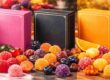
Playful and Vibrant: Creative Layouts for CBD Gummies and Edibles
Box designs for CBD oils often look clean and clinical. In contrast, packaging for CBD gummies and other edibles is more vibrant and lifestyle-focused. These boxes allow more creative freedom and bold expression.
Designers often use strong colors that match the flavor of the product. Deep berry shades suggest fruit flavors. Bright orange tones reflect citrus or “dream” candies. Since edibles are seen as fun products, the packaging may include playful illustrations. Some boxes even use die-cut windows to show the product inside.
When adding required symbols to colorful designs, it is best to group them together. A small “cluster of icons” keeps the layout neat and organized. Using a contrasting color helps the icons stand out without competing with the artwork.
A glossy finish works well for gummy packaging. It makes the colors brighter and more appealing. This creates a fresh and “delicious” look that attracts the customer at first glance.
The “Clinical Chic” Aesthetic: Inspiration for CBD Topicals and Balms
Regarding CBD creams, balms, or other types of CBD topicals, a common source for box design ideas comes from more high-end skincare or dermatological packaging. This design aesthetic is sometimes referred to as “Clinical Chic” for this reason. This style will have plenty of negative space, minimalist but clean sans-serif lettering, and then a “hero” graphic or symbol representative of what’s most important about this product, such as a snowflake for its cooling properties or, say, a leaf for its medicinal nature. Here, having crucial symbols actually adds to the product design, allowing them to function as “badges of authority” in terms of their medicinal properties.
A current trend for CBD box design inspiration for topicals is what is known as a “Shadow Box” design, featuring the product’s name positioned centered with a thin and elegant border around it. A current trend for brands in 2026 is embracing a “Dual Texture” approach for packaging, with a matte finish on top and a high-gloss spot UV finish for product names and prominent icons. This subtle play of light creates an exotic and luxurious perception of the box. Thus, by adopting these skincare trends, CBD businesses can easily align the positioning of their CBD products with that of luxurious skincare products in retail stores.

Eco-Friendly Innovations: Sustainable Materials as a Design Statement
In 2026, CBD box design inspiration packaging design follows a strong “material-first” trend. In this approach, the material of the box is almost as important as the logo itself. Brands are now moving beyond basic biodegradable paper. They are choosing advanced eco-friendly materials like mycelium (mushroom packaging) and bioplastics made from seaweed.
These natural materials look unique and feel organic. At first glance, they show that the brand cares about the environment. Their earthy texture also creates a perfect base for clean black ink designs. This contrast feels elegant, modern, and very luxurious.
When exploring sustainable CBD packaging ideas, you will notice a new idea called “lightweighting.” Today, lighter packaging is seen as a sign of luxury. Engineers now use strong but light fibers and avoid toxic adhesives. This reduces waste and protects the product at the same time.
According to Zenpack’s 2026 packaging trends, sustainability now defines luxury. Brands use fewer materials while offering better protection and style. This supports the “naked packaging” trend, where the structure of the box itself becomes part of the design. The package proudly shows its strength, simplicity, and purpose.
The Future of Smart Packaging: Connecting Design to the Digital World
As we move into 2026, CBD box design inspiration is no longer limited to the physical look of the package. A new idea called “Connected Packaging” is now becoming standard. Many brands are adding GS1 digital link QR codes and NFC tags to their boxes.
With a simple phone scan, customers can open a “Digital Product Passport.” This shows the full journey of the hemp, from seed to shelf. Because of this, the box itself can focus more on beauty and branding. Technical details can now live online instead of filling the package with text.
Another exciting trend is the use of Augmented Reality (AR). A customer can scan the box and see a 3D plant grow out of the package on their screen. This can explain the terpene profile and product benefits in a visual way.
According to DHL’s 2026 Trend Report, intelligent packaging is becoming a trusted source of truth. It helps customers feel confident and informed. With this approach, you are not just designing a box. You are building a digital bridge between the product and the customer.
Accessibility in Design: Inclusive Layouts for Every User
One of the less prominent yet important sources of inspiration in CBD box design inspiration relates to inclusive accessibility. As of 2026, the most popular designs are those that can be accessed by anyone, regardless of whether they have visual or manual dexterity impairments. Such designs involve embedding braille in the embossed designs of the box, as well as making sure that the ‘opening experience’ does not have to be done with a lot of force. Such features are being incorporated in a manner that represents a special texture in the box, thereby allowing empathy to coexist with high-end design.
When searching for box inspiration related to CBD products, observe the blending of high contrast color schemes and “hyper-legible” fonts being used to support low vision customers. Inclusive design is now being recognized and achieved through winning Pentaward winners in 2025-2026, and it is essential to focus on innovative aspects related to “easy-grip” matte finishes and notched lids that are now being honored with success. Through making your box more accessible to the public, you will not only fulfill a moral obligation but also gain recognition from a broader and more diverse range of customers with a respect and appreciation for human-centered design.
The Psychology of Unboxing: Creating a Ritualistic Design Experience
“Unboxing” has become a major trend in today’s marketing world because CBD box design inspiration directly relates to this concept. This is when a consumer moves from a customer to a supporter of a specific brand. To better create such a packaging item, designers are examining this box from the point of view of a story developed in stages. While hooked from the outside, people are actually delivered their story inside these products. With some special interior colors or personalized paper packaging, known as “tissue paper packaging,” or even “Welcome Card” packaging positioned on top of products, consumers can experience their purchase in a completely different way. This is very important for CBD packaging because such products are directly related to self-care.
Break down what makes good CBD box design inspiration when it comes to package design inspiration, and you’ll see that designers pay a lot of attention to what is known as “haptic feedback,” which refers to the experience of opening a package and the sensations that occur when you open it. According to Packaging of the World, it is because of such minute details related to the senses that the release of dopamine is triggered in the brain, resulting in consumers feeling they are receiving something of greater value when they get the product compared to when they get it from an ordinary fold-over box.
Regional Design Trends: Global vs. Local Aesthetics in 2026
When considering the CBD box design inspiration, the need to comprehend the role of the geographic origin of preferences in design aesthetics cannot be overemphasized. While the North American market provides a massive inclination towards the “Modern Apothecary” look, the European market tends to opt for a “Bio-Pharmaceutical” look, which is symbolized by extreme simplicity, a dominating color palette of bright whites, with a huge focus on hi-tech medical graphics. Such a scenario makes the need to design the brand language according to the local perceptions of wellness a consideration for a globally operating brand.
CBD box design inspiration in the Asian market in 2026 may take cues from traditional botanical paintings combined with modern accents in neon lights, a “Cyber-Zen” approach, which will reflect the region’s cutting-edge technology combined with its herbal knowledge from the past. According to the International Journal of Design, packaging that expresses a certain cultural symbolism can bring up to 65% more trust in the packaging among the target audience if indeed the packaging resonates well with their values and beliefs.

The Impact of Typography on Brand Hierarchy and Speed of Choice
As we further our exploration for CBD box design inspiration examples, we also have to consider the time frame in which a consumer reaches a purchase decision—this typically takes less than three seconds. The role of “Typography” in this “speed of choice” is evident. “High-impact designs in 2026 incorporate the innovative ‘Variable Fonts,’ which can be adjusted digitally to precisely fit into certain geometric shapes on the packaging boxes.” This will enable the name “to ‘breathe,’ and within this breathing process, the essential ‘tech symbols’ will be placed in a well-organized sidebar.”
When one considers box design inspiration for CBD products through a typographic lens, another trend that appears to be falling in love with is ‘Emotive Lettering.’ Here, one would opt to use either hand-lettered or custom-scarred texts, which are a measure of what the product does. For instance, one might use soft, rounded letters on a ‘Sleep’ oil or bold, italicized, and dynamic letters on a ‘Focus’ tincture. This psychological stratification of information will ensure that your CBD box design inspiration is more than just an encasing, but a communication device like no other, highly efficient, addressing the subconscious needs of the buyer.
Conclusion: The Future of CBD Box Design Inspiration
In order to conclude this long exploration of CBD box design inspiration, it is apparent that the best CBD boxes in 2026 consist of the best art combined with smart functionality. Just by going beyond the “techno” need of the CBD box design inspiration, every sign, texture, and letter can be harnessed as an inspiration, thus making the best art. It doesn’t really matter whether you follow the path of art and sustainability or the path of smart CBD box design inspiration; the central point of every design will always lie in the customer experience. Your CBD box design inspiration will represent the promise of your brand, so tell a story worth telling.
Summary of CBD Box Design Styles and Their Impact
The following table breaks down the core visual strategies we have discussed, helping you identify which CBD box design inspiration path suits your brand’s personality.
Design Style | Core Visual Elements | Consumer Perception | Best For |
Minimalist | Negative space, sans-serif fonts, monochromatic palettes. | Purity, transparency, high-end luxury. | CBD Oils & Tinctures |
Maximalist | Vibrant patterns, botanical illustrations, bold colors. | Energetic, flavorful, adventurous. | Gummies & Edibles |
Clinical Chic | White backgrounds, grid layouts, badge-style icons. | Professionalism, medical-grade safety. | Topicals & Balms |
Eco-Organic | Raw textures, earth tones, debossed or etched logos. | Sustainability, natural origins, trust. | Eco-conscious brands |
Cyber-Zen | Neon accents, traditional art, holographic foils. | Innovation, premium quality, modern lifestyle. | Gen Z & Tech-savvy users |
The Role of “White Space” in Premium CBD Box Design Inspiration
One of the most important but least considered elements of your CBD box design inspiration is the strategic utilization of “white space,” or “negative space” in design terms. White space, in design terms, is not empty space; it is rather a design element with high visibility that is used effectively in highlighting the most critical elements of your design, including your boxes. Giving your logo or critical symbols adequate breathing space helps prevent your customer from becoming mentally overloaded when interacting with your design, including your boxes. This is especially critical when dealing with your CBD box design inspiration, given that your clients might be suffering from any form of discomfort.
Moreover, the design of your CBD product box with large margins and space between the text elements exudes confidence. This is the kind of box design where your brand will not feel the need to shout about itself through loud graphics because it knows that the quality of the product will just be sufficient on its own. Research on design psychology indicates that products with white space are valued at retail as being of higher quality.
Strategic Integration: Turning Symbols into Brand Assets
CBD box design inspiration is to realize that “technical” needs are simply “creative” challenges. This means you don’t view a QR code or a warning symbol as a problem to be solved. Instead, consider using a QR code as a design focal point, nestled within a stunning border. A warning symbol can be done in metallic ink to match your brand colors. When designed this way, every bit of your box will be a work of art.
The development of the looks and inspirations for the CBD box design inspiration in 2026 reveals that customers are no longer purchasing a commodity but a vision and a set of values as well. First contact with this vision and set of values is your packaging product. By using the emotional qualities of color, texture, and clarity, it is possible for you to create a CBD box design inspiration that not only stands among industry standards but breaks them as it stands out as a masterpiece of packaging design as well. To round off this in-depth tutorial, we have provided answers to the frequently asked questions. This section aims not only to address design questions but to make sure your CBD box design inspiration idea is equipped with a valuable high-level strategy.
Frequently Asked Questions: Mastering CBD Packaging Design
Q 1. What are some methods to properly take care of a CBD subscription box?
The key to successful CBD box design inspiration is to take a look elsewhere in the industry and learn what high-end makeup, high-end liquor, or organic skincare products have to offer. By examining how high-end products in those markets incorporate texture and typography, you can take those high-end elements and incorporate them into your own CBD products to make your products truly unique in the marketplace.
Q 2. How can I incorporate bright colors for my CBD packaging box to be more eye-catching yet professional?
Indeed, to have a colorful CBD box design inspiration idea, these colors must be balanced with some elements of “grounding.” Use a bold key color in the major panel sections, but these have to be coupled with white typography and grid systems to invoke a sense of medical professionalism and maturity of the brand.
Q 3. Why is sustainable material selection important to my CBD box design inspiration?
The choice of such sustainable materials as hemp-based paper or recycled cardboard, with natural textures, fundamentally changes the inspiration for your CBD box design inspiration. Most often, such textures work best with minimum ink coverage, allowing the organic “feel” of the material to be a main design element signaling eco-consciousness to the consumer.
Q 4. Where exactly are the places in a CBD box design inspiration where essential symbols should be placed?
When looking for CBD box design inspiration, focus your attention on the “lower third” or side panels of the box. Placing essential symbols within these secondary zones keeps the primary display panel clean and puts the attention where it needs to be: your brand’s aesthetic.
Q 5. How frequently should I update my design inspiration for a box of CBD to maintain a trend?
Within the ever-competitive wellness industry, it would be beneficial for you to change your CBD box design inspiration every 18-24 months. Although your brand identifications should be kept unchanged, there might be minor modifications regarding the use of finishes, such as the implementation of Holographic Foil 2026 and the update of your Typography.
Q 6. Can I incorporate QR code design inspirations for my CBD box design inspiration?
Absolutely. A possible modern CBD box design inspiration might consider the QR code element in the design process, perhaps turning the QR code into a graphic design element, maybe including a border or a specialized “digital discovery” section where you could write something like “Scan for Lab Results,” which would give the unboxing process some semi-guided order.
Q 7. What is the significance of typography in my CBD box design inspirations?
Typography is the “voice” of your brand. The choice between the old serif and new sans-serif typography in your CBD box design inspiration will determine whether the client will view your CBD products as artisan or scientific. The proper use of typography will also guarantee that the most crucial information is processed first.
Eco-Friendly Innovations: Sustainable Materials as a Design Statement
In 2026, CBD box design inspiration packaging design follows a strong “material-first” trend. In this approach, the material of the box is almost as important as the logo itself. Brands are now moving beyond basic biodegradable paper. They are choosing advanced eco-friendly materials like mycelium (mushroom packaging) and bioplastics made from seaweed.
These natural materials look unique and feel organic. At first glance, they show that the brand cares about the environment. Their earthy texture also creates a perfect base for clean black ink designs. This contrast feels elegant, modern, and very luxurious.
When exploring sustainable CBD packaging ideas, you will notice a new idea called “lightweighting.” Today, lighter packaging is seen as a sign of luxury. Engineers now use strong but light fibers and avoid toxic adhesives. This reduces waste and protects the product at the same time.
According to Zenpack’s 2026 packaging trends, sustainability now defines luxury. Brands use fewer materials while offering better protection and style. This supports the “naked packaging” trend, where the structure of the box itself becomes part of the design. The package proudly shows its strength, simplicity, and purpose.
The Future of Smart Packaging: Connecting Design to the Digital World
As we move into 2026, CBD box design inspiration is no longer limited to the physical look of the package. A new idea called “Connected Packaging” is now becoming standard. Many brands are adding GS1 digital link QR codes and NFC tags to their boxes.
With a simple phone scan, customers can open a “Digital Product Passport.” This shows the full journey of the hemp, from seed to shelf. Because of this, the box itself can focus more on beauty and branding. Technical details can now live online instead of filling the package with text.
Another exciting trend is the use of Augmented Reality (AR). A customer can scan the box and see a 3D plant grow out of the package on their screen. This can explain the terpene profile and product benefits in a visual way.
According to DHL’s 2026 Trend Report, intelligent packaging is becoming a trusted source of truth. It helps customers feel confident and informed. With this approach, you are not just designing a box. You are building a digital bridge between the product and the customer.
Accessibility in Design: Inclusive Layouts for Every User
One of the less prominent yet important sources of inspiration in CBD box design inspiration relates to inclusive accessibility. As of 2026, the most popular designs are those that can be accessed by anyone, regardless of whether they have visual or manual dexterity impairments. Such designs involve embedding braille in the embossed designs of the box, as well as making sure that the ‘opening experience’ does not have to be done with a lot of force. Such features are being incorporated in a manner that represents a special texture in the box, thereby allowing empathy to coexist with high-end design.
When searching for box inspiration related to CBD products, observe the blending of high contrast color schemes and “hyper-legible” fonts being used to support low vision customers. Inclusive design is now being recognized and achieved through winning Pentaward winners in 2025-2026, and it is essential to focus on innovative aspects related to “easy-grip” matte finishes and notched lids that are now being honored with success. Through making your box more accessible to the public, you will not only fulfill a moral obligation but also gain recognition from a broader and more diverse range of customers with a respect and appreciation for human-centered design.
The Psychology of Unboxing: Creating a Ritualistic Design Experience
“Unboxing” has become a major trend in today’s marketing world because CBD box design inspiration directly relates to this concept. This is when a consumer moves from a customer to a supporter of a specific brand. To better create such a packaging item, designers are examining this box from the point of view of a story developed in stages. While hooked from the outside, people are actually delivered their story inside these products. With some special interior colors or personalized paper packaging, known as “tissue paper packaging,” or even “Welcome Card” packaging positioned on top of products, consumers can experience their purchase in a completely different way. This is very important for CBD packaging because such products are directly related to self-care.
Break down what makes good CBD box design inspiration when it comes to package design inspiration, and you’ll see that designers pay a lot of attention to what is known as “haptic feedback,” which refers to the experience of opening a package and the sensations that occur when you open it. According to Packaging of the World, it is because of such minute details related to the senses that the release of dopamine is triggered in the brain, resulting in consumers feeling they are receiving something of greater value when they get the product compared to when they get it from an ordinary fold-over box.
Regional Design Trends: Global vs. Local Aesthetics in 2026
When considering the CBD box design inspiration, the need to comprehend the role of the geographic origin of preferences in design aesthetics cannot be overemphasized. While the North American market provides a massive inclination towards the “Modern Apothecary” look, the European market tends to opt for a “Bio-Pharmaceutical” look, which is symbolized by extreme simplicity, a dominating color palette of bright whites, with a huge focus on hi-tech medical graphics. Such a scenario makes the need to design the brand language according to the local perceptions of wellness a consideration for a globally operating brand.
CBD box design inspiration in the Asian market in 2026 may take cues from traditional botanical paintings combined with modern accents in neon lights, a “Cyber-Zen” approach, which will reflect the region’s cutting-edge technology combined with its herbal knowledge from the past. According to the International Journal of Design, packaging that expresses a certain cultural symbolism can bring up to 65% more trust in the packaging among the target audience if indeed the packaging resonates well with their values and beliefs.