Cosmetic Packaging Colors Proven to Attract More Buyers
Colors are strong. They communicate without words. In packaging cosmetics, color can make or break a sale. The appropriate color can guarantee that products get noticed on a busy shelf. The wrong colors will kill an otherwise phenomenal product.”.
This article talks about why cosmetic package color draws in customers. We shall look into the color packaging psychology, actual examples, and some branding tips. The aim is to assist you in selecting cosmetic packaging colors that boost sales and foster a solid brand image.
Why Colors Matter in Cosmetic Packaging
First Impressions Count
Consumers make their decision within seconds. The color of the package is the first thing they see. A red lipstick package or a light pastel-colored cream jar can evoke immediate emotions.
Colors Evokes Emotions
Colors are associated with human emotions. Red is strong. Pink is gentle. Green is organic. Customers look at these colors and associate them with values or emotions.
Branding and Trust
Colors also convey brand personality. Black and gold will be used by a luxury brand. Earth tones will be used by a line for natural skincare. Customers are most likely to think of the product when colors reinforce the message of the brand.
The Psychology of Cosmetic Packaging Colors
Red: The Color of Passion
Red is sensational, powerful, and vibrant. Red becomes the norm in lipstick packaging in cosmetics. Red appeals to consumers who desire glamour, power, and passion. Red packaging drives products to appear hardy and noticeable.
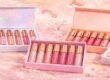
Pink is delicate, soothing, and sensual
Pink is usually associated with skincare, blush, or fragrances. Cool pinks have a sense of serenity and sweetness, whereas hot pink has a sense of playfulness and boldness.
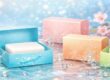
White: The Colour of Purity
White is direct and clean. White is used most by skincare and cosmetic companies to evoke cleanliness. It transmits a feeling of trust, safety, and integrity. White also has the feeling of being cutting-edge and under-the-radar.
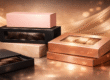
Black: The Color of Luxury
Black is strong and classic. High-end makeup companies adore black packaging since it is classy and sophisticated. Black is great when combined with gold or silver accents to give the impression of high-end products.
Gold: The Color of Glamour
Gold evokes a relationship with wealth, quality, and elegance. Cosmetic companies usually apply gold to high-end products such as serums, perfumes, and high-end creams. It makes the buyer associate the product with being more expensive.
Green: The Color of Nature
Green is green, natural, and healthy. Natural and organic cosmetic companies apply green to emphasize natural and safe products. It also appeals to consumers who are concerned about being eco-friendly.
Blue: The Color of Tranquillity
Blue is peaceful, genuine, and secure. Blue, as a color used for cosmetics packaging, is usually employed for men’s grooming or skincare. Pale blue is clean, and darker blue is robust.
Purple: The Colour of Royalty
Purple has been associated with royalty and spiritualism for centuries. Purple in cosmetics captures individuality and creativity. It is used in perfumes, eye shadows, and those products that require a mystique.
Yellow: The Happiness Color
Yellow is a vibrant and happy color. Yellow gets noticed and has the reputation of making people feel more cheerful. Yellow is applied by beauty firms in summer lines or playful product lines to make people smile.
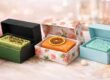
Positive Color Combinations to Use in Beauty Packaging
Black and Gold to Develop High-End Appeal
Both colors are perfect for high-end cosmetics. They both represent prosperity, luxury, and sophistication. This duo is employed by Dior and Chanel in order to preserve the high-end look.
White and Green for Natural Skincare
White and green together inform the consumer that the product is natural and green-friendly. Skin care products tend to employ these two as a duo for creams, masks, and natural lines.
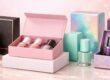
Pink and Silver for Feminine Products
Pale pink metallic silver appears trendy but feminine. It is suitable for lip gloss, blush, and fragrances.
Blue and White for Freshness
Blue and white appear tidy and clean. It is favored for facial wash, creams, and cosmetics among young purchasers.
How Different Audiences React to Colors
Women Consumers
Most women are drawn to pale colors such as pink, purple, and nude. They, however, like applying strong colors such as red and black for makeup purposes.
Men Consumers
Men like plain, strong colors such as black, gray, navy, or dark green. These are powerful but not overly flashy.
Teenagers
Teenagers prefer boldness, brightness, and playfulness in colors. Neon pinks, electric blue, and yellow are appropriate for their playful nature.
Eco-Conscious Buyers
Environmental care buyers like natural color branding. Beige, brown, green, and white are a green image.
Seasonal Trends in Cosmetic Packaging Colors
Spring Colors
Pastel soft colors such as baby pink, mint green, and pale lavender are used all over in spring packaging.
Summer Colors
Loud colors such as yellow, coral, and turquoise overtake summer custom packaging. They are considered vibrant and playful.
Fall Colors
Burnt orange, rich red, and warm, earthy brown homey tones give a cozy fall ambiance.
Winter Colors
Silver, icy blue, dark purple, and black cool colors impart festivity and elegance.
The Role of Cultural Influence on Color Selection
Colors mean something different in different cultures.
White in the Western world symbolizes purity.
White symbolizes mourning in certain Asian cultures.
Red symbolizes luck and happiness in China, but passion in Western economies.
Gold is most commonly regarded as riches, but the amount of luxury it symbolizes can differ.
Cosmetic companies need to examine the color semantics prior to deciding on the pack color for international markets.
Case Examples of Brands Using Colors Wisely
Chanel
Black and white packaging is used by Chanel for sophistication. Such a classic design has turned the brand iconic.
The Body Shop
Green and natural colors are utilized by The Body Shop to emphasize ecological and environmental concerns. Consumers naturally link the brand with sustainability.
Fenty Beauty
Fenty Beauty employs neutral colors as well as vibrant packaging colors. This portrays inclusivity and style popularity.
Choosing the Right Packaging Colors for Your Brand
- Know Your Audience
Each brand also has its own favorite target market. Teenagers adore bright and vibrant colors like neon yellow or pink. Females relate to light colors like pastels but also adore strong colors like red and black for makeup. Males adore strong, neutral colors like navy blue, black, or dark green. Environmentally conscious consumers prefer natural colors like beige, green, and white.
If you know their preferences, then you can select colors that resonate with them. It is this procedure that makes your product and the people who use it very intimate.
- Match Brand Identity
Your packaging must be according to your brand personality. If your brand deals with luxury products, then the use of black, gold, and silver colors is ideal. They give your products a rich, premium feel. But if your brand deals in natural skin care, then you must select white, beige, or green. These shades symbolize honesty, purity, and greenness.
Always keep in mind that your packaging is your silent salesperson. Your customers can get confused and lose faith in your products if your colors conflict with your brand identity.
- Test Before Launch
Never release a product onto the shelf without guaranteeing your color on the packaging. Sometimes, the colors that you prefer are not what customers want. Design trial packages in two or three color schemes. Next, test them by showing them to a small group of clients. You can also sell them in small quantities online or in stores and see what sells the best.
Testing is cost- and time-efficient, too. You can discover what actually works with your public before you spend a lot of cash.
- Stay Current with Market Trends
Trends dominate the cosmetic packaging. For instance, bright pastel colors are spring mode, bright is summer ruler, earth tones such as orange and brown are autumn, and cool colors such as silver or dark purple are winter style.
Cultural trends matter as well. Red is a sign of luck in China, while in the West it is a sign of passion. Through the observation of trends, your brand can keep up and be more attractive to global clients.
- Be Yourself
Cosmetic box design trends are helpful, but don’t follow competitors. If your packaging appears identical to that of other companies’, customers will forget you. Rather, use colors that represent the company’s heritage and values.
For instance, if all the skincare products in your area are utilizing white, pale lavender, or pale mint green, they can be used. This contrast will allow your products to cut through cluttered shelves and online platforms. Differentiation creates a strong identity and makes it easy for clients to identify your brand at a glance.
The Future of Cosmetic Packaging Colors
There will be even more planet-friendly and personalized colors in the future. Consumers adore companies that are green. There will be increased earth tones, natural textures, and biodegradable inks. Digital printing will also enable more creative designs and color blends.
Conclusion
Meanings of color cosmetic packaging extend beyond appearance. They are significant marketing weapons. Colors evoke people’s feelings, convey company messages, and generate sales.
From the opulence of black and gold to the earthy feel of green and white, each color is eloquent. Strategically deployed colors by companies can help them trust, differentiate, and win repeat business.
If you wish your beauty firm to expand, begin with the proper colors of packaging. They are the quiet retailers of your brand.
FAQs
Q1: Do packaging colors actually boost sales?
Yes. Colors drive emotions and shopping habits. The right colors can boost sales by drawing attention.
Q2: What color do expensive cosmetics opt for to convey luxury?
Black, silver, and gold are favorite luxury colors. These give products an upgraded look.
Q3: What colors would be most suitable for natural products?
Green, beige, brown, and white best suit natural or green beauty product brands.
Q4: Is it okay to incorporate more than one color on packaging?
Yes. Brands harmonize color combinations. Just ensure they align with your brand narrative.
Q5: How do I choose what color will work best?
You can make sample packages in various colors. Get feedback from a focus group or sell in small batches.