Cosmetic Packaging Colors That Drive Impulse Purchases
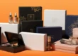
Colors are strong. They draw our attention before words or form do. In packaging for cosmetics, colors play an even larger role. Individuals purchase beauty products for use, but also for the way they feel. A plain lipstick box or cream jar in a suitable color may cause an impulse buy. This implies customers purchase without intention.
In this piece, we will look at how color on cosmetic packaging colors affects purchasing. We will find out which colors evoke feelings, how they influence shopping, and what we can do to make the right use of color.
Why Color Matters in Cosmetic Packaging
First Impressions Count
When shoppers walk into a store or browse online, they notice colors first. Color on packaging creates the initial impression. If the package is eye-catching, shoppers stop and glance. If it is dull, they don’t even notice it.
Color Creates Emotions
Each color provides an emotion. Some bring us to a state of calm, while others generate excitement. Cosmetics are mood products. Shoppers desire to feel beautiful, confident, or relaxed. Brand colors enhance these emotions.
Fast Decisions
Research indicates that individuals make decisions regarding products in seconds. Color on packaging is central in that brief span. A suitable color can compel buyers to purchase without thorough consideration.
Color Psychology in Cosmetics
Red: Bold and Passionate
Red is powerful, energetic, and bold. It is used frequently in lipstick packaging. Red evokes feelings of strength and sexual attraction. Numerous consumers are unable to resist red packaging since it appears bold.
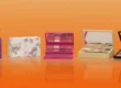
Pink: Feminine and Playful
Pink is playful, soft, and romantic. Beauty companies use it for products for young girls or women. Light pink is smooth-feeling, while hot pink is dynamic. Both evoke impulse buying.
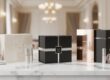
Black: Class and Sophistication
Black provides a high-end feel. Several upscale beauty companies employ black models for perfume or mascara packaging. Black implies quality and intrigue. Consumers believe they are purchasing something unique.
White: Simple and Clean
White represents purity, serenity, and simplicity. White is used by skincare companies to indicate natural and harmless products. White packaging gets customers to believe the product readily.
Gold: Luxurious and High-End
Gold signifies wealth and luxury. A golden element on packaging has the ability to make a product appear high-end. Budget firms also employ gold patterns to add value to consumers.
Blue: Peaceful and Trustworthy
Blue is calm and reliable. Blue is used by skincare products and lotions to indicate safety. Light blue is refreshing, while dark blue is solid.
Green: Natural and Eco-Friendly
Green connects nature and wellness. Green packaging is frequently selected by environmentally friendly cosmetic brands. It conveys a message of protection, nurturance, and sustainability.
Purple: Creative and Royal
Purple has been associated with royalty for a long time. It feels luxurious, enigmatic, and innovative. Cosmetic products with purple-colored packaging appear sophisticated and quirky.
How Colors Drive Impulse Purchases
Attraction at First Sight
A bright or one-of-a-kind color grabs attention instantly. Consumers might pick up a product simply because the color is appealing.
Emotional Connection
When the color of the packaging coincides with a customer’s emotional state, they feel associated. For instance, someone in distress picks soothing blue or green products.
Social Media Impact
Everyone loves to share beautiful packaging on social media. Bright colors such as pink, gold, or purple tend to go viral. Social media visibility promotes more spontaneous purchases.
Group Identity
Identity is also expressed through colors. Teenagers might like bold pinks or neon colors, but professionals will like black or white. Color in the package makes individuals feel that a product aligns with their lifestyle.
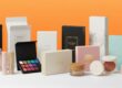
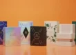
Color Combinations in Cosmetic Packaging
Black and Gold: Traditional Sophistication
Several luxury brands employ black and gold. This combination is used to convey richness and sophistication. People purchase such products even if they are expensive.
White and Green: Natural and Fresh
This combination is best for green brands. It conveys purity and concern for nature. Customers feel secure in using such products.
Pink and Silver: Fashionable and Contemporary
Pink and silver create a sleek, glossy appearance. It is commonly utilized in makeup kits or nail products.
Blue and White: Peaceful and Trustworthy
Blue and white, as a combination, convey purity and tranquility. Skincare products commonly utilize this duo to indicate trust.
Packaging Shades for Various Cosmetic Products
Lipsticks
Red and pink rule lipstick packaging. They are emotional hues associated with attraction and confidence.
Perfumes
Black, purple, and gold are the favorite colors for perfumes. They convey mystery and luxury. People purchase perfumes as presents, so high-end colors count.
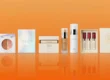
Skincare Creams
White, blue, and green are good for creams. They evoke feelings of security, freshness, and health.
Nail Polishes
Vibrant colors such as neon pink, red, or metallic shades drive impulse purchases. They are fashionable and funky.
Hair Products
Shampoos and hair serums usually employ blue, green, or white. These hues are evocative of freshness and strength.
The Role of Culture in Color Choice
Different Meanings in Different Countries
Color does not mean the same everywhere. In Western nations, white symbolizes purity, peace, and weddings. However, in certain Asian nations, white is associated with mourning and sorrow.
In the same way, red in Western societies may reflect passion or danger. Red is a lucky and joyful color in China, however. Hence, a lot of Chinese beauty products utilize red packaging during holidays.
Black is another case in point. Black in Europe or America would be elegant and high-end. It can reflect mourning, however, in other cultures.
These examples illustrate the reasons why cosmetic companies should carefully research what colors in each market mean before creating packaging. The color that increases sales in one place will decrease sales in another.
Local Trends
In addition to established meanings, regional shopping habits also influence color selection. For instance, in the European region, consumers tend to have a liking for minimalist custom packaging with soothing colors such as white, beige, or pale pastels. However, in the Asia or Middle Eastern region, individuals might enjoy bright, shiny, and bold packaging that feels indulgent and celebratory.
Seasons and holidays count, too. In India, red and gold packaging moves more during Diwali. In Japan, pale cherry blossom pinks appeal in the spring. Such regional tastes have the power to kill or make impulse buys.
Global Brands Tweak Colors
Large cosmetic companies realize that one style does not suit everyone. They frequently change the color of packaging from region to region in order to better resonate with local consumers.
For instance, an international perfume brand can market its product in black and gold packaging in Europe to emphasize luxury. However, the same perfume can be available in red and gold packaging in China to keep up with cultural concepts of good luck and celebration.
This adaptability keeps brands global yet accommodating of local cultures. It further instills trust since customers believe that the brand knows their culture and way of life.
Tips for Brands Choosing Cosmetic Packaging Colors
Know Your Audience
Know to whom you are selling. Young customers might appreciate dramatic pinks. Older customers might enjoy refined blacks or whites.
Match Product Purpose
Colors must suit the product’s use. Skincare needs to feel safe, so blue or white is good. Makeup can play with bold colors for enjoyment and energy.
Keep It Simple
Too many colors confuse buyers. A simple design with one or two dominant colors appears more premium.
Use Contrast
Contrast helps the package stand out. A black box with a gold imprint or a white container with green foliage draws the eye.
Be Consistent
Keep to the same color scheme throughout your brand. Customers will be able to identify your products better.
Cosmetic Packaging Color Trends in the Future
More Environmentally Friendly Shades
Earth tones such as beige, brown, and green will trend. They reflect concern for the earth.
Metallic Effects
Rose gold and silver will see increased demand. These colors provide contemporary luxury for less expense.
Digital Impact
Social media trends will dictate color selection. Viral colors could rapidly be seen on packaging.
Aesthetic Silhouettes
Sleek, smooth colors with a minimalist design will increase. Most consumers today want peaceful packaging instead of detailed patterns.
Conclusion
Colors are not just ornamentation. In beauty packaging, colors create feelings, faith, and an impulsive choice. A single color can make a basic product an absolute purchase. Red stimulates, pink teases, black conveys prestige, white soothes, green evokes nature, and gold glows with affluence.
Brands that recognize color psychology can win consumers’ hearts and boost impulse buying. From lipsticks to perfumes, all cosmetic products require careful color selection. More sustainable and digital-ised colors will emerge in the future, but the objective will be the same: attract, engage, and sell.
FAQs
Q 1. Why do packaging colors matter in cosmetics?
Colors make the initial impression. They evoke feelings and compel customers to make a quick purchase.
Q 2. What color is ideal for luxury cosmetic packaging?
Black, gold, and purple are the most popular. They provide a high-end, luxurious, and classy atmosphere.
Q 3. Do impulse buys rely on packaging colors?
Yes. Bold and vivid colors, such as red or pink, tend to make individuals purchase on impulse.
Q 4. What are ideal colors for skincare products?
White, blue, and green are best. They indicate purity, safety, and freshness.
Q 5. How do color differences due to culture influence color choice?
Colors have varying meanings in various nations. Brands need to research local culture prior to selecting packaging colors.
Q 6. Can eco-friendly cosmetics incorporate bright colors too?
Yes. Eco brands can incorporate green, beige, or earthy tones with a bright accent color.
Q 7. Will trends in packaging color be different in the future?
Yes. Even more sustainable colors, metallic colors, and simple designs will rule cosmetic packaging in the future.
Q 8. Must small cosmetic brands pay attention to color psychology?
Yes. Even small brands can gain attention and trust by making the correct package color choices.