Cosmetic Packaging Fonts That Influence Buying Decisions
You enter a store and see numerous cosmetic products. They are all fighting for your attention. The designs, the colors, and the box shapes all matter. There’s one factor that people mostly ignore—fonts. Cosmetic packaging fonts have a lot of influence on how customers feel.
Letter style can influence the mood of the packaging. A letter set can make a product appear luxurious, natural, fun, or safe. Consumers make buying decisions often in seconds, and the font directs that choice. This article describes how cosmetic packaging fonts influence purchasing decisions and how brands can select the right ones.
Why Fonts Matter in Cosmetic Packaging
First Impressions Count
When a customer purchases a product, the initial impression is from the packaging. Fonts make that first impression. A bold font may appear strong. A script font may appear elegant. A playful font may appear fun.
Creating Brand Personality
Fonts relate to personality. For instance:
A luxury brand might opt for serif fonts with clean lines.
A natural skincare brand might go for handwritten or organic-looking fonts.
A youth-oriented brand might select bold and contemporary fonts.
Emotional Connection
Fonts talk to feelings. They have the power to make consumers feel trustworthy, excited, or at ease. For cosmetics, feelings are essential since beauty items are intimate.
Fonts Used in Cosmetic Packaging
Serif Fonts
Serif fonts possess little lines at the end of every letter. They appear traditional, high-end, and reliable. Most high-end cosmetics brands use serif fonts to indicate sophistication and stability.
Sans Serif Fonts
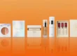
Sans-serif fonts lack additional lines. They appear clean, modern, and minimalist. Skincare and daily cosmetic companies frequently employ them to convey freshness and sincerity.
Script Fonts
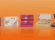
Script fonts resemble handwriting. They provide a feminine, soft, and classy feel. Fragrance and high-end beauty products frequently employ script fonts to incorporate romance.
Display Fonts
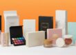
Display fonts are distinctive and attention-grabbing. They are reserved for logos or special edition packaging. The fonts stand out on a crowded shelf when a customer purchases a product.
Handwritten Fonts
Handwritten fonts feel personal and conversational. Organic and eco-friendly brands utilize them to reach customers who care about nature and authenticity.
How Fonts Impact Purchasing Decisions
Luxury Appeal
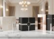
Customers purchasing high-end cosmetics desire packaging that feels luxurious. Gold or embossed serif fonts give the product a more costly look.
Trust and Safety
For skin care products, safety is crucial. Soft color, clean sans-serif fonts provide a sense of honesty and safety. Customers perceive the product as safe for their skin.
Fun and Youthful Look
Cosmetics targeting youth typically utilize playful or bold fonts. The fonts are new and modern, appealing to younger consumers.
Eco-Friendly Connection
In case the product is organic or natural, the font should be similar. Earthy-toned, handwritten fonts indicate that the product is friendly to the environment. This creates a sense of belonging for consumers who are environmentally conscious.
Gender Targeting
Fonts even have the ability to address genders. A script font is appealing to women, and a sans-serif bold font is appealing to men.
Color and Font Combination
Fonts are highly effective on their own, but add colors to them, and you see the effectiveness increase even more. The correct color and font combination is capable of determining how customers feel about your product in seconds.
Black Serif Fonts on White
This combination gives a timeless and luxurious appearance. Most luxury brands employ white backgrounds with black serif fonts. It looks clean, premium, and reliable. Consumers associate this combination with tradition and elegance.
Green Handwritten Fonts
Green with handwritten fonts looks natural and environmentally friendly. It creates a feeling that the product is organic, safe, and in harmony with nature. Companies selling herbal or green cosmetics prefer this combination to appeal to environmentally friendly customers.
Pink Script Fonts
Pink script fonts appear feminine and elegant. They provide softness and beauty to packaging. It is effective for perfumes, lip glosses, and other products for females.
Bold Black Sans Serif Fonts
Modern and crisp-looking fonts come across as bold black sans-serif fonts. They provide a strong, confident, and minimalistic vibe. Unisex cosmetic and skincare products tend to utilize this combination to demonstrate professionalism and honesty.
Why the Mix Matters
One half of the story is conveyed by the font, and the other half by the color, with the latter providing the emotion. Combined, they can double the impact on consumers. The correct pairing makes packs more appealing, reliable, and memorable.
Psychology Behind Fonts in Cosmetic Packaging
Serif = Trust and Luxury
Consumers associate serif fonts with tradition and luxury. The fonts make products appear trustworthy.
Sans Serif = Simplicity and Honesty
Sans-serif fonts are simple to read. They give packaging a clean, modern look. Consumers feel the company is honest.
Script = Elegance and Emotion
Script fonts appeal to the emotions. The fonts make consumers feel special and classy.
Handwritten = Natural and Friendly
Handwritten fonts are personal. They communicate trust to environmentally conscious consumers.
Bold = Power and Confidence
Bold fonts are striking. They give products a strong and confident look.
Real-Life Examples of Font Use in Cosmetic Packaging
Luxury Perfumes
Dior and Chanel brands frequently use serif fonts. The letters are uncomplicated but classy. This makes the perfume come across as ageless.
Skincare Products
Brands such as The Ordinary employ sans-serif fonts. Their product custom packaging appears clean and medical. Consumers feel that the products are safe and efficient.
Natural Beauty Brands
Nature-based brands tend to employ handwritten fonts. This indicates that the product is natural.
Makeup for Youth
Glamorous brands employ bold and playful fonts. They desire to appear cool, creative, and trendy.
Tips for Selecting the Proper Font for Cosmetic Packaging
Understand Your Market
Consider who will purchase your product. Younger shoppers like bold type. Older shoppers might enjoy serif type.
Align Brand Story
If your brand’s story is luxury, choose a type that appears high-end. If your brand’s story is natural, use type that appears natural.
Prioritize Readability
Fonts need to be readable. An ornate type might be beautiful, but if shoppers can’t read it, they might overlook the product.
Test Before Launch
Experiment with various font types on prototype packaging. Test them with your target group. Gather responses before making the final selection.
Use Fonts Properly
Most brands stick with two fonts. One for the logo and another for product information. The pairing should be balanced and not bewildering.
Cosmetic Packaging Font Trends of the Future
Clean Fonts
More brands in the future will incorporate simple and minimalist fonts. More is less when it comes to contemporary packaging.
Custom Fonts
Brands can design their own distinctive fonts. This makes the packaging unique and hard to copy.
Eco-Looking Fonts
With increased eco-friendly cosmetics, more natural and handwritten fonts will become visible.
Digital Fonts
With intelligent packaging, fonts can feature scannable or AR-compatible designs that link to online content.
Common Mistakes to Make in Cosmetic Packaging Fonts
Having Too Many Fonts on One Package
One of the largest errors is using too many fonts on one package. If there are three or four various styles, the packaging is cluttered. Customers might be confused and avoid the product. A simple design with one or two fonts appears professional and balanced.
Selecting Hard-to-Read Fonts
Certain brands choose fonts that appear fashionable but are not easy to read. Buyers lose interest if they cannot easily read the product name or information. Fonts must always be legible, uncluttered, and easy to read from far away.
Neglecting Brand Identity
Fonts should reflect your brand personality. If your brand is luxury, a playful font will not cut it. If your brand is natural, a bold, futuristic font is out of place. Failing at this connection makes your package meaningless. Always go for fonts that reflect your brand story.
Copying Other Brands
Most new brands attempt to imitate the font styles of well-known companies. This devalues the product and makes it appear less original. Exclusive fonts make you stand out in the marketplace. Developing your own style creates more powerful brand recognition and trust among customers.
Conclusion
Fonts are not letters. They are silent narrators on packaging that is cosmetic. A proper font can make a consumer feel safe, luxurious, or enjoyable. A font can reach emotions and forge brand recognition.
Cosmetic companies that select fonts with consideration gain customer confidence and boost sales. Each line, curve, and font style determines how a product is perceived. Once the companies realize this, they can create packages that not only are beautiful but also sell better.
FAQs
Q1: Why are fonts important in cosmetic packaging?
Fonts make the first impression. They influence how customers feel about the product.
Q2: What fonts should I use for luxury cosmetics?
Serif fonts suit luxury well because they are elegant and high-end.
Q3: What fonts do I use for natural skincare?
Handwritten or organic-type fonts indicate that the product is natural and eco-friendly.
Q4: Can I have multiple fonts on a package?
Yes, but not multiple ones. Two are fine—one for logo, one for details.
Q5: What font errors should I steer clear of?
Steer clear of unreadable fonts, excessive styling, and fonts that don’t align with your brand narrative.