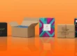
How Color Psychology Drives Packaging Sales
Color is more than decoration. Color talks to the heart and mind. People feel when they see colors. People think quickly. People decide quickly. That is how color psychology operates. It has a significant influence on the way people shop, particularly product packaging.
If your package color is correct, you will stop people in their tracks. If it is incorrect, folks might pass on your product. Major brands understand this. That’s why they spend time and money selecting colors. Small brands can achieve the same. This book will teach you how.
What is Color Psychology in Packaging?
Color psychology is the science of studying how colors affect thoughts and feelings.
In packaging, color psychology assists brands in:
- Sending the correct message
- Evoke certain feelings
- Stand out on store shelves
- Build trust with consumers
- Drive sales
People make snap decisions based on color. Research indicates customers judge a product within 90 seconds. And 60–90% of that judgment is based on color alone.
Why Color Matters in Packaging
Let’s explore how color can work for your product:
- Grab Attention
Vibrant and bold colors grab attention. They grab your product from cluttered shelves.
- Represent Brand Identity
Colors convey your brand’s personality. Are you playful and fun or high-end and serious? Color communicates that.
- Establish Trust
Certain colors are comforting. Others are tacky. Clever color use can make customers feel good about what you sell.
- Boost Recognition
Consider red and Coca-Cola. Or blue and Facebook. Color makes it easier for people to remember you.
- Drive Buying Decisions
The correct color can drive individuals to purchase. It can get them energized, calm, or even hungry.
Top Packaging Colors and What They Represent
Now let’s have a look at what various colors communicate to consumers. Apply these connotations when selecting packaging colors:
Red – Urgency and Energy
Red is powerful. It catches the eye quickly. It makes them feel a sense of urgency and excitement. Because of this, it is suitable for sales, food, and teenagers.
Great for: Snacks, quick food, beauty products.
Blue – Credibility and Serenity
Blue is secure. Blue indicates honesty and serenity. Individuals trust blue. That’s why banks, computer firms, and health brands adore it.
Great for: Skincare, medicine, and technology products.
Green – Health and Nature
Green resonates with earth, health, and freshness. It indicates your business is eco-friendly or organic.
Great for: Tea, organic food, eco-products.
Yellow – Cheerfulness and Warmth
Yellow is bright and cheerful. It gives energy and joy. But too yellow is difficult to read. So use it sparingly.
Great for: Kids’ products, snacks, gifts.
Orange – Friendly and Bold
Orange is playful. It’s full of fun and adventure. It suggests urgency without feeling too overpowering.
Great for: Fitness, tech gadgets, drinks.
Purple – Luxury and Wisdom
Purple richly feels. It relates to royalty, wisdom, and serenity. It’s excellent for expressing high value.
Excellent for: Beauty, perfume, luxury boxes.
Black Power and Sophistication
Black is strong and serious. It’s employed to express strength and sophistication. Simple black packaging tends to feel premium.
Excellent for: Fashion, luxury items, electronics.
White – Clean and Simple
White feels pure and fresh. It provides a clean appearance. It causes other colors to stand out.
Great for: Health care, minimalist brands.
Pink – Sweet and Soft
Pink is warm and endearing. It resonates with femininity and nurturing.
Great for: Baby care products, beauty, gifts.
How to Choose the Most Effective Color for Your Custom Packaging
Selecting the correct color is not merely about what is aesthetically pleasing. You must think smart. Here’s how:
- Know Your Audience
Ask: Who will purchase your product?
- Children love bright colors like yellow and red.
- Teenagers like strong colors like purple and black.
- Environmentally conscious adults like green and brown hues.
- Know Your Product
What are you selling?
- Food: Appetizing colors such as red and orange.
- Skincare?:Soothing shades such as white and blue.
- Luxury goods: Black, gold, and dark purple.
- Match Your Brand Personality
All brands have an essence. Is it playful? Serious? Soothing? Select colors that reflect this mood.
- Study Competitors
Observe what others in your industry are doing. You do not want to copy, but you would like to match the market.
- Test and Get Feedback
Test a few of them before printing thousands of boxes. Get customers’ opinions. Select the one that feels best to most.
Real-Life Examples: Brands That Use Color Well
Coca-Cola – Red for Energy
Coca-Cola employs dramatic red. It conveys excitement, fun, and energy. The red can gives people a sense of energy.
Apple – White to convey Clean Design
Apple goes simple. Their white design comes across as clean, new, and intelligent. It aligns with the feel of their product.
Starbucks – Green to represent Freshness
Green is used by Starbucks to signify a connection to nature.
It aligns with their green image and soothing feel.
Tiffany & Co. – Blue for Luxury
The iconic “Tiffany Blue” exemplifies elegance and sophistication. It’s delicate, distinctive, and reliable.
Color and Online Shopping
In stores, individuals view products on shelves. But online, pictures count more. Colors have to appear good on screens, also. Nice product pictures with the appropriate colors can:
- Grab clicks
- Engage buyers
- Make individuals trust the product.
- Result in increased sales
Ensure your packaging appears clear and shiny in images. Utilize natural light and favorable positions.
Color Combinations: Mix Smartly
One color at times may be insufficient. Combining colors could make your packaging stand out. But it has to be done smartly.
Good Combos:
- Black and gold – for a premium feel
- White and blue – for a clean look
- Red and yellow – for energy
- Green and brown – for a natural vibe
Don’t combine too many colors. Keep your palette basic. 2–3 colors suffice for most brands.
Color and Culture: Know Your Market
Different colors mean different things in different regions. For instance:
- Red is fortune in China, but risk in other areas.
- White is purity in the West but bereavement in much of Asia.
- If you have a global sale, research what your colors symbolize in every market.
Color in Logo and Branding
Your packaging for your product should be similar to your logo and brand appearance.
Color helps build a strong brand memory. When customers see your color again, they remember you.
So, if your logo is purple, try using that color in your box or label too.
Use Color to Guide the Eye
Color can also guide buyers where to look. For example:
- Use a vivid color to make your logo stand out.
- Use contrast to make your product name readable.
- Use bold color on one side to create drama for your offer.
- This makes your design both beautiful and intelligent.
Tips to Increase Sales with Color
Here are some quick tips:
- Make your packaging simple and bold.
- Use a strong contrast between text and background.
- Select one prominent color and 1–2 supporting colors.
- Do not imitate others. Create your own identity.
- Use color to associate emotion with your product.
Eco-Friendly Packaging and Color
If your company is green or sustainable, your color must affirm that. Earth tones such as brown, green, and beige are best.
You may use kraft paper or recycled materials as well. The natural color will indicate your company values.
Those who care about the planet pay attention to these details. And they tend to pay more for eco-friendly packaging.
Conclusion: Color Can Make or Break Your Sale
Color is a mighty force in the packaging world. It communicates quicker than words. It makes your brand stand out, feel good, and sell better.
Selecting the perfect color for your packaging isn’t design—it’s good marketing. So consider your audience, message, and brand. Then choose the color that is best representative of you.
Even if you are a small business, you can win consumers with color. You just need to have knowledge, care, and creativity.
FAQs
Q1: What is color psychology in packaging?
Color psychology in packaging is the practice of using colors to make people think and feel something about a product. The right color will get people to notice, trust, and buy your product faster.
Q2: Why do colors affect product sales?
Colors convey emotional messages. For instance, red invokes excitement, blue inspires trust, and green indicates freshness. These feelings can influence a buyer’s choice.
Q3: Which color is best for packaging?
There is no single “best” color. It depends on your product, audience, and brand style. Food brands often use red or yellow. Luxury brands may use black or gold. Eco brands prefer green or brown.
Q4: Can I use more than a single color on my packaging?
Yes. Using 2–3 colors together can make your packaging look great. But don’t use too many colors since it becomes messy.
Q5: Do colors hold the same meaning in all countries?
No. Colors carry different meanings in various countries. For instance, white is purity in the West but mourning in other countries in Asia. Always conduct research prior to selling in a new market.
Q6: What’s the best way to pick the correct package color for my brand?
First, get to know your customer. Then find a color that fits your brand persona. Check out what colors the competition is using, too. And try it out with actual customers.
Q7: Are colors in online products as important as on the shelf?
Yes. Good color presentation is even more crucial in online shopping since customers can’t touch the product. Vivid, clean, and accurate images are likely to increase trust and sales.
Q8: Can bright colors be used by eco-friendly brands?
Yes, but earth tones such as green, brown, and beige are more natural for eco brands. If you do use bright colors, see to it that your packaging materials convey sustainability even so.
Q9: Can the packaging color be changed too frequently?
Small refinements are okay, but frequent alteration of your primary color will confuse customers. Consistency is used to establis