How Scent and Color Influence Soap Packaging Design
Soap is not just a hygiene issue. It’s about experience—how something feels. As you browse down the shelf of a store or scroll through a website, the packaging of a soap bar can stop you short in a second. And two very powerful weapons brands have when it comes to packaging are scent and color.
In this article, we’ll explore how scent and color influence soap packaging design and how brands can use these elements to stand out in a competitive market.
Why Scent and Color Matter in Packaging
- Before someone uses your soap, they see it and smell it. These two senses—sight and smell—are the first to respond.
- Color triggers emotion. Soft pinks feel calming, bold reds feel energizing, and cool blues feel refreshing.
- Smell forms memory. A lavender scent will lead to thinking of bedtime. Citrus may be fresh and clean.
- When the two of them are together, they can generate trust, draw buyers in, and even boost repeat purchases.
Color Psychology in Soap Packaging
Color communicates without words. Every color evokes a different tale. Let’s discover how colors influence soap packaging.
- Blue – Freshness and Cleanliness
Blue is the color of choice for soaps that will be cool, refreshing, or clean. Ocean scents or minty soaps come to mind.
Used for:
- Unisex or men’s soaps
- Mint, marine, or water-based scents
- Natural, herbal, or cooling effects
- Best with: Clear fonts, minimal designs, and silver or white accents.
- Green – Natural and Soothing
Green symbolizes nature, calm, and eco-friendliness. It’s best suited for soaps with organic or herbal ingredients.
Used for:
- Tea tree, aloevera, cucumber, or neem soaps
- Eco-friendly or handmade brands
- Sensitive skin or baby lines
- Best with: Kraft paper, leaf designs, or natural colors.
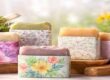
- Pink and Purple – Floral and Feminine
They are colors related to romance, delicacy, and opulence. Rose, lavender, and jasmine-perfumed soaps like these hues.
Used for:
- Floral or essential oil scents
- Spa or relaxation lines
- Women’s personal care lines
Best with: Gold foils, classic fonts, or pastel backgrounds.
- Orange and Yellow – Energy and Warmth
These shades are vibrant, cheerful, and stimulating. Ideal for citrus- or fruit-scented soaps.
Applied to:
- Orange, lemon, turmeric, or honey soaps
- Summer brands or kids’ soaps
- Uplifting moods
- Ideal with: Bold designs, clear plastic wrap, or warm designs.
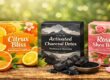
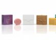
- Black and White – Luxury and Minimalism
Black and white packaging has a feel of luxuriousness, cleanliness, and quality.
Applied to:
- Charcoal, musk, or Oriental scents
- Premium or gift packaging in modern or minimalist design
- Modern or minimalist brands
- Best paired with: Gold lettering, matte boxes, or textured finishes.
Scent Depiction on Packaging
You can’t smell an image. Yet great packaging design causes you to imagine the fragrance even before you’ve lifted the lid of the box. That’s what brands do:
- Imagery and Icons
Lavender-scented soap might have lavender flowers printed on it. An orange or lemon on a citrus soap.
Why it works:
It creates a mental connection between what you see and what you will feel.
- Descriptive Language
Words like “Refreshing Citrus Zest” or “Calming Rose Petals” assist your imagination.
Tip: Use sensory words-fresh, earthy, spicy, floral, creamy, etc.
- Scent Colors Match
Color sets your mind expecting. Yellow is lemon. Green is mint. Blue is the ocean.
Great brands use:
- Cool colors for fresh fragrances
For example,
- Warm colors for sweet or spicy fragrances
For example,
- Earth tones for herbal or natural soaps
For example,
- Scent and Color Match: Best Matches
A few best scent and color combinations that work for soap packaging:
Scent Type | Color Palette | Emotion Triggered |
Lavender | Light purple, soft pink | Calm, relaxation |
Citrus (Orange) | Bright orange, yellow | Fresh, energizing |
Tea Tree / Mint | Cool green, blue | Clean, refreshing |
Rose | Blush pink, ivory | Romantic, gentle |
Charcoal / Musk | Black, grey, metallics | Bold, modern, masculine |
Sandalwood | Brown, gold, cream | Warm, grounding, soothing |
These combinations tell shoppers precisely what kind of experience they’re buying, before they even touch the soap.
Case Study: Real Brands Doing It Right
Let’s examine how leading brands employ scent and color on soap packaging:
- Lush Cosmetics
- Colorful wrapping paper has scent themes.
- Scents such as honey have gold and amber colors.
- Earth scents such as “Herbalism” have green colors.
- Dr. Bronner’s
- Has a color-coded label system—each fragrant scent has a unique bold color.
- Peppermint is blue, lavender purple, and citrus orange.
- Clear message and fast recognition.
- Burt’s Bees
- Natural kraft paper finish with green or yellow undertones.
- Highlights the natural ingredients and honey-like warm color tones.
- Speaks to the environmentally conscious consumer.
Scent and Color Tips in Soap Packaging
- Know Your Target Market
Who is your soap market? Children, women, men, or eco-conscious consumers? Each reacts to various color and scent signals.
- Be Consistent
Once you’ve set blue for peppermint and orange for citrus, do it across your entire line. This creates brand trust.
- Use Eco-Friendly Inks and Materials
If you’re selling natural fragrances, ensure your packaging is also natural. Soy inks and recycled paper are a great start.
- Test on Customers
Make prototypes and try out reactions. Does your rose soap have a rosy scent when you gaze at it? Sometimes, bluntness is the greatest.
- Think Shelf Presence
Your packaging must stand out from a distance. Employ vivid contrasts, clearly legible labels, and approachable fonts.
Scent and Color in Different Cultures
Various cultures and countries perceive odors and colors differently. What is happy in one location can be sad in another. You should know this if you sell soap abroad.
Examples:
In Asia:
- White usually equates to mourning or a funeral (it can be sad).
- Red signifies luck and celebration, particularly in countries such as China.
In the West (such as the USA, the UK, Europe):
- Lavender will be more likely to be relaxing and soothing.
- But in other cultures, lavender brings to mind religious rituals.
Smells of sandalwood or jasmine:
- They might be religious—used in ceremonies or in temples—in India, say.
- Elsewhere, they might just imagine them as pleasant flower fragrances.
Discover the significance of colors and scents prior to selling your soap internationally or even across other regions. This saves you from making mistakes and engaging with customers effectively.
How to Apply Fragrance and Color to Packaging
Let’s now check how to use the fragrance and color on varied packaging for soaps:
- Box Packing (e.g., cardboard box)
- You can print full colors on the box corresponding to the fragrance (e.g., orange for citrus).
- Include embossed text (raised letters) to indicate the scent name.
- You can even have a scent window (small hole) or scratch-and-sniff spot so customers can smell the soap before purchase.
- Kraft Wraps or Pouches (e.g., brown paper wrap)
- These are normally naturally looking wraps.
- Color the wrap to match the fragrance—e.g., green for mint, pink for rose, etc.
- You can put a tiny ribbon or label on it to say the fragrance family (e.g., “floral” or “citrus”).
- Transparent Plastic or Paper Wraps
These are clear, so people can see the color of the soap within.
Great if your soap has a natural hue, e.g.:
- Black for charcoal
- Yellow for turmeric
- Green for aloevera
- Seeing the actual color helps people to imagine the scent and texture without opening it.
SEO Benefit: Why Color and Scent-Based Packaging Drives Sales
Employing color and smell in your packaging design is not only innovative—it’s good marketing sense. Here’s why:
Boosts Search Keywords
We like to search for “lemon-scented soap” or “lavender soap bar.” If your packaging makes it visible, your SEO gets boosted.
Boosts Click-Through Rates (CTR)
Descriptive and color-coded online store designs get clicked more.
Fosters Social Sharing
Great-looking packaging that aligns with the fragrance experience is more “Instagrammable.”
Conclusion
Your soap can be great, but without the packaging bringing the scent and feel to life in an instant, customers will walk past. Scent and color together:
- Create feelings
- Build brand identity
- Inform shopping decisions
So, sell online or out of a store, think outside of soap quality—build the experience. Let color and scent speak.
Bonus Checklist: Design Your Soap Box Like a Pro
- Select a color that matches the fragrance
- Employ imagery or images of perfume
- Create sensory-driven copy
- Match the packaging material with the theme of the fragrance
- Test out your design on customers
- Consistency with product line