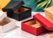
Minimalist Kraft Box Design: Creative Branding Ideas for Modern Packaging
Minimalist packaging design has evolved from being aesthetically driven to a branding tool, especially for brands that want to convey authenticity, modernity, and credibility through their products. As a part of the minimalist branding trend, kraft packaging is a natural progression of the minimalist design philosophy. The rustic look, brown color, and eco-friendliness associated with kraft packaging enable brands to convey their value without the need to add too many design elements to the packaging. It is here that Minimalist Kraft Box Design transcends aesthetics and becomes a language of branding.
Unlike packaging designs that are loud and colorful, minimalist kraft boxes are all about strategic restraint. Simple typography, ample white space, strategic white ink application, and clever logo placement enable consumers to zero in on what really matters: the brand and the product. For new and existing businesses, this design strategy can eliminate unnecessary visual noise while promoting brand recall, especially in a crowded retail and online marketplace.As per the usability and branding studies presented by Nielsen Norman Group, users are more receptive to designs that are simple, predictable, and calm in nature, as simplicity enhances clarity and trust.
From a more technical standpoint, minimalist kraft box design is also simpler to scale for product lines. Whether you are packaging beauty products, food, handmade, or lifestyle products, a minimalist design philosophy is easier for brands to maintain their brand identity while scaling the size and format of the packaging. Kraft paper is also best printed with white ink, which makes branding elements readable without overwhelming the packaging.This is one of the biggest advantages of Minimalist Kraft Box Design.
Understanding Minimalist Kraft Box Design in Modern Branding
Minimalism in packaging is not about removing design value; it is about maximizing visual communication in such a way that every detail has a purpose. In modern branding, Kraft Box Design represents this philosophy by using fewer visual elements and still achieving better brand definition. Contemporary brands no longer use graphics and multiple colors; instead, they emphasize structure, authenticity of material, and design elements that appear functional rather than aesthetic.
Kraft boxes are inherently minimalist because the natural look of the material itself exudes authenticity and sustainability. When brands opt for kraft as the main material, they are essentially using the material as a design element. This aligns with the current consumption pattern of consumers, who are increasingly demanding transparency and sustainability. A study published by McKinsey & Company shows the packaging that conveys sustainability and simplicity through visual elements has a massive impact on consumer behavior, particularly among environmentally conscious consumers.
From a branding perspective, Minimalist Kraft Box Design enables businesses to project confidence. A minimalist design philosophy practiced by brands sends a message that the brand does not need too much information to compete. A logo, font, and space can make a kraft box packaging design recognizable from a distance. This is important for shelf and unboxing experiences because simplicity always looks more luxurious than complex designs.
Consistency is another important consideration for kraft box design in contemporary branding. When packaging design is made simple, it becomes easier to maintain consistency in design across various box sizes and product offerings. This consistency is essential for building brand recall and overcoming design challenges as the business grows. The Interaction Design Foundation’s design principles highlight that consistency and simplicity are the building blocks of good visual communication, as they ease the user’s burden of perception.
Ultimately, the design of minimalist kraft boxes is not something that brands choose based on trends but is rather a long-term strategy for brands. By combining natural materials with minimalist design philosophy, brands are able to create packaging solutions that are modern and relevant for today and tomorrow. This is why minimalist kraft packaging is becoming more popular by the day.
The Visual Psychology Behind Minimalist Kraft Box Design
Packaging design is a very powerful psychological tool in the perception of customers before they even purchase the product. Kraft Box Design is effective because it capitalizes on the way in which the human brain processes visual information, preferring the simple to the complex. When a design is simple and peaceful, consumers are more likely to perceive the brand as credible, of high quality, and genuine.
One of the most powerful psychological tools of minimalist kraft packaging design is the use of natural color and texture. The brown, uncoated appearance of kraft paper automatically suggests natural links with eco-friendliness, authenticity, and simplicity. Such links are particularly desirable in product categories such as food, cosmetics, and health, where consumers are actively searching for natural and sustainably produced products. As a study published in the Journal of Consumer Psychology indicates, visual links with environmental sustainability can have a positive impact on the perceived value of a brand and product ()
Minimalist kraft box design also has the advantage of reduced cognitive load. If the packaging is not cluttered with too many colors, images, and words, consumers can easily identify the brand and the purpose of the product. This is very important in retail and online shopping, where consumers have limited time to focus on a product.
The studies cited by Nielsen Norman Group state that simpler visual designs lead to better understanding and decision-making because the viewer is not required to filter out too much unnecessary information.
Another psychological technique often employed in Kraft Box Design is the use of white space. The white space surrounding logos and words helps to guide the viewer’s eye to the most important parts of the branding, creating a sense of sophistication and confidence. Rather than appearing empty, the white space in well-designed packaging actually creates a sense of purpose and luxury. This design technique is well-known in branding psychology, where simpler designs are often linked to high-end products and contemporary design, as discussed in the design research of simplicity and perception by Smashing Magazine.
Through the understanding of the visual psychology of minimalist kraft box design, brands can make more informed creative decisions that not only impact what the customer sees but also how they feel. When simplicity, material, and spacing are combined, kraft packaging becomes a silent communicator of brand values such as calm, confident, and trustworthy.

Typography Choices for Minimalist Kraft Box Design
Typography is one of the most powerful aspects of Minimalist Kraft Box Design, since text is often the focal point of the packaging. Without much graphic design and color, the use of typography is essential in the perception of the brand. Typography can also be employed to convey sophistication, trust, or innovation without dominating the natural kraft material.
In kraft box design, readability is always given priority over decoration. Simple and well-proportioned fonts are most suitable for kraft materials, where the texture can be utilized to reduce sharp edges. Sans-serif fonts are commonly used for their readability and modern feel, while serif fonts can convey elegance in moderation. Research on typography published by Adobe suggests that the application of simpler font styles can enhance readability and recognition in print media.
Spacing is also crucial in Kraft Box Design. Letter spacing, line height, and margin control are also important to ensure that the text does not look dense against the kraft paper. The liberal use of spacing ensures that the text is readable and that the minimalist design principle of “less is more” is maintained. This design principle also ensures that the kraft material is visible, which is important in maintaining the natural and honest image that many brands aim to project. According to the Interaction Design Foundation, proper typographic spacing helps in reducing visual fatigue and improving information uptake, even in offline applications such as packaging.
Color contrast is also a factor to consider in selecting typography for minimalist kraft boxes. White, off-white, or dark neutral inks are always the best choices, as they provide the best combination of visibility and subtlety. High contrast ensures that the brand name and key product information are visible without compromising the minimalist look. This is especially important in Minimalist Kraft Box Design, where the typography has to call attention quietly rather than loudly.
Finally, the typography in a kraft box design should be functional, not aesthetic. When font selection, spacing, and contrast are balanced in harmony, typography becomes a powerful branding tool that promotes simplicity and reinforces brand identity on every package.
White Ink and Neutral Tones in Minimalist Kraft Box Design
The application of colors in minimalist packaging designs is more about accuracy than variety. In Kraft Box Design, white ink and earthy colors are always preferred because they go well with the kraft material without overpowering it. The minimalist color palette in kraft box designs ensures that the branding elements are always visible while still retaining the raw, natural look that kraft packaging is so famous for.
White ink is also a very effective choice for kraft box designs because it provides a very striking contrast to the brown color of the boxes. White ink is a very understated yet powerful design element that can be best used for logos, brand names, and important messages. In a minimalist design for kraft boxes, white ink represents clarity, sophistication, and naturalness. As packaging studies have been quoted in Packaging Europe, using high contrast with minimal color schemes is a very effective strategy for brands to get a premium look without adding complexity.
Black, dark gray, light gray, and earthy colors can be combined with white ink to create depth without going against the minimalist design. These colors can also be best used for secondary content like product details and legal notices to ensure that the text is readable without impacting the design. In the Kraft Box Design, this approach ensures that the box is neither too dull nor too busy.
The combination of white ink and neutral colors also has the advantage of maintaining consistency in design regardless of the box size. Whether it is a small or large kraft box, whether it is rigid or foldable, a minimalist color scheme is easy to scale. This consistency is essential in building brand recognition and will make future design changes easier. As per branding tips provided by Smashing Magazine, a simple color palette leads to better visual balance and easier brand management.
From a more functional branding standpoint, white ink and monochromatic colors also happen to pair well with sustainability branding. The simple design aesthetic also helps to reinforce the notion of “excess reduced,” which is a very appealing message to the eco-conscious consumer. Minimalist kraft box design accomplishes this through the strategic use of color.
Logo Placement Strategies in Minimalist Kraft Box Design
Logo placement in minimalist packaging design is an important aspect to consider, as every element in the design needs to prove its relevance. In Kraft Box Design, the logo is bound to be the most prominent element of the design, and hence its placement, size, and spacing directly influence the impression of the brand. A logo placed in the right position can create the impression of being confident and clear, while a logo placed in the wrong position can create an unbalanced look despite the clean design.
The positioning of the logo at the center of the design is one of the strategies used in kraft box design.This strategy works best for luxury or boutique brands that aim to give the impression of being elegant and simple. The logo can be placed at the center of the design with ample space around it to let the kraft itself define the brand. Design research published by Nielsen Norman Group indicates that centered and uncluttered designs enable users to understand brand information more quickly because of the visual hierarchy.
The positioning of the logo on the offset or corner, however, can be used to inject some creativity while still adopting the minimalist design. This design approach will give the packaging a modern and unconventional look, which is mostly preferred by lifestyle brands. In Minimalist Kraft Box Design, offset logos should be employed in conjunction with liberal use of negative space to ensure that the design is deliberate and not accidental. According to the Interaction Design Foundation, asymmetrical designs can be beneficial if balance is achieved by using spacing and alignment.
Another element that needs to be taken into consideration in kraft box design is the issue of scale. Using large logos may end up overwhelming the packaging, thus undermining the minimalist design. On the other hand, using small logos may end up being lost against the kraft texture of the box. In kraft box design, it is, therefore, important to use moderate logo scaling. This will ensure that the logo is visible without overpowering the natural design of the box. This will also show confidence in the brand, which does not need to be emphasized in order to be noticed.
In kraft box design, positioning is more important than decoration when it comes to logo positioning.

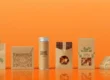
Minimalist Kraft Box Design Across Different Industries
One of the most important advantages of Kraft Box Design is that it can be used in a wide range of sectors. Even though the design is kept very simple and subtle, it is possible to make a few changes to suit the personality and product type.This way, companies can retain their minimalist brand identity while also satisfying industry requirements.
In the beauty and skincare industry, the minimalist design of kraft boxes is utilized to deliver the message of purity, transparency, and authenticity of ingredients. The use of clean typography, white ink branding, and text messaging helps to deliver the message of authenticity and luxury without appearing too commercial. This aligns with the consumer research published by Mintel, which says that “beauty brands that adopt a subtle and natural packaging design approach are more likely to be seen as authentic and ethical by consumers.”
In the food and bakery industry, the Kraft Box Design delivers the message of freshness and simplicity. The use of kraft packaging with a minimalist design approach gives consumers the assurance that the product is natural and processed in a simple way. Small design elements such as icons, product names, and minimalist brand designs help to keep the product in the limelight. According to Packaging Digest, “minimalist food custom packaging helps to improve shelf clarity and enables consumers to distinguish product categories and quality.”
The minimalist kraft box design will also be beneficial for handmade, artisan, and lifestyle brands. These brands usually have a story to tell and are not mass marketable. The minimalist kraft box design with simple branding will help to draw attention to the fact that the product is handmade and give the consumer a personal touch. Design professionals at AIGA assert that a minimalist design is best suited for small brands as it exudes confidence and maturity without requiring heavy production costs.
In all these sectors, the key to the success of minimalist kraft box design is its ability to adapt without losing its identity. This is achieved through the adaptation of typography, logo positioning, and tone, without the need to add more visual elements to the design.
Sustainability as a Core Element of Minimalist Kraft Box Design
In today’s consumer culture, sustainability is no longer a negotiable factor—it is an important element that determines the perception of a brand. The Minimalist Kraft Box Design is a direct reaction to this increasing trend because kraft itself is an eco-friendly, recyclable, and sometimes post-consumer material. Brands can create a luxurious look without the need for too much ink and coating by going for a minimalist design approach in packaging.
The minimalist kraft packaging design also gives off a sense of purpose and responsibility. A design that does not feature unnecessary elements such as graphics, colors, and embellishments sends out a signal that the brand is concerned with simplicity and resourcefulness. As stated by the Sustainable Packaging Coalition, brands that incorporate minimalist packaging designs into their packaging are not only environmentally responsible but also increase consumer trust because consumers have come to associate simplicity and natural designs with responsibility.
The application of white ink and natural colors in minimalist kraft box design further promotes sustainability messages. This is because the application of white ink and natural colors reduces the application of chemical-based ink and synthetic materials. Even the smallest design element, such as the reduction of printed panels and the use of single-color branding, helps to reduce the carbon footprint during the production and distribution process.
Sustainable minimalist kraft box design also involves considerations for the entire packaging life cycle. Those companies that emphasize the importance of recyclability, biodegradability, and reusability in their design considerations are more attractive to environmentally concerned consumers. A study conducted by McKinsey & Company indicates that sustainable design in packaging has a positive effect on consumer purchasing behavior and the development of long-term brand loyalty, especially among the younger generation who are more environmentally concerned.
In summary, Minimalist Kraft Box Design is not just a visual treat; it is the fusion of simplicity and sustainability.
Common Design Mistakes to Avoid in Minimalist Kraft Box Design
While Minimalist Kraft Box Design emphasizes the concept of simplicity, it is actually very easy for companies to ignore design considerations that could result in a lack of impact or clarity. By recognizing the design pitfalls, companies can ensure that their minimalist designs are elegant, clear, and consistent with their brand.One of the dangers of minimalist design is oversimplification. While the point of minimalist design is to simplify and avoid clutter, too much simplification can result in a kraft box design that is incomplete and generic. For example, a logo that is too small, a lack of contrast between important information, or too little contrast between design elements can result in customers being confused rather than led.Nielsen Norman Group suggests that even in minimalist designs, it is important to maintain a good visual hierarchy to communicate information and keep customers’ attention .Another pitfall of kraft box design is a lack of contrast. Owing to the textured, brown finish of kraft boxes, it might be difficult to read light or muted ink. Thin type, fancy fonts, or lines might lead to poor readability, especially in a retail environment with low lighting or while looking at product photos on the internet. In Minimalist Kraft Box Design, white ink or dark neutral colors should be selected carefully to avoid losing readability while maintaining a minimalist design.
Neglecting space and white space is also a design error. The negative space between text, logos, and the edges of the kraft box is essential in Minimalist Design. Too much type or information close to the edges of the box might be distracting from elegance and create a messy appearance, even with the minimalist design. The Interaction Design Foundation strongly recommends using white space to significantly improve readability, reduce visual stress, and add perceived value.
Lastly, some companies neglect scalability and consistency. A minimalist design for a small kraft box may not be scalable or consistent for larger packaging or other product lines. Minimalist Kraft Box Design needs to ensure consistency in all packaging designs to ensure brand recognition and trust.
Therefore, by avoiding all these pitfalls of oversimplification, lack of contrast, poor spacing, and inconsistency, brands can ensure that the minimalist kraft box design remains aesthetically pleasing and consistent with aesthetic and functional considerations.
How Brands Can Stand Out Using Minimalist Kraft Box Design
In a competitive market, Minimalist Kraft Box Design provides brands with an unparalleled chance to stand out without resorting to catchy graphics and bright colors. The trick is to capitalize on the power of subtle design elements that convey quality, creativity, and brand personality while remaining consistent with the tenets of minimalist design.
One such design element is texture and finish. Although embossing, debossing, and spot varnish on a kraft box can provide a lot of texture and sophistication without cluttering the design, this is exactly what brands should concentrate on. Unboxing design is what packaging design professionals from Packaging World advise, and texture in minimalist packaging design is what helps achieve this and leaves a lasting impression on the consumer.
Another design element that brands can concentrate on is logo placement and size. In minimalist kraft box design, the logo frequently takes center stage.The use of centered, offset, or partially hidden logos can give a unique spin to the design while still being readable and simple. This attention to detail can help the packaging of a brand stand out in a crowded market or product showcase.
Branding across product lines is also necessary. A consistent design language in minimalism, like shared typography, color, and layout, is easier to recognize and more credible. Whether it is a small skincare product or a larger subscription box, a consistent design approach will ensure that the brand itself is recognized as credible and detail-focused. The need for a consistent visual identity is emphasized by the research done by AIGA.
Finally, the creative application of functional design elements, for instance, creative closure designs, handle designs, or multi-functional designs, can also be applied in minimalist kraft packaging design. Such functional yet beautifully designed elements are incorporated into the brand narrative without overpowering the design.
By applying the strategic combination of design elements, branding, and functional creativity, brands can differentiate their minimalist kraft boxes. Minimalist Kraft Box Design, therefore, is no longer just a design option but a tool for communicating quality, uniqueness, and intentionality in the marketplace.
Future Trends in Minimalist Kraft Box Design
The world of packaging is constantly evolving, and Minimalist Kraft Box Design is no exception. With the ever-evolving preferences of consumers towards sustainability, authenticity, and functional chic, brands are looking for ways to ensure that minimalist kraft boxes continue to be modern and trendy.
One of the trends that are currently being witnessed is the incorporation of smart and interactive elements. QR codes, augmented reality, or scannable product stories can be incorporated into kraft boxes in a way that does not affect the minimalist design. These interactive elements allow brands to reach their customers online while keeping their offline design clean and minimalistic. According to Packaging Insights, the combination of minimalism and digital interactivity is rapidly becoming the hallmark of retail and e-commerce packaging design.
Another trend that is being witnessed is the use of innovative textures and finishes. While embossing, debossing, and soft-touch finishes have been the rage for a while now, brands are now looking to incorporate eco-friendly varnishes, recycled foil elements, or sustainable lamination to give kraft boxes a tactile and luxurious feel.
Sustainability will continue to be a trend that will influence the future design of minimalist kraft boxes. Organizations are engaged in the adoption of biodegradable inks, plant-based coatings, and optimized packaging designs that appeal to environmentally conscious consumers. According to McKinsey, packaging that embodies environmentally conscious values through the use of materials and minimalism is gaining popularity among consumers, especially Millennials and Gen Z.
Finally, personalization and limited edition designs are gaining popularity. Organizations can adopt a minimalist design strategy and use different designs for special product lines or limited edition designs. This strategy offers value and sparks loyalty, proving that minimalism can be both timeless and dynamic.
Conclusion
In conclusion, by staying at the forefront of these trends, Minimalist Kraft Box Design will continue to be a strategy that embodies beauty, sustainability, and innovation to help organizations reach their consumers in a meaningful and compelling way.
Minimalist Kraft Box Design is not only a design trend but also a design philosophy that includes simplicity, sustainability, and branding. By using the principles of effective typography, logo positioning, white or light ink, and the natural texture of kraft, brands can create packaging design that not only looks modern, luxurious, and premium but also authentic. Minimalist design is more than a design trend; it also represents a positive message about eco-friendliness, consistency, and trustworthiness.
In the years to come, the use of subtle functional design elements, eco-friendly materials, and textured finishes will ensure that minimalist kraft boxes continue to be functional and interesting. Whether you are packaging cosmetics, food, handmade crafts, or lifestyle products, the use of the principles of minimalist design will ensure that your brand gets noticed without using bold graphics and unnecessary details.
For brands that are interested in incorporating minimalist designs with strong and high-performance packaging, you can also look into the Engineering Durable Paper Bags: A Technical Guide for Heavy-Duty Design, which provides valuable information on how to create strong and long-lasting packaging that is also in line with modern branding trends.
If you are ready to take your packaging design to the next level, you can also consider using minimalist kraft boxes.
Q&A: Minimalist Kraft Box Design
Q1: What is Minimalist Kraft Box Design?
A: Minimalist Kraft Box Design is a packaging design philosophy that represents the essence of simplicity, readability, and good design for kraft boxes. It is the art of applying minimal typography, logo design, white ink, and white space to design kraft boxes that exude a sense of modernity, luxury, and eco-friendliness. This design philosophy is all about leveraging the material and the message of the brand to create value rather than through design.
Q2: Why choose minimalist design for kraft boxes?
A: Minimalist kraft boxes are preferred by consumers who are seeking authenticity, eco-friendliness, and luxury. The design philosophy is simple and easy to read, and it also aids in brand recognition. According to a study on branding by Nielsen Norman Group, minimalist designs are easier to understand and process, which is very helpful in retail and e-commerce settings.
Q3: Can minimalist kraft boxes be used for all types of industries?
A: Yes. Whether it is the cosmetic industry, the food industry, or the lifestyle industry, Minimalist Kraft Box Design can be used to suit the needs of different industries.Through typographic, logo, and other detail adjustments, brands can ensure consistency in their identity while also adhering to industry standards.
Q4: What is the role of typography in minimalist kraft box design?
A: Typography plays an essential role in minimalist packaging design, as text is the most visible design element in such designs. Well-designed fonts with proper spacing and contrast make the design more readable and appealing. Sans-serif fonts are generally the most popular for their modern appeal, and serif fonts can be used for their elegant appearance in minimalist designs.
Q5: What is the importance of using white ink and neutral colors in the minimalist design of a kraft box?
A: White ink and neutral colors provide contrast to the brown kraft box, which does not overpower the design. The most important aspect of the brand is highlighted by using white ink and neutral colors, making the design simple and eco-friendly.
Q6: How can I make my minimalist kraft boxes more durable?
A: Although the minimalist design is all about aesthetics, durability is still a factor in packaging designs. Brands can combine both minimalist design and robust materials. For more technical advice on how to design effective and heavy-duty packaging,
Q7: What are the most common pitfalls of minimalist kraft box design?
A: Over-simplification, lack of contrast, insufficient spacing, and poor branding are the most common pitfalls. Each of these factors can negatively impact the clarity, readability, and aesthetic appeal of the packaging, which can have a negative impact on the benefits of minimalist packaging design.
Q8: What is the future of minimalist kraft box design?
A: The future of minimalist kraft box design will include the integration of interactive components, the development of new textures and finishes, a focus on sustainability through the use of biodegradable inks and coatings, and personalized or limited edition designs.