Packaging and Brand Identity: How to Build Recognition Through Design
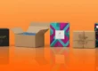
Today, focus is fleeting and savage packaging competition, in a saturated market of products, packaging is more than a box—it’s part of your brand image. It’s frequently the first and last thing individuals see and touch. Excellent packaging design is not only a container for a product; it tells your brand image, establishes emotional bonds, and generates lifelong loyalty.
From the symbolic Coca-Cola red-and-white bottle to the minimalist packaging style of Apple, ingenious brands understand that consistency is paramount: design consistency leads to recognition. This article defines how things such as where a logo appears, color, font, and material play into an identifiable, reliable brand through packaging design.
Why Packaging Is a Core Part of Brand Identity
Your product could be amazing—crafted with love, loaded with features, or full of quality ingredients—without packaging that communicates this brand message, customers will never have a chance to realize its value. With today’s visually driven and emotionally invested marketplace, packaging isn’t a container—it’s your brand’s first impression, voice, and welcome.
Break down the reasons why packaging is so important in creating and forming your brand image:
Visual Identification: Instant Shelf Recognition
Consider some of the biggest brands out there—Coca-Cola, McDonald’s, Apple, Tiffany & Co. You may be able to identify their product on a shelf halfway across the store without even noticing the name. That is the strength of visual recognition.
- Colors, logo position, and unique design features become visual cues to your brand.
- As consumers are stumped by choices at the store or on the internet, easily recognizable packaging increases the chances they’ll pick up your product.
- Consistent visual identification for all brands assists with building recognition and builds long-term loyalty.
Example: Campbell’s Soup can, red and white, has been almost identical for over 100 years, and it’s one of the most steady pantry staples to this day.
Emotional Trigger: Appeal to Emotions in Design
Humans do not purchase products—her products—their needs and their feelings. Packaging is therefore employed as the front-runner for creating the emotional connection that will drive purchase behavior.
- Colors evoke feelings. Blue, for instance, induces trust, green health or eco-friendliness, and pink femininity or softness.
- Textures and finishes—a flat finish, for example, or raised logo—speak to the sense of touch and convey subtly luxurious or quality messages.
- Shape and structure (plain, dramatic, classic) unconsciously lead consumers to place your brand—lighthearted, high-end, eco-, youthful, etc.
Example: An all-natural brand using natural color and kraft paper immediately offers a wholesome, natural, and green feel—without needing to remind you.
Communication Tool: Messaging Without Saying Too Much
Packaging has physical limits in surface area—but not when you have creative design. It is then a superb communication tool. It can tell your story, communicate your mission, and communicate your value proposition—all at once.
- Utilize your packaging to share your brand narrative: your story, what you believe in, or why your product is unique.
- Typography, symbols, icons, and layout can convey lots of information both visually and logically—even across cultures.
- QR code, NFC chip, or plain copy can nudge customers to more engagement through tutorials, brand video, or BTS.
Example: A low-key brand may employ white space, plain typefaces, and bare words to reinforce a “less is more” philosophy, reflecting their transparency and simplicity values.
Trust Builder: Consistency = Credibility
First impressions matter. If a packaging is normal, neat, and quality, it conveys that the brand itself is neat, professional, and reliable. If disuniform or unclean, even a high-quality product within may be shunned or suspected.
- Consistency in design across packaging, website, social media, and advertisements creates an unbroken experience that builds credibility and authority for the brand.
- Carefully selected packaging materials indicate a focus on detail—another key trait consumers link with brand reliability.
- Protective and rugged packaging communicates to consumers that you value safeguarding the product—and, by proxy, the consumer.
Example: In high-end skincare, consumers correlate heavy glass jar, magnetic cap, or foil cap with enhanced performance—before they’ve even tried the formula.
1. Logo Placement: The Anchor of Brand Recognition
Your logo is among the strongest identifiers of your brand. Where and how it appears on your package can play a significant role in recall as well as perceived credibility.
Best Practices:
- Front and Center: Position the logo in the front where it’s prominent—top of a box, middle of a pouch, or center of a bottle label.
- Steady Size and Proportions: No matter whether small or big products, keep the view of the logo consistent.
- Integrated Design: Make the logo a part of other design elements but still recognizable.
Why It Matters
A consistent style-position logo anchors memory. The more frequently and predictably a customer sees your logo in the same style and location, the faster they’ll associate it with quality, trust, or premium—whatever your promise is.
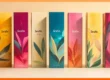
2. Color Psychology: Creating Emotional Resonance
Colors move and motivate purchases—a trend encouraged by decades of psychological study. Consistent use of specific colors for your brand creates a building block of recognition in the consumer’s mind.
Meaning of Color in Branding:
Color | Emotional Impact | Common Use Cases |
Red | Excitement, energy, passion | Food, youth brands |
Blue | Trust, calm, professionalism | Tech, finance, healthcare |
Green | Health, eco-friendliness, growth | Organic, wellness, sustainability |
Black | Sophistication, luxury, power | Premium products, fashion |
Yellow | Optimism, warmth, attention-grabbing | Kids’ products, casual food |
Purple | Creativity, mystery, royalty | Beauty, luxury, spirituality |
Rules for Effective Usage
- Restrict the main brand colors to a single or two colors on all packaging.
- Apply contrasting accent colors for visual hierarchy.
- Apply color consistency in print (use Pantone codes for precision).
Real-Life Example:
Tiffany & Co.’s robin egg blue signature box color is so renowned that it’s legally trademarked—and instantly recognized worldwide across high-end luxury.
3. Typography: Let Your Font Tell a Story
Your hierarchy, font size, and style are all important when defining your tone and brand personality.
Key Things to Consider:
- Font Style: Formality and tradition are suggested by serif styles; clean and modern fonts are sans-serif.
- Readability: Your packaging must be readable at a glance, particularly within shopping environments where time is critical.
- Hierarchy: Employing font sizes and deliberate bolding to channel the reader through key information (brand name → product category → benefits).
Consistency Tip:
Employ the same family font across the website, product box, box, marketing materials. This constructs a voice and constructs recognition.
4. Materials and Texture: Constructing a Sensory Experience
Customers do not merely view your packaging—they handle it and touch it. The material choice (paperboard, glass, plastic, metal) and finishes (matte, gloss, embossing) establish the value that your product is perceived to have.
How Materials Convey Brand Personality:
- Matte finishes convey sophistication and simplicity.
- Glossy textures convey energy and boldness.
- Recycled kraft paper conveys sustainability and green awareness.
- Thick cardstock or sturdy boxes convey luxury.
Why It Matters:
Sensory memory is powerful. A touch of class can set your brand apart and become part of your DNA. Think opening an iPhone box—so experience is designed.
5. Storytelling Through Packaging
Packaging must and should communicate a story of the company’s history, mission, and values.
Good Storytelling Strategies:
- Back-of-Pack Copy: Share a personal experience, reason behind your brand, or interesting fact.
- Images and Icons: Use pictures to show your products’ or ingredients’ path.
- QR Codes or Augmented Reality Features: Involve customers in learning about your brand on the internet with scans or interactives.
Result?
You shift from being another product to one that can be associated with by customers on an emotional and personal level.
6. Consistency Across SKUs and Product Lines
Having 5 or 50 products, having package design consistency throughout your whole product line provides more brand consistency.
How to Make it Consistent:
- Adhere to a design system with rules of layout, color usage, logo position, and typography hierarchy.
- Alter colors or icons utilized to tell apart various flavors or versions, but keep overall identity intact.
- Bring structure and material selection to seem highly similar to uniform shelf presence.
Case Study:
Clean white typography and black pots are used across the product range by Lush. Regardless of differing smells, sizes, or uses, customers instantly recognize it is Lush.
7. Packaging as a Marketing Tool
Your package may be your top-performing ad space—particularly for direct-to-consumer (DTC) companies or subscription boxes.
Marketing Levers in Packaging:
- Social Media-Worthy Packaging: Strong, stunning packaging makes consumers want to film their unboxing on the internet.
- Call-to-Actions: Positioned on-cue like “Share your unboxing” or “Scan for rewards.”
- Limited Editions or Seasonal Themes: Lock down your brand identity without getting stale.
Packaging is not the end of the sales journey—it’s somewhere in the middle with the consumer and usually a big brand touchpoint.
Conclusion
It takes a long time to establish a lasting brand identity—it’s the culmination of purposeful, thoughtful, and repeatable design choices. By uniting your packaging components—logo, color, type, material, narrative, and form—you create an emotional and visual connection with your buyers.
Where consumers are overwhelmed by options, make your packaging the mark that guides them back to your brand—forever.