Paper Bag Logo Design Best Practices
Paper bags are not just bags. They are mobile advertisements for your brand. When someone takes your bag, others notice it too. That is why the logo on your paper bag really counts. A good logo gets people to remember your brand. A bad one is simply a lost opportunity.
In this article, you will discover how to create the perfect paper bag logo design. We will discuss colors, fonts, sizes, and positioning. We will also provide some tips on how small businesses can stand out. Let’s begin.
Why Logo Design Matters on Paper Bags
Your logo represents your story in one image. It reflects who you are and what you stand for. A great logo creates trust. It gives individuals the impression that your brand is professional and trustworthy.
Paper bags with custom packaging are utilized in food, fashion, gift, and retail ventures. In all these sectors, your logo on the bag creates an association with the purchaser. It also indicates to other individuals that someone made a choice between your brand. That’s word-of-mouth for free.
If your logo appears legible and attractive on the bag, individuals might even reuse the bag. That is good for the planet and good for your company.
Key Points in a Good Paper Bag Logo
When creating the ideal paper bag logo, it is all about a few basic things.
- A Simple Design
Simple designs are memorable. They also appear nice when printed in tiny sizes. Do not use a lot of colors, words, or thin lines. Consider highly recognized brands like Nike or Apple. Their logos are simple and clean.
- Take Advantage of Strong, Simple Fonts
Use a legible font. Thin or curly ones don’t print well. Bold fonts print better on paper surfaces. Ensure that your business name reads easily from afar.
- Select the Appropriate Colors
Use 2–3 colors maximum. Use colors reflecting your brand. For instance:
- Green conveys eco-friendliness or nature.
- Black conveys luxury.
- Red is attention-grabbing.
- Pastel colors are soft and adorable.
Also, keep in mind that some bags are made of brown Kraft paper. So, try your logo colors on real bag material.
- Make It Scalable
Your logo must be scalable. Your logo will be amazing, whether big or small.
A big logo can go on the front. A small one might be required for a sticker or tag. Ensure both versions look crisp and clean.
Where to Place the Logo on the Paper Bag
Logo positioning is a big deal. Don’t just stick it anywhere. The best positions are:
- Center Front
This one’s the most popular. The center commands attention. It’s also the least expensive to print.
- Top Center
Use this if you want to leave room below for a message or pattern.
- Bottom Corner
Use this for simple designs. It’s classy and understated.
- Both Sides
Some companies print the logo on both the front and the back. This allows for visibility from everywhere.
Logo Size Guidelines
Don’t get the logo too small or too large. If it’s too small, nobody can read it. If it’s too large, it will look cheap or forced.
A size that is good is about 30–50% of the width of the bag. On an average medium-sized bag (8 inches wide), your logo should measure about 3–4 inches wide.
Logo Printing Techniques
Various printing methods may influence the way your logo appears.
- Screen Printing
Suitable for bold, single-colored logos. Budget-friendly and explicit.
- Digital Printing
Suitable for full-color logos or gradients. Ideal for smaller quantities.
- Hot Foil Stamping
Adds a metallic, shiny finish. Suitable for high-end brands.
- Embossing or Debossing
Imparts a 3D effect. This provides texture and makes your logo stand out.
Select a method depending on the style of your brand and your budget.
Tips to Make Your Paper Bag Logo Stand Out
Even little tricks can make your bag special. Experiment with these ideas:
- Add a Tagline
A brief line under your logo will tell your brand’s story. Be brief and concise. Example: “Fresh Bakes Daily” under a bakery logo.
- Incorporate Texture or Patterns
Incorporate light patterns or texture in the background of the logo. It gives attention without diminishing attention.
- Utilize Brand Colors Within the Bag
You can make the exterior simple and a surprise color on the inside. It is one little detail that makes it feel luxurious.
- Include Your Website or QR Code
This makes your bag a promotional piece. One can scan the code or browse your site with ease.
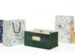
Top Logo Designs for Paper Bags
Let us consider some logo designs that will suit paper bags.
Minimalist Logo
Simple lines, minimal colors, and plain fonts. Suitable for fashion and beauty brands.
Example: A circle logo with the company name in black on a brown Kraft bag.
Hand-Drawn Logo
Looks warm and personalized. Suits best for organic or handmade products.
Example: A soft pink or green flower sketch with the brand name.
Bold Modern Logo
Stronger shapes and heavier fonts. Suitable for tech, streetwear, or food delivery.
Example: White letters inside a red square.
Vintage Logo
Old fonts and badge look. Suitable for gift stores, bakeries, or coffee shops.
Example: A classic text with a small icon in the center of a circle logo.
Mistakes to Avoid in Paper Bag Logo Design
Ducking up mistakes saves money and makes your company grow faster.
- Don’t Use Too Many Colors
Too many colors can be expensive to print. They also make your logo hard to understand.
- Don’t Pick a Weak Font
Thin fonts may fade or break when printed. Stick to bold, clear letters.
- Don’t Place the Logo Too Low
If the logo is too close to the bottom, it might fold or get covered.
- Don’t Forget to Test Print
Always ask for a test sample. Check colors, size, and placement before placing a bulk order.
How to Test Your Logo Design
Testing is easy and cheap. Here’s how to do it:
- Print your logo on plain paper.
- Tape it onto a sample paper bag.
- Step back and look from a few feet away.
- Ask team members or friends what they notice at first glance.
- Ensure the logo is legible and prominent.
Working with Eco-Friendly Inks and Materials
Lots of people adore brands that take care of the planet. Demonstrate this in your design decisions.
- Use soy-based or water-based inks.
- Select recycled or Kraft paper bags.
- Print single-sided to conserve ink and cost.
- Print “eco-friendly” on the bottom of the bag if applicable.
- This indicates your brand is responsible and contemporary.
Best Practices by Business Type
Various businesses require various types of logo design. Here’s the way to conceptualize your own.
Food and Bakery Shops
- Employ appetizing, vivid colors such as yellow, red, or brown.
- Display icons such as cupcakes or coffee cups.
- Employ fonts that are lively and cozy.
Fashion Stores
- Select black, white, or pastel shades.
- Employ a chic, clean font.
- Opt for a little centered logo.
Gift Shops
- Employ cute or artistic symbols.
- Attach ribbons or texture around the logo.
- Make it special and personal.
Skincare or Wellness
- Use soft blues, greens, or beige.
- Minimalist or hand-drawn styles are the choice.
- Minimalist or hand-drawn art is the preference.
- Give the impression of calmness and peace.
Rebranding? Update Your Bag Logo Carefully
Change your logo slowly if you are changing it. Let your buyers know why. Change your paper bags only after the logo is completed.
Old and new logos together confuse consumers. Ensure your new logo aligns with your brand values.
Cost-Saving Tips for Small Businesses
If you are beginning, here’s how to save:
- Utilize plain Kraft bags and imprint your logo.
- Print single-color logo only.
- Utilize stickers with your logo rather than printing directly.
- Buy in bulk to achieve lower costs.
- Begin with a small logo size on only the front side.
- You don’t have to spend a lot. Clever decisions still look fabulous.
Final Thoughts
Paper bag logo design is plain but effective. It creates your brand, communicates your message, and generates free exposure. A good logo informs people about who you are. It makes them remember you.
Make it simple, bold, and understandable. Choose the right size, colors, and positioning. Test first before printing in bulk.
And above all, ensure that your logo suits your brand voice. Whether cookies, clothes, or candles—your bag can talk.
Take your time, plan carefully, and let your paper bag do the talking.
FAQs
Q 1: What makes a good paper bag logo?
A simple, bold, and legible design with brand-matching colors.
Q 2: What size should a paper bag logo be?
Around 30–50% of the bag’s width for balance and visibility.
Q 3: Which colors work best for paper bag logos?
2–3 brand-aligned colors that contrast well with the bag material.
Q 4: Where should I place my logo on a paper bag?
Center front is most popular; other options include top center or both sides.
Q 5: How can small businesses save on logo printing?
Use stickers, single-color prints, or bulk ordering to reduce costs.