The Psychology of Color in Packaging
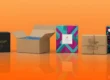
What do you observe first when you look at a box of a product? For most individuals, it is the color. Colors get us in good moods, relax us, energize us, or even make us hungry. That’s why firms carefully use colors on their packages.
Color can distinguish a product on an overcrowded shelf. Color in packaging can help people believe in the firm. There are colors to indicate that a product is safe. There are colors to make the product appear fun or high-class. This is referred to as the psychology of color. It is the manner in which color influences the manner in which people think and feel.
In this article, we are going to learn how colors function on packaging. We are also going to learn how to choose the proper colors for your product. This will assist you in making a powerful brand and boosting sales.
What Is Color Psychology?
Color psychology refers to the effect of colors on the emotions and behaviors of individuals. Various colors evoke various feelings in individuals. Red, for instance, can give people an energized feeling. Blue makes them feel secure and safe. It is due to this reason that intelligent brands employ color to connect with their clients.
Colors can also be evocative. Green, say, might remind you of health or nature. Pink might remind you of sweetness or concern. So if you are selling a health drink, green might be the way to go. But if you are selling toys, red or yellow might do better.
How Colors Affect Brand Image
Color does not exist solely for aesthetics. It is a tool for constructing your brand. The colors you use might tell a great deal about your company. If your packaging has muted, soothing colors, individuals might think that your brand is gentle and supportive. If your packaging incorporates bold, rich colors, it could look professional or high-end.
Your customers make a buying decision within seconds. Colour assists in this instant decision. Proper selection of colour gets your brand recognized. Others also tend to believe in your product if the colour appears appropriate to them.
Selecting Proper Packaging Colors
Selecting the proper color relies on three factors:
- Your product
- our brand
- Your customer
For example, if you are selling baby lotion, you will use gentle and angelic-looking colors such as white, light pink, or light blue. If you are selling an energy drink, you will use strong and dark colors such as red, black, or neon green.
Also, always keep in mind who is purchasing your product. Are they kids, teenagers, adults, or senior citizens? Teenagers might enjoy energetic and lively colors. Senior citizens might enjoy conservative and relaxing colors.
Meaning of Common Colors in Packaging
Let us consider some frequent colors and what they convey in packaging design:
Red: Energy and Urgency
Red is strong. Red grabs attention immediately. It energizes and stimulates people. That’s why red is used so widely on packages of foods such as chips or soft drinks. Red will also produce a sense of urgency, which is perfect for sales.
Too much red is too powerful. Use it sparingly, particularly when you are selling peaceful or natural products.
Blue: Trust and Calm
Blue is safe and reassuring. Blue is reliable and serene. Blue is used by many tech, healthcare, and cleaning companies. Light blue is soft and gentle. Dark blue is serious and strong.
If you need your company to be clean and honest, blue is a good option.
Green: Health and Nature
Green reminds us of nature, freshness, and health. Green is used a lot in green, organic, and healthy products. Green is also utilized to portray a soothing and natural sensation.
If your company is nature-friendly, then green is a powerful color for your package.
Yellow: Happiness and Warmth
Yellow is the sun’s color. Yellow makes people smile and feel lively. Yellow heats people up and raises their spirits. Yellow is used by brands that want to be light-hearted and playful.
Too much bright yellow, however, is excessive. It works best with lighter colors.
Black: Luxury and Power
Black is elegant. Black oozes luxury, authority, and mystery. Luxury brands adopt black in order to appear glamorous and high-end. You can also use it with gold, silver, or white.
Black is suitable if you wish to make your product luxurious and unique.
White: Naivety and Simplicity
White is clean and fresh. It conveys purity and honesty. White is also used by medical and skincare companies to a great extent. White also works well with pale or pastel colors.
White space in packaging also provides the product with a modern and easy-to-grasp feeling.
Pink: Confectionery and Love
Pink is gentle and soft. Pink tends to make individuals think of sweets or romance. Pink is also trendy in cosmetics, gifts, and children’s products.
Bright pink is adventurous and playful. Light pink is loving and soothing.
Orange: Warm and Adventurous
Orange is a mix of yellow and red. Fun and energy are taken along with orange. Orange is imaginative, friendly, and adventurous. Orange is usually applied in children’s toys, drinks, and snacks.
If you wish your product to be happy and distinctive, orange will do.
Purple: Luxury and Imaginativeness
Purple is what comes to mind when one is thinking “regal.” Purple means creativity, luxury, and wisdom. Purple is used in cosmetics, chocolate, and health products.
It’s not used as much as other colors, so it’s special.
Cultural Meanings of Color
Colors can mean something other than in other countries. For example:
- White symbolizes purity in the U.S. But in some Asian countries, white is used in funerals.
- Red is lucky in China but dangerous elsewhere.
- Next, if you are selling to the whole world, find out what colors mean everywhere. Then you won’t be confused or make a mistake.
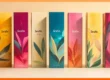
Color Combinations That Work
One color is strong. But when you do two or more colors well, your packaging can be even stronger.
Here are some good color combinations that work:
- Black and gold – indicates luxury and power.
- Blue and white – conveys safety and cleanliness.
- Red and yellow evoke fun and excitement.
- Green and brown – feels natural and green.
- Pink and white – feels sweet and gentle.
Choose colors that match your brand mood. Also, ensure the colors are appropriate for your logo and design.
Using Color to Guide the Buyer
Smart brands employ color to direct the buyer. For instance:
- A cereal box may employ red for strawberry and blue for blueberry.
- Green can be used by a skincare line for oily skin, and pink for dry skin.
- This makes it easy for shoppers to find what they need. It also makes the shelf look more organized.
Utilizing Contrast for Improved Readability
Always think about contrast when choosing colors. Contrast refers to the difference between two colors. High contrast is readable.
For example:
- Black text on a white background is readable.
- White on a yellow background isn’t readable.
- Bad contrast damages your custom package. If they can’t read the label, they might not buy the product.
How to Test Color in Packaging
Don’t make an educated guess about what will occur. Test it with actual people. You can do:
- Small focus groups
- Surveys
- A/B testing (test two options and see which sells more)
- This way, you can determine what colors your consumers prefer. You might be surprised.
Color Trends in Contemporary Packaging
Trends evolve over time. Here are some of the emerging color trends for packaging:
Soft Pastel Colors
Pale blue, baby pink, and pale green pastel colors are trending nowadays. They are soothing and contemporary. Many baby and clean beauty brands employ them.
Earthy and Natural Tones
Tan, brown, and olive green work great on green products. They are natural and homemade-looking.
Neon and Bright Colors
Neon pink, electric blue, and bright orange pop. They grab people’s attention online and on store shelves. They are trend-setting for Gen Z brands.
Metallic Colors
Gold, silver, and bronze have an upscale appearance. Use them on premium editions or high-end products.
Color Psychology in Online Shopping
In e-shops, the color of packaging is even more crucial. Why? Because customers can’t touch the product. They get to see only the image.
Vibrant and clean color choices thus gain attention online. Bright colors also capture attention on the small screen of mobiles. Always check your pack shots to understand how they look on mobiles and tablets.
Color Blunders to Avoid
The following are some typical blunders to be avoided:
- Putting too many colors to use – It’s messy and confusing.
- Using not enough color contrast – You can’t read the text.
- Copying other companies’ examples – You lose your own identity.
- Ignoring your audience – Use colors your customers enjoy.
- Overusing color meaning – Colors convey a message even without words.
- Carefully think out your use of colors. Good design takes patience.
How Small Businesses Can Use Color Psychology
You don’t have to have a huge budget to get color to work. Small companies can:
- Select one or two lead brand colors.
- The logo fits with the packaging.
- Use colors that are consistent with the product’s mood.
- Keep the design clean and simple.
- Repeated use of color builds trust. Eventually, people will recognize your brand from your colors alone.
Final Thoughts: Use Color to Tell Your Story
Color is a powerful tool in packaging. It tells your brand’s story without words. It creates trust, commands attention, and makes people remember you.
With the right colors, your package will not only guard the product. It will talk to the customer’s heart and mind.
Begin with what your product is. Consider who your customer is. Select colors that reflect the mood you desire to achieve. Continue testing and fine-tuning.
Color has the ability to take a mundane box and make it a compelling brand message.