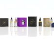
The Role of Fonts and Graphics in CBD Packaging
Nowadays, packaging plays an enormous role in the growing market of CBD. Wrapping just some form of product is not it, but the look of a box tells a customer what kind of brand it is. First of all, people note fonts and graphics. Such little details make simple packaging catchy and memorable.
A good packaging design will make a company’s CBD packaging products stand out from the crowd. The fonts and graphics together can make the product look trustworthy, stylish, and professional.
First Impressions
First impressions mean everything, and design speaks volumes before words can when customers first set their eyes on your CBD product. Be it a bold font or simple graphic, it might tell a story about the quality and purpose of the product.
Attractive packaging makes the appearance of the product look appealing, thus giving an idea about the product inside that seems worth trying. Fonts and visuals guide the customers toward trust and interest even before reading the label.
Fonts in the Design of CBD Packaging
Fonts are not just letters; they show the personality and explain the message of your brand. The right font will make custom packaging look natural, luxurious, modern, or calming. In the case of CBD packaging, the font style explains what it is that the brand stands for.
The Power of Font Style
Font pairing style can make a difference in the way people feel about a product:
- elegant means classy and luxurious
- clean and simple ones mean pure and honest
- handwritten or script fonts give a friendly and natural look
Even the style of the fonts of CBD brands reflects the suitability to their product type. While a wellness product might use soft and simple fonts, sleek and elegant ones would be used for a luxury CBD oil.
Readability First
While beautiful fonts do matter, easy reading is way more important. When people aren’t able to read the name or other information, they lose interest in it. Clear fonts maintain professionalism in design and make it user-friendly.
Fonts that are simple and bold by nature seem to work on the CBD boxes due to the simple fact that they can easily be read from a distance.
Font Size and Placement
Font sizes and their placements act as guides to the eyes. The brand name font size is usually bigger in order to catch the attention of the customer, while information detailing the product, for example, ingredients, or how to use the product, is normally in smaller fonts.
Good balance in the layout creates neat and organized packaging, while proper spacing also maintains cleanliness and readability of the text.
Matching Font with Brand Personality
Every brand theme will have something else that’s going to set them apart in style, and fonts really should reflect that. A brand that’s more organic or natural could use soft, earthy fonts. High-end CBD may want to use thin and minimal fonts to get across a modern feel.
Font choice creates emotional connection. When the design feels right, customers have confidence in choosing that brand.
Packaging Design for CBD: Infusing with Graphics
Graphics can tell a story without words. In relation to CBD packaging, graphics can represent nature, serenity, or recovery. In fact, this kind of visuals helps customers attach themselves to the reason behind the product.
Meaning of Graphics
Each picture and symbol in packaging means something:
- leaves and plants, or drops of oil, appear on so many packagings just to show purity and natural origin
- soft lines and simple icons create peace and balance
- bright shapes bring energy and fun
Graphics help customers understand what the product is about even before reading.
Brand Awareness Creation
Repetition of the same graphics every time makes the brand memorable. If the same logo, color, or symbol appears on every box, then the customer starts recognizing it easily.
Graphics make the products stand out on the shelves. A creative design makes a brand more visible among its competitors.
Balance of Graphics and Text
Good packaging has a balance between text and graphics. Too many visuals confuse the viewer, while much text makes it boring. Both should work in harmony together.
The graphic should enhance, not overpower, the font. Together, they will create an appealing visual story.
Product Purpose through Graphics
Graphics explain, too, what the product does. A soft leaf or hand icon can represent a care product like a CBD cream. A CBD oil of calmness could be depicted with smooth waves or natural patterns.
Such visuals guide the customer’s emotions and create confidence.
Color, Fonts, and Graphics Together
Colors, fonts, and graphics interact best when they support each other. Soft greens or beiges really complement natural CBD products. Black, gold, or deep green conveys a high-quality feel for high-end packaging.
All of the elements combined create balanced and professional packaging. If the font, color, and graphics are combined in a bad way, it will turn an otherwise good product into an unprofessional one.
How Fonts and Graphics Affect Buying Decisions
Design directly affects buying behavior. A neat and stylish box may attract a customer and have him or her reach for the product over the others. Fonts create trust, and graphics create emotion.
Every time consumers see relaxing fonts and natural visuals, they associate those with relaxation and wellness. If the fonts are bold and of a high-end look and feel, there is a feel of quality and value. These very simple design choices push the buyer to make a purchase.
CBD Packaging: Trends in Fonts and Graphics
The trend of packaging has changed with time, and similarly, the packaging of CBD follows each new trend.
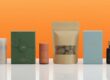
Minimalist Designs
There is a high demand for clean and simple designs with soft colors and light fonts. This gives a natural and pure feeling that coincides with the image of the CBD brand.
Nature-Inspired Graphics
A design featuring natural patterns, leaves, or landscapes would be a trend in packaging related to CBD. A design like that would remind one of organic and eco-friendly attributes.
Geometric Shapes and Icons
The modern brands use neat geometric shapes. This gives a sharp, organized look to the CBD products.
Hand-Drawn Elements
Hand-drawn and sketch-style graphics add that human touch. They exude a warm and honest image that so many customers seem to love.
Brand Identity Building with Fonts and Graphics
Strong font and graphic design create a very clear brand identity. Recognition, and hence trust, will be built when the same design style appears on all the packaging.
For example, if a brand is using calm fonts along with soft green leaves, then that is its signature look, and its clients start remembering it with that visual identity.
Consistency in design creates loyalty and provides a sense of quality.
Environmentally Friendly Modern Printing of Fonts and Graphics
Today, brands care about sustainability too. Printing is done in an eco-friendly way to contribute to reducing waste and keeping the planet safe. Beautiful packaging can be responsible by using soy-based inks and recyclable materials.
Modern printing encompasses the techniques for digital and offset printing, which can produce clear and colored graphics. With such techniques, each design appears fresh and professional.
How to Choose the Right Font and Graphics for CBD Packaging
Which design to use depends on the product and target audience. Here’s a rundown of some key things to consider:
Use fonts that reflect the tone and purpose of your brand.
Text should be clear, clean, and easy to read.
Use relevant graphics that relate to the product’s benefits.
Never overload the design with too many visuals.
Keep color, font, and imagery consistent.
A good design, planned effectively, will appeal to the targeted audience and make it likable.
Common Mistakes to Avoid
Even minor design faults can hurt the product’s image. Some of the common mistakes include:
Too many kinds of fonts
Choosing unreadable or very fancy fonts.
Adding too many graphics that distract from the message.
Ignoring color harmony between the text and visuals.
Thus, avoiding these mistakes will keep packaging neat, elegant, and effective.
The Future of CBD Packaging Design
As time goes on and the CBD market continues to grow, there will be more evolution in packaging design. In the future, there will be more personalized and environmentally friendly styles. Fonts and graphics will also be much more creative for storytelling.
Moreover, modern technologies will enable more advanced printing options, better color accuracy, and interactive designs. Smart packaging can also apply QR codes that tell more about the product story.
Conclusion: Fonts and Graphics Define the Look of the CBD Brand
More than design tools, fonts and graphics are silent messengers that tell a story. Together, the right combination elicits emotion, builds trust, and identity in CBD packaging. It is when fonts speak clear that graphics add meanings; then, packaging is one of the most powerful marketing tools.
Thoughtful design not only draws attention but also keeps customers coming for more.
Frequently Asked Questions
Q 1: Why are fonts important in CBD packaging?
Fonts show the style and purpose of a product. They create an impression of it and make the reading of text easy.
Q 2: How do graphics help in packaging design?
Graphics tell a story without words. They make packaging attractive and explain the product visually.
Q 3: What font is most appropriate for CBD packaging?
Clean, simple, and readable fonts are the best. They give a professional and trusting look to the design.
Q 4: In what ways does design influence sales?
A box well in design catches the attention, creates trust, and guides customers toward choosing the product more quickly.
Q 5: What is the current design trend when it comes to packaging for CBD?
The minimalist design with nature-inspired motifs and geometric configurations that give off a modernistic clean look.