Why Minimalist Tincture Packaging Sells More
In this busy retail world, packaging speaks before the product does. Often, the simplest design catches more eyes than the loud one. Most brands in this modern era go with minimalist tincture packaging. It looks clean, elegant, and professional. Customers like everything that seems straightforward and honest, and that’s why such minimal designs lead the sales in the market these days.
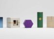
What is Minimalist Tincture Packaging?
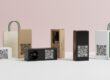
Minimalist packing in tincture means showing more with less. It focuses mostly on simple colors, fonts, and clear labeling. Other than that, many images or bold prints are avoided; instead, it keeps the box or bottle design calm and neat. The attention should go to the product, not just the package.
A minimalist design will make the product look natural, high-quality, and modern. It saves the cost of printing and reduces waste, hence assisting in attaining eco-friendly goals.
The Popularity of Minimal Design
Modern customers like designs that look peaceful and simple. The world is full of ads, bright colors, and noise. A clean design brings a sense of calm and trust. Such a minimalist tincture box will definitely catch one’s eye in any store or online due to its elegance. It also fits the trend, which lately has grown for sustainable and natural living.
Successful brands use minimal design today because it speaks to the concept of purity and wellness. This approach would, therefore, be in complete accord with tincture products created for health and balance.
Psychology Behind Minimalist Packaging
Simplicity feels honest
Simplicity in packaging builds trust: when the box looks clean, it seems that the brand has nothing to hide. A neat design sends a message that the product inside is pure and reliable.
Less Confusion, More Focus
Too much information would just confuse the mind. A minimal design allows clarity of information without a visual overload. Immediately, the customer sees what the product does and how it helps.
Premium & Peaceful Outlook
A minimalist package feels serene. It looks high-end without the necessity of shiny prints or loud art. The mix of simplicity and luxury has drawn both new buyers and repeat buyers.
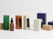
Key Elements of Minimalist Tincture Packaging
- Simple Color Palette
Mild colors are best, like white, beige, or earth tones. One or two colors are enough to keep the design calm and pleasing to the eyes. You can add a touch of gold or black to make it more premium.
- Clear Typography
Clean fonts make the name of the product easily readable. Serif and sans-serif styles with proper spacing are useful in creating neatness, while it is also important that the placement of text should be balanced to improve visual harmony.
- Limited Graphics
Less packaging uses fewer images or icons. One simple logo, small symbol, or clean line often says much more than many pictures. It keeps the concentration on the brand name and product benefits.
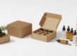
- Quality Material
The texture and quality of the paper or cardboard matter a lot. Smooth kraft papers, matte finishes, and embossed designs provide a natural and premium feel. Environment-friendly materials also appeal to buyers who show concern for the environment.
- Smart Labeling
What a label needs is only the most important information. The product name, ingredients, size, and usage instructions will suffice. A clutter-free label instills confidence and clarity.
Why Minimalist Packaging Sells More
- Fast Brand Recognition
A simple design allows customers to remember a certain brand easily. Clean visuals and an appropriate color palette make the product visible on store shelves and online listings. After repeated exposure, a strong recall is built.
- Modern and Trendy Appeal
Minimalism fits the lifestyle of today’s customers. Modern buyers love clean branding design, and that is especially true for wellness and beauty products. Tinctures with minimal boxes seem up-to-date and stylish.
- Easy to Read and Understand
Very often, buyers decide in seconds. A clear label helps in quick reading. Therefore, when ingredients and uses are available at a glance, the choice becomes simple. This fast understanding enhances sales.
- More Trust and Transparency
Minimal packaging creates a feeling of honesty. Nothing superfluous is used in decoration, and there is nothing hidden. The brand seems transparent, and trust follows automatically. People are more willing to choose a product that looks open and clear.
- Professional and Premium Look
Even with a low design cost, minimalist tincture boxes do look professional. The design gives a high feel and does not use many colors or heavy patterns, therefore making the product valuable and well-made.
- Natural Product Image Matching
Tinctures often come from herbs and other natural ingredients. That minimalist look supports that image: pure, organic, close to nature, and fitting health-conscious customers very well.
Minimalism and Brand Identity
A simple design builds a solid brand identity. When every box is following one clear style, that creates unity in appearance, it creates a confident and consistent brand.
Minimum packaging can easily associate a logo, color, or font with the brand. Over time, the customer recognizes it at once, and that silent connection creates loyalty and long-term sales.
Eco-Friendly Advantage
Minimal packaging contains fewer materials and eco-friendly ink. This reduces general waste, taking care of the planet. Many customers now prefer brands that show care for the environment. A simple kraft box with natural tones can send a green message for your brand. It actually tells your customers that your brand cares for more than just profit.
Economical Yet Elegant
The minimalist designs use less ink, fewer colors, and simple layouts. This reduces printing costs since the quality remains unaffected. Money saved on these could go into better materials or the improvement of the product in some other way. Thus, it results in an elegant-looking yet affordable product.
Minimalist Design in Online Sales
Better Photos, Better Sales
The first impressions about the product come through product photos in online stores. Minimal packaging photographs really well. The clean look is visually appealing against digital backgrounds and appeals to modern buyers who scroll fast.
Clarity in the Product Listings
Online shoppers read packaging details from the images; a minimalist label makes sure visibility is clear. Clean typography with limited text means information is easily decipherable, even on small screens.
Creates a Luxurious Digital Presence
Sleek minimalist tincture packaging translates to sophistication on both eCommerce websites and social media. It creates that feeling of luxury and well-being that online brands try to convey. It enhances visual appeal and conversion rates.
Minimalism in Retail Stores
Shelf Impact
In crowded stores, a lot of boxes compete for attention. Among loud patterns, a simple design creates a break. Shoppers’ eyes naturally stop at something calm and elegant. This pause increases the chance of purchase.
Better Brand Placement
Retailers also like the appearance of neat, orderly products. Minimal boxes line up well on the shelves, improving the overall in-store display. This professional look appeals to stores and customers alike.
Common Mistakes to Avoid in Minimal Packaging
The minimalist design still needs balance. Too little detail can easily confuse or appear unfinished. Important details, such as ingredients, warnings, or expiry dates, need to remain clear at all times.
Fonts should remain readable at even the smallest of sizes. Also, while using plain colors, the contrast should remain strong enough to highlight the main information.
Minimalism should look simple, not empty. Every design decision should have purpose and clarity.
Tips to Create Successful Minimalist Tincture Packaging
- Focus on Core Message: Only that which is really vital should remain on the package. Each word and each design element should have value.
- Choose the Right Material: Choose strong, yet natural materials. Recycled kraft paper or matte-finish cardstock works best with minimalist designs.
- Brand Name Highlight: Place the logo or brand name clearly, yet not to overpower everything else in the design.
- Balance Space and Text: White space is the breathing room for your design. Balanced spacing keeps it clean and easy to look at.
- Add Subtle Texture: Embossed logos or touches of foils can add an element of luxuriousness without breaking the theme of minimalism. A little bit of texture brings sophistication.
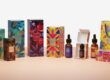
Case Study: Success Through Simplicity
Most plant-based and CBD tincture brands have moved onto minimal packaging, and the results are obvious in sales growth. For example, one wellness brand changed its busy labels for soft beige boxes and clean fonts; in months, sales increased because customers found the new design both easier to trust and remember.
The brand message got stronger, and on-shelf and online, the product looked more premium. This just goes to prove how simplicity can often bring in more profit than complex artwork.
Consumer Behavior and Minimal Design
People often shop with emotions, not with reason. A clean design feels calm and trustworthy; when packaging feels peaceful, it reflects purity and care. This is a huge part of why minimalist tincture packaging sells better. It invites confidence and loyalty at the very first glance.
Sustainability as a Selling Argument
Eco-friendly minimalist boxes fall in line with the world’s environmental values. Using recyclable paper and soy-based inks gives it an appeal to green-conscious customers. Most buyers nowadays prefer products with low carbon footprints. A minimalist box uses less material, so it’s stylishly sustainable. This adds one more reason for the higher sales.
Minimalist Packaging in Luxury Branding
Luxury doesn’t have to mean gold or glitter. Many high-end brands use clean whites or soft pastel designs to provide class. Minimalist tincture packaging offers that same premium feel but at a far more affordable cost. It proves true luxury is about quality, not decoration. This would appeal to both premium and budget buyers alike.
Future of Minimalist Packaging
Minimalism isn’t a fad; it’s a direction. As the influence of digital grows, and with growing awareness of sustainability, clean design will remain powerful. Most probably, tincture packaging in the future will be printed with even smarter printing methods while using eco-materials and retaining the same simple look.
The focus will remain on authenticity, purity, and function. The minimalist trend will keep guiding brands towards clear and meaningful presentation.
Conclusion
Minimalist tincture packaging has revolutionized the way things look and are sold. This clean look brings peace, trust, and elegance to the market. Simplicity makes them concentrate on what really matters: the quality inside. A calm design instills confidence, supports sustainability, and appeals to online and in-store buyers alike.
Every clean line, soft color, and neat font sends a message of care and honesty. That’s why minimalist tincture packaging keeps selling more and stays ahead in modern branding.
Frequently Asked Questions
Q1: What colors should be used for minimalist tincture boxes?
Neutral tones, therefore, include white, beige, brown, or soft pastels. They give a clean and calm look.
Q2: Does minimalist packaging cost less?
Yes, it does. Fewer printing materials are used, and the layouts are simple, reducing the cost of production.
Q3: Can minimalist packaging fit eco-friendly branding?
Absolutely, minimal design supports sustainability by way of reduced materials and recyclable paper.
Q4: Does a minimalist design work for luxury tinctures?
Yes, a clean look often feels more premium than over-decorated designs.
Q5: Why do consumers trust minimalist packaging more?
Because it looks honest, clear, and pure. It avoids confusion and focuses on real product value.